Last updated on February 12th, 2018
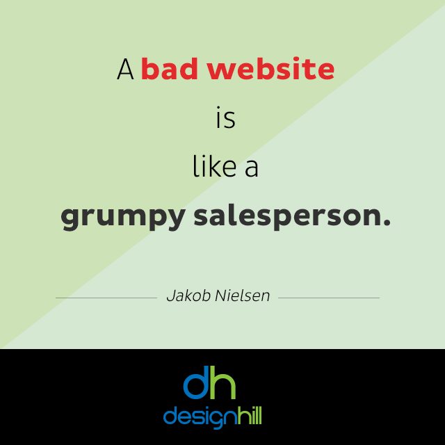
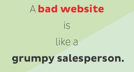
Websites are part of doing business in the modern world. With the help of websites & good website design, a business can target the markets where it wants to sell products or services. But the success of a website depends on its design and its ability to make a good rapport with the audience.
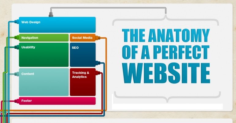
Here are some common mistakes that you should avoid to get better result.
Excessive Use Of Images
In their enthusiasm, many website designers overload websites with images. While images make a site look impressive and they have the capability to send a business message, still their overuse on the site pages can put off the visitors. Your visitors come to your website to get information and not just to see the pictures. Make it sure that the images are on the site pages with a purpose and not to fill the space. The images must represent your business and what it wants to convey to the viewers.
But a major damage that excessive use of images does is that it slows a website’s load time. As a rule, a website should not take more than 4 seconds to load. More loading time will frustrate your potential customers and they will prefer visiting your competitors’ websites. If your website takes more time to load, remove heavy image files and reduce the number of images on your site pages. Reduce the resolution of the image files down to the level that helps in easy loading of your website.
If your website must incorporate many high quality images, then make sure that your website has a separate portion marked for such images. You can direct the viewers to that portion of the website. This implies that you do not have to create many images on your home page and ‘about us’ page so that they load quickly.
Information At A Wrong Place

This is another common mistake that the web designers make. First of all, there should not be any unnecessary information on any web page of the site. But if you visit these faulty sites, you will find that the information is at a wrong place. For instance, your home page may be showing company news. Now, what has company news to do with your home page? Such news can be shown on your company’s Facebook or Twitter page or have a separate news section elsewhere on the website. A visitor comes to a homepage, not for the company news but to know how the website can be useful to him or her. Marcus Sheridan in thesalesloin.com says, ‘’….stop yapping about your latest company award that really means nothing to anyone other than those that actually work for you……it’s fine to have a news section of your website, but the homepage is simply not the proper place in the majority of cases.’’
Bad Navigation
Can you believe a website taking its visitor from home page to its own home page? But there are websites that make this mistake and link home page to home page or any current page to current page. There are in fact many such navigational errors. The visitors do not know where to go next and where is the link that will take them to certain information on the site.
Some web designers create strange navigational buttons, which are also known as Mystery Meat Navigation. Webpagesthatsucks.com says, ‘Mystery Meat Navigation occurs when, in order to find specific pages in a site, the user must mouse over unmarked navigational “buttons” — graphics that are usually blank or don’t describe their function. JavaScript code then reveals what the real purpose of the button is and where it leads.’’
These are the most common mistakes found in a majority of websites. You must avoid them to convey your business message effectively.