Last updated on February 19th, 2018
Experienced logo designers know the importance of colors in creating a logo design. They understand that people visualize colors easily and remember an emblem mainly due to the use of effective colors. For a logo design to communicate business message and to represent a company or industry, the design element of color is crucial and it should be carefully incorporated after paying attention to various aspects of the design and business.
Tips for use of colors in logo design
The first thing to be noted in using colors for logo design is that each colors represents some emotions and therefore colors are today associated with industries. There is a long list of industries and businesses using specific colors to successfully have a rapport with the targeted audience. For example, the industries or business that make products associated with aggressiveness, passion, strength and vitality use red as main color in logo design. The industries that are in making beauty products for women generally use pink in logo design as this color evokes femininity, softness, innocence and health.
Many soft drink makers’ logo has orange as main color. This is because this color evokes fun, warm exuberance and cheeriness. Similarly, use of yellow is mostly to express positivity and green are used for tranquility, freshness, and health.
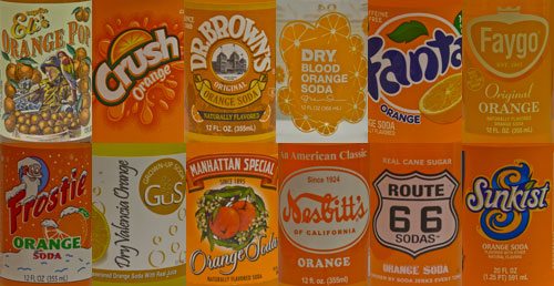 (Source drinks.seriouseats.com)
Blue represents authority, security, faithfulness and dignity. Purple evokes earthiness, subtle richness and utility while gray is the color for somberness, practicality and corporate mentality. Black evokes distinctness, classic, boldness and seriousness while white is known for purity, refined and truthfulness.
However, a creative logo designer will not be strictly following the traditional meaning of colors. In fact, there already many examples of how creative designers have broken these rules of colors. For example, red has been the color for soft drink manufacturers such as Coca Cola, but Fanta used grey as main color for its logo and product design.
Similarly, blue and red were once favorite colors for mailing. But FedEx used different colors and changed the tradition. While green used to be a color for the food industry, Macdonald changed it by using red and yellow for the fast food industry.
![]()
![]()
To conclude, you must be sure as to why you are using a particular color in a logo design. You can break the rules but first know them. There is always a scope for experimenting with colors but you must be creative so that business message reaches to the targeted audience.


