Last updated on December 6th, 2019
Curious about what 2015 has in store for logo designs? Can’t wait to see which trends carry over from the previous year and which ones will die a fast death? Which ones will go the way of the dinosaurs and which ones will adapt, evolve and outlast the rest?
Let’s dig right into what the year might hold for us, shall we?
Here’s A List Of 10 Trend Predictions For Custom Logo Design
01. Mobile Is Still A Thing
Yep, we saw plenty of mobile-friendly logo designs last year. And we’re going to see more of the same this year. Logos that shrink once you scroll down a page? Check. Logos that don’t lose any of its appeal when viewed on mobile, desktop or tablets? Check. Logos that are absolutely fuss-free and perfect for small screens? Already working on it!
![]()
![]()
With the growth in mobile and tablet usage, more and more consumers are demanding better user experience for these devices. Given that mobile usage is set to outpace desktop usage in the next few years, it could mean that, soon, mobile-friendly logo design would be the norm, rather than the exception. And that realization is pushing a lot of designers to change the way they conceptualize and create designs for logos, images and pages, among other things.
02. Flat Design Lives On
Last year, Flat Design was a big hit. The popularity was spurred on by Microsoft and Apple. In no time at all, flat design developed into a flat-ish design that used flat elements with enhancements—details from the real world—that just served to add even more to its appeal. A fine example of this, one that exemplifies the spirit of this style, is Google’s Material design.
![]()
![]()
Flat design will continue to make waves this 2015. The clean simple style we associate with it works especially well on mobile devices. Eschewing elaborate, fussy trends, Flat Design has enabled designers to create mobile-friendly logos.
Looking For a Logo Design?
We have helped thousands of business owners from all around the world with their graphic design needs such as a logo design, website design, social media posts, banner design and much more.
Get Your Logo DesignGet a Free Quote
03. Low Polygon Is Back
Used mostly in backgrounds as well as wallpapers, this one is obviously based on 3D software, the likes of C4D, 3D studio Max and Maya. It’s quite a famous form to use for your logos or icons.
![]()
![]()
04. Negative Space Is Going Strong
This was a winner last year and it’s still here, the “less is more” trend. With mobile use rising, there’s been a decided demand for logos that can survive the shift from one platform to another, one device to another—and by survive; we mean the ability to go through the entire thing unscathed. It’s why “shrinking logos” were developed. And it’s also one of the main reasons why negative space is popular.
![]()
![]()
It’s the perfect technique for this technology. The logo design stays the same, undiminished or non-deformed in any way. The design doesn’t suffer from the constant transfer and migration, from being sized or re-sized onscreen. It was a major win for us last year and still is, this 2015.
05. Simple Is Good
Logos with simple designs work the best. Logos with fussy, elaborate and even ostentatious designs are the worst to pull off. This is why we’re sure to see more logos this year simplify. Technology is driving the change.
06. Overlapping Elements Are Good Elements
Here’s another 2014 trend on the list and it looks to be going strong this 2015. The logo design, often the result of two design elements overlapping with each other, pulls a clever detail with nothing more than the ingenious placement of a shadow. It’s creative and inventive. No wonder it stayed on the list.
07. Bold And Thin Lines In Logos
No shades, no boxes. Just bold and thin lines that create a stark and simple logo design. This kind of design’s got punch, we’ll give you that.
08. 3D Metal Is Still Cool
The 3D effect adds a great metallic finish to the logos. The effect is the same as the one you see and often admire on the emblems of car logos—mirroring the same shine, the same polish.
09. Hand-Lettered Or Hand-Drawn Illustrations
This is a pretty audacious bit of 2015 prediction. But given the rise of color, large images and strong, clean fonts, logo designer will soon want to find a way to distinguish themselves. And none will do it better than going with a hand-drawn or hand-lettered logo design.
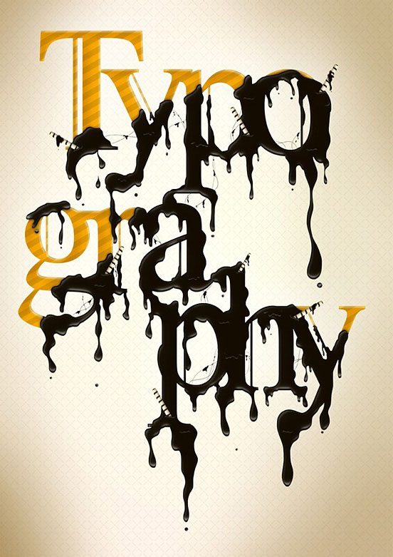
10. Better Typography
This one means we’ve started to see logo designs use better typography. There’s visual hierarchy that works, unique fonts and statements strong and plucky enough to make them memorable. Watch out for more of the same sort in 2015.
So there you have it, our 2015 predictions. The trend that seems obvious, at this point, is that logos are going to move towards a logo design that values simplification and accessibility. We’re sure more awesomeness will come. Cheers to more exciting designs! May we see bigger, better things from 2015.
Do you agree that logo design is so important to your organization? Please share your opinion with us in the comment box below.
Looking for Customized, On time, Menu Design? Launch a Logo Design Contest today. Choose from 100+ designs. Take your pick!
We offer a full 100% money back guarantee! Finally, a risk-free way of getting a customized design.
Like our blog? Follow us on Twitter, Facebook and Linkedin.


