Last updated on January 12th, 2018
A website page is capable of retaining its visitor if its content is legible. After all, you created a website with the intention of offering valuable information with the hope that the visitors will think of buying your products or services. If it is a non-commercial site, a font’s legibility quality becomes even more important to help share a lot of information.
Decorative typefaces
However, all typefaces are not designed for legibility. There are decorative typefaces and these are generally considered as illegible. They are primarily designed for decorative purposes and are meant to be seen and not read. So, they carry a decorative value and can be used on the welcome cards etc with such lettering that requires embellishment. You cannot read a lengthy text in such typefaces.
 Legible typefaces
Legible fonts are designed particularly for easy reading of text blocks. You have read novels or newspapers without any straining of your eyes. From one end to another and top to bottom, such typefaces allow you to read the content without putting much stress on your mind as the fonts are clearly visible.
How to identify legible fonts
The market of typefaces is crowded with hundreds of new and old typefaces. A new designer usually faces problems in finding out right legible fonts that work well due to plenty of fonts available. So, how would you identify these fonts?
 [Source:designyourway.net]
One of the characteristics of legible fonts is that they are what experts call them as ‘transparent.’ This means that the readers can easily read the text without focusing on the fonts.
‘’A long-standing typographic maxim is that the most legible typefaces are “transparent” to the reader–that is, they don’t call undue attention to themselves. Additionally, the most legible typefaces contain big features and have restrained design characteristics.’’ Says typography expert Allen Haley
A website dedicated to fonts – designyourway says, ‘’A legible font will usually be one that has conventional letter forms and design characteristics which are consistent. These types of fonts are likely to be the ones which will deliver legible results.’’
Some key points to help you select legible typefaces
- Avoid Fonts with Excessive Ornamentation

One of the rules for easy reading of a text is that the reader should not be focusing on the fonts to find out what it stands for. So, clarity of a letter is paramount. So, a designer should avoid the fonts that have unconventional shape. There is no place for excessive ornamentation and artistic designs of fonts when considering them for legibility.
- Opt for conventional typefaces
A safe way to choose typefaces for quick and clear reading of larger text is to opt fortheir conventional designs. The typefaces used in newspapers and novels are meant primarily for ease of reading thousands of words with no stress on eyes and mind. These fonts do not come with novelty of design and instead facilitate quick eye movement across the line.
- Good space between the letters
Another tip to select the typefaces for legibility is to watch out for space. The space between the two letters must be sufficient. If the visual gap is too narrow, the reader will waste time in recognizing the letters, word and the sentence structure. But when there is a greater space between the letters, the reader need not to focus on individual letters and goes on reading the text easily.
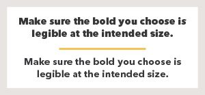
- Tall x-height is ideal
An important parameter to choose right legible typefaces is to judge it on the x-height scale. According to fonts.com, ‘’the term x-height refers to the height of the lowercase x in a given typeface at any given size. It provides a way of describing the general proportions of any typeface.’’
If a font has short x-height, its legibility is not good enough. But with increase in the x-height, the clarity of reading of text increases.
Here is what the Smshingmagazine says to explain the importance of x-height. It says ’’The x-height shouldn’t be “high”. The font size, weight and width must just be chosen according to the x-height of the font. Sure, at first glance one typeface with a larger x-height might look more legible than another, but the latter is just set too small (or too bold or too condended). In addition, a large x-height only helps a few letters like e, s, a (with double-storey shape). Other characters (with descenders, diacritical marks) suffer from a larger x-height.’’
- Ideal combination
Reading a text becomes a lot easier with some variation of typefaces. But you should ensure clever use of different typefaces for good effect when the intention is to make reading experience interesting and engaging.
In this regard, views expressed in website design your way are worth mentioning here. The site opines ‘A combination of different typefaces may be effective. It is important that these fonts are different in order to get the full effect of this. A good solution is to pick one serif font and one sans serif. This will create contrast and give the text a cohesive look, especially if fonts are chosen from the same designer’’