Last updated on December 10th, 2019
Iconic logos have gone through numerous changes in their designs since their inception. Apple logo design is one such legendary business symbol that has seen many twists and turns. Starting its journey as a big and fat classical logo, it is now a simple bitten apple design. The logo speaks volumes for the computer business of the company. The new design has helped build the brand.
One of the key features of the globally recognized companies is that they have iconic logos. These business symbols have become part of our daily life and cultures as we use their products or services frequently.
But what is even more noticeable is that these logos went under many changes in the design. Almost all global logos look different today than the shape they were few years back in and when they were conceived. Apple logo is one such iconic logo of our times.
Apple logo is a symbol based logo design. It has a half bitten apple as the company’s brand identity for the consumers to recognize and authenticate its computer and smartphone related products.
It is hard to remember a fruit that has represented a global company as proudly as apple has represented Apple Inc., an American multinational corporation that designs, develops and sells personal computers, software and consumer electronics.
Apple logo is one of those few logos that people recognize instantly and can tell the business it represents. The apple logo is also an excellent example of how making some changes helps in transforming a company image.
Main Highlights About The Evolution Of Apple Logo Design
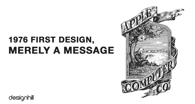
01. 1976 First Design, Merely A Message
Steve Jobs, who was CEO of Apple Inc at the time of his death in 2011, designed first Apple logo along with professional designer Ronald Wane in 1976. Since Steve believed in thinking differently, he choose apple as name of his computer company to which one of his partners had objected saying that it was not a fruit selling store. But Steve continued with apple and even had it in the company logo design.

02. 1976 Apple Logo
The first Apple logo design itself speaks a lot about what Steve thought about his company. The apple logo design showed that an apple was about to fall from the tree on Isaac Newton’s head who is shown sitting underneath the tree.
This business logo design clearly showed the people that the company welcomed new ideas. The logo had these words inscribed:Newton —A Mind Forever Voyaging Through Strange Seas of Thought —Alone. A ribbon banner on the logo had Apple Computer Co written on it.
Looking For a Logo Design?
We have helped thousands of business owners from all around the world with their graphic design needs such as a logo design, website design, social media posts, banner and much more.
Get Your Logo DesignGet a Free Quote
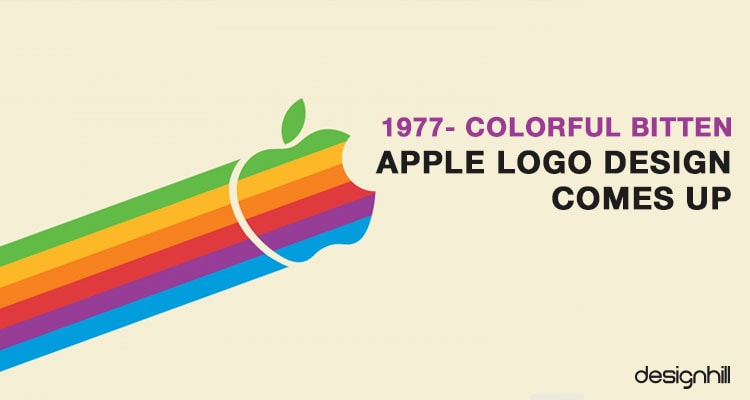
03. 1977 Colorful Bitten Apple Logo Design Comes Up
Since its inception in 1976, apple logo design was changed twice. The very first design had served its purpose of conveying the message that the company believed in thinking a new. But the design looked less like a logo and more as motto engraved in classic style.
The design lasted for one year only as it was not at all modern in its look. So, Steve commissioned Rod Janoff, a graphic designer, to create a logo that looked modern. Janoff came up with Apple logo that we see today on the company products.

Janoff created an apple that was bitten on one side. But why did he create bitten apple? It was because he did not want apple to look like a cherry. Another reason for creation of the one-side-bitten apple was that it reflected Apple tagline Byte into an Apple.
04. 1976 Apple Logo
Besides having a bitten apple, the new Apple logo design incorporated rainbow strips. There were six strips of different colors in the logo. Steve Jobs want to humanize the computer company by using the color strips. But there was no logic behind the placement of the color strips.
Green was at the top simply because the leaf was there. A former Apple executive saw lust, knowledge, hope and anarchy in the use of colors of the rainbow in wrong order. This multicolored logo continued to be in use for 22 years.
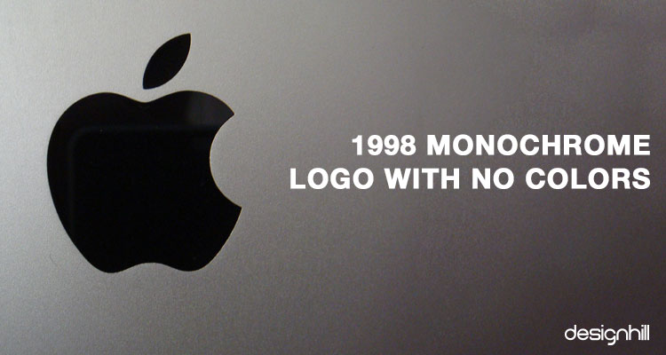
05. 1998 Monochrome Logo With No Colors
When Steve Jobs returned to Apple in 1997, he axed the multicolored logo. He gave the logo monochromatic look and did away with the colors. The overall shape of the logo, however, remained unchanged.

06. 1998 Apple Logo
The monochrome logo was created in 1998 and continues to be in use till today. One of the reasons for Steve Jobs doing away with colorful stripes was that printing costs had escalated at the time when Apple was in financial trouble.
The company was finding it harder to stand in competition with Microsoft and wanted to cut the costs. Furthermore, placing the colorful logo on Bondi Blue iMac would have looked out of place and silly. Also, the colorful logo would not have looked good on new apple metal devices.
Recommended Reading:
The current Monochrome styled Apple logo design also helped the company in changing its image. In the era when the colorful logo was in use, the company was facing financial losses and was seen as a failing company. Steve used the Monochrome styled logo to transform the image into a company that manufactured cutting edge sleek products.
So, like many famous global logos, Apple logo design also kept its shape and size unchanged, which sends the message that the company is confident of its quality products. The only change it made in the logo was making the new Monochrome style logo colorless from earlier version of the colorful logo.
If you also need a unique logo design for your small business, Designhill can offer you a cost-effective solution. This crowdsourcing site is the meeting ground for graphic designers and business owners. Hundreds of designers and business owner clients visit this platform daily.
You can laung your logo design contest at this marketplace to get dozens of new logo concepts and fully developed logos for your business. You can then select one of these designs as suitable for your business. Designhill runs 100% Money Back Policy so that your investment in the logo creation is safe.
Conclusion
Apple logo is iconic for using an apple as its business symbol. But the logo was once a huge design with lots of details in classical styles. With the time, the logo saw many changes such as that it was a colorful design once. It was transformed into the present day logo after the company decided to make the logo a simple and minimalistic design.

