Last updated on December 1st, 2022
2014 saw many exciting logos and many of them were an improvement over past logos. But not all of them were redesigned well, while many others were impressive.
Here Is A List Of 7 Logo Redesign That Made News In 2014
01. Black + Decker
Black + Decker [formally known as Black & Decker], was in news for its logo redesign for a good reason. The company, a power tool manufacturer of great reputation, wanted to give some fresh look to its business and decided to go for logo redesign. The redesign was done by New York-based firm Lippincott and it was successful in helping the company get an edge on the market.
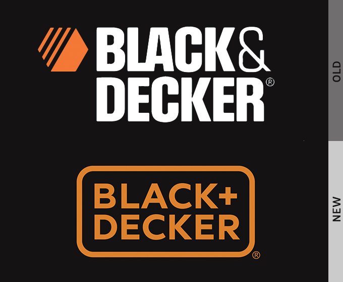
The design firm completely ditched the old logo and redesigned it wholly. The old logo was hardcore type giving a steely look. After logo redesign, new logo has a simple and clean look with a simple typeface. Also, modern + sign makes the logo look great.
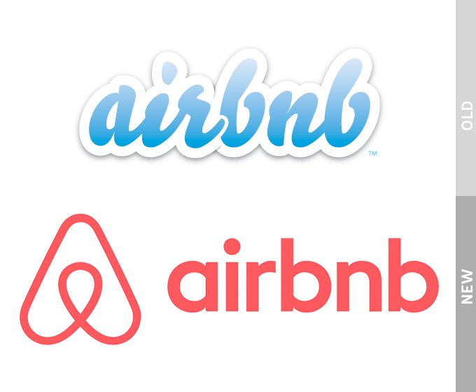
02. Airbnb
Airbnb has been gaining attention of the customers for affordable and friendly alternative hotels in big and small cities alike. Old logo of the company did not look good as many saw it resembling with private part. So, the company settled for redesigning the logo. It created a new ‘Belo’ logo. But it gathered controversy as people thrashed the logo through adverse comments. They did not at all found the logo as per the company’s policy of offering family-friendly hotel services.
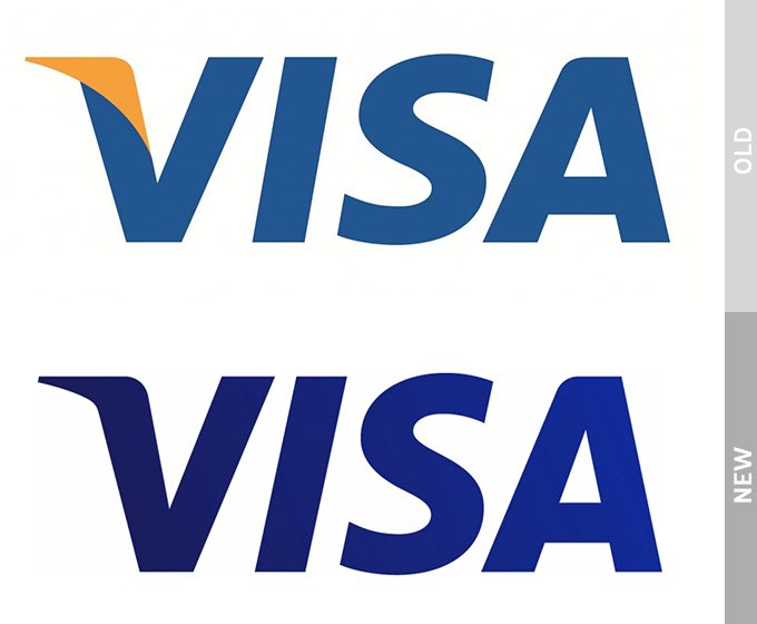
03. Visa
Visa logo redesign is another good example of a company benefiting from making some useful changes only. Instead of going for a complete overhauling of the logo, the company very wisely settles for small and careful improvements keeping with the new times. See how carefully they did their logo redesign, without loosing their old charm.
The opted for a darker blue color instead of the old lighter one. Another change was in the tagline. While the old logo had tagline ‘for everyone, everywhere’, the redesigned logo has ‘it’s everywhere you want to be.’’
On the top of the V of the logo, the changed logo design has darker edge and bolder blue color. This change gives a new simplified look to the logo in order to rebrand the company’s business.
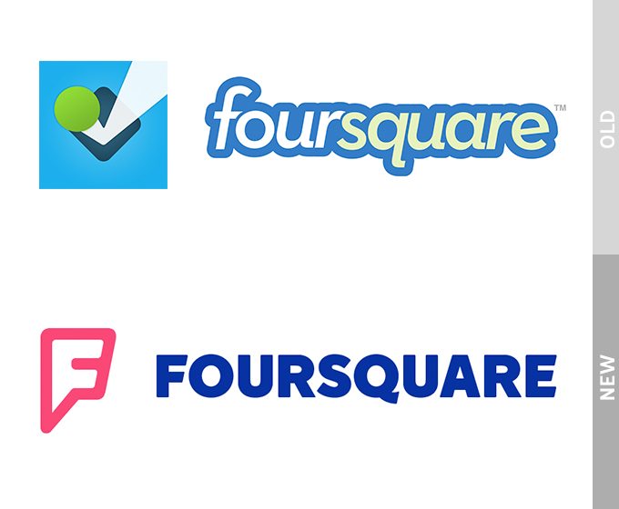
04. Foursquare
In July, Foursquare redesigned its logo wholly, which upset its audience. The people criticized the logo for its complete redesign to such extent that it became unrecognizable. The users did not expect such radical changes and wanted at least the color scheme of the old logo to be retained. The company, however, took an entirely new route and still has continued with it. Let us see if the customers like it or not in the future.
5. Tamba Bay Buccaneers
Tamba Bay Buccaneers, known as Bucs, are a professional football franchise based in Tamba, Florida. Their old logo had rough edges which was good for the older times. They went for logo redesign with a modern vector art look and a brighter red color.
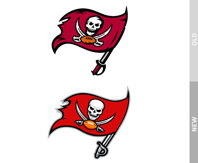
The redesigned logo has lost the vintage look but, due to their old pirate flag and skull still kept in the logo, the new look is successful in conveying the message to the modern audience.
6. Fitness First
Fitness First is a fitness club that was launched way back in early 90s. The company wanted to make changes in its logo after carrying the old logo for over 20 years. The old logo had feminine cursive design with navy blue color. Now the new FitnessFirst logo design has a new look of a trend setter fitness club. The blockier design of the logo and its bright red color scheme sends a business message to the modern people who are health conscious and need to be fit. The redesigned logo enhance image of their powerful brand.

Source: (Fitness First)
7. WWE
This wrestling entertainment company also was in latest news for logo redesign. The old logo, in the shape of a letter W with rough looks, was in fact very old from 1980s, and had scratch lettering. There was also a red swirl underneath.
This year, however, they completely shed the scratchy and rough design and instead fine tuned the letter W into an elegant design. The letter still has steely look, suited to the wrestling business, but it is not roughed look. It has instead a shiny and slick aesthetic appearance.

Source: (WWE)
Do you think the list is incomplete? You can add below more such example of redesigned logos that you found exciting this year.