
Last updated on February 2nd, 2023
Several times, design mistakes crop up in marketing materials but there are ways to avoid them by following a few simple rules. This is particularly true when designing documents like case studies that are visual representations of what your business can do for customers. A great case study can earn companies new clients—a poor one could lead to a loss of business. In this article, we outline why marketers create case studies, the five design mistakes that can creep in, and how these errors can be overcome. By the end of this post, you will be able to design a study that highlights your brand’s achievements and successfully attracts new business prospects.
What is a Case Study?
A case study is a research document that tells your brand’s story, shares how a process works and gives readers a greater understanding of a particular subject.
In the field of business, case studies showcase how your product or service works, as well as outlining the ways your company has helped customers.
They also act as evaluation tools—brands can use a case study to analyze how customers are using their product or service to determine areas of improvement.
You can see how marketing case study examples, like the one below, highlight how brands have a positive impact on their partners or customers.
[Source: Venngage]
This helps to engage potential customers—not only can brands showcase how their products work, but they can also leverage case studies as social proof and endorsements from customers.
But, the gains from a case study diminish if the visual appeal is lacking—there are numerous design mistakes that marketers can fall afoul of that could undo the work put in to create the study.
What are the Common Case Study Design Mistakes?
Five common design mistakes can occur when designing a case study—and it doesn’t matter whether brands regularly create them or are designing one for the first time.
Here, We Look At What These Errors Are And How Companies Can Avoid Making Them
Design Mistake #1: Choosing The Layout First
Form follows function in design—which is why fitting the subject for your case study to a design can lead to your message being lost.
This is a design mistake that most people make—no matter what visual they’re creating. It’s tempting to choose an aesthetically pleasing layout and hope you can fit your research and data into it later.
But that is not going to yield the best results. What will likely end up happening is that the designer will struggle to include their information and have to cut corners, losing out on crucial facts that could sway potential customers.
Here Are A Few Steps To Follow When Creating A Case Study So You Can Avoid Choosing Form Over Function
i. Choose Your Subject
Designing a case study becomes easier if you are discerning about the subject you are going to showcase.
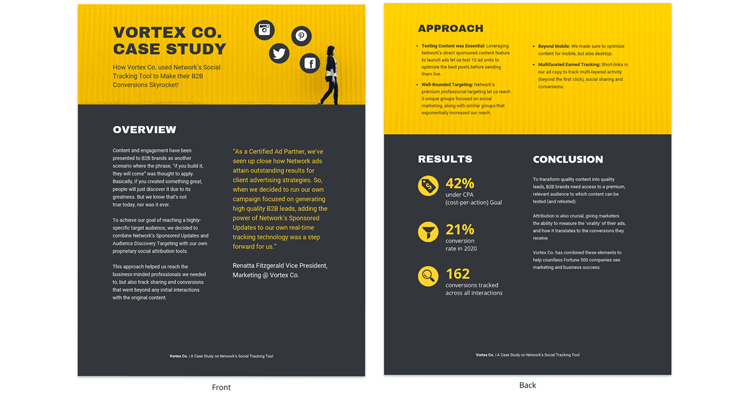
Choose a product, process, or customer that will be relevant to the target market for your case study—after all, you need to create content that your audience will engage with.
If you intend to showcase a customer, ask them whether they want to participate, and outline the process for them so they know how involved they have to be.
When you choose a subject correctly, you can design a cogent case study like this example.

ii. Design Around A Brief
Major design mistakes can happen when materials are put together haphazardly. It is important to put together a plan or a brief for the case study before you start writing it.
A brief could look something like this:
- Goals and objectives of the study.
- The subject of the study.
- Number of people to be interviewed.
- Metrics to be researched and showcased.
Once you have a subject and a brief, you can start writing your content, and then take steps to choose a layout that suits your material.
Design Mistake #2: Not Structuring Your Study
Before designing the case study, you need to structure your content so that picking a layout becomes easier.
If you have huge blocks of text with no breaks or defined sections, you are going to struggle to design a layout around it.
Whether you use a template or have a designer to put a visual together, a set structure helps the study look more organized—making it more engaging to readers, such as this case study on increasing web traffic.
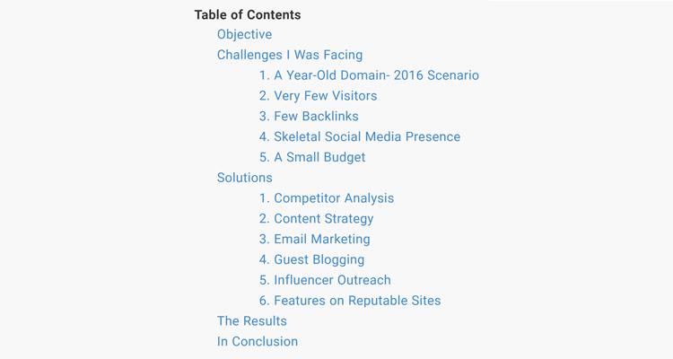
Here’s How You Can Structure The Text To Avoid Any Design Mistakes When Creating A Layout
- Executive summary of the case study.
- Company overview.
- Statement of purpose.
- Insights and impact.
- Methodology.
- Resources used.
- Key takeaways.
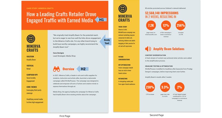
You also need to break down sections with titles, headings, and subheadings. Use h1, h2, and h3 headings to subdivide content, as you can see below.
[Source: Venngage]
A blog post case study like this example uses headings and subheadings to draw the eye and segment the various stages of the study.
Looking For Graphic Design Projects ?
We have helped thousands of freelance graphic designers from all around the world to find clients and graphic design projects in the area of their expertise, such as logo design, website design, social media posts, banner design and much more
Find Freelance Graphic Design JobsFind Graphic Design Projects
Design Mistake #3: Not Following The Rules Of Visual Hierarchies
A visual hierarchy is crucial to avoiding common design mistakes. The human eye makes connections between visuals to ascertain their importance in a set of information.
By understanding these rules, designers can create a case study that is visually appealing and accurately portrays the business story.
Size
Not sizing elements correctly is a design mistake that many make—if you’re aiming for uniformity, you can lose out on highlighting key data.
People’s eyes are attracted to the largest element on a page—that should be the most important information.
Increase the size of quotes from a customer, or percentages in your case study. Conversely, diminish less important data by decreasing the size.
Color Contrast
Colors make elements stand out in a document—pops of color draw the eye and convey information better.
But one of the major design mistakes that companies make is adding too many colors or not using the concept of color theory to their case studies. This is confusing to readers because all the colors compete for their attention.
You also want to avoid using colors that clash and make it difficult to read the study. Certain color combinations work better together, as you can see from this guide.
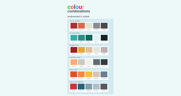
[Source: Venngage]
Use a maximum of three colors to design your study—these can be contrasting colors or varied hues of one color.
Space
A case study includes a lot of information. To fit it all in, marketers can make one of the most basic design mistakes—they forget to leave any space between the elements.
White space is a crucial part of good design—with enough space around your information, you make the study more readable.
Space also helps move the eye from element to element and segments sections from each other.
You can also use space to create correlations between elements—data spaced closer together appear related, whereas elements spaced farther apart are viewed as unrelated.
These crucial rules of design will make your case study easier to understand.
Design Mistake #4: Not Including Visuals
Case studies are mostly textual but that doesn’t mean you should avoid using visual elements. Images, videos, charts, or icons can make your case study more engaging.
You can include images such as screenshots to illustrate aspects of your study. Add photos of your clients alongside their testimonials—it gives the study a more human appeal. Video testimonials or walkthroughs are also a great way to showcase your subject.
Charts are essential for sharing data about your study. Instead of including numbers and using text to explain what the numbers mean, you can use a graph to convey the same information in less time.
Take inspiration from these data visualization examples to create a case study that is easy to read and understand.
Data also allows you to use icons, like in the below example, to illustrate the relation between the data and the subject.
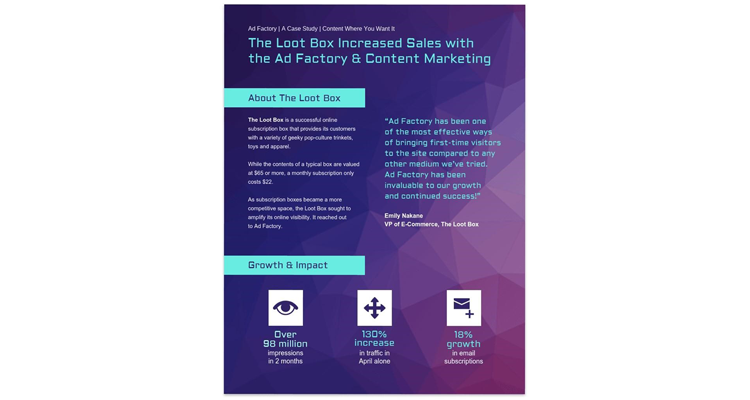
[Source: Venngage]
Recommended Reading:
Design Mistake #5: Choosing The Wrong Typography
Typography is as much a visual design element as images or colors—not putting thought into the typeface you use in your case study is a design mistake that could have huge negative implications.
There are numerous kinds of typography and they impart their personality to your content, as you can see in this guide.
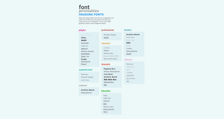
[Source: Venngage]
You don’t want to choose typography that clashes with your subject matter—a playful font may look good but it won’t suit a study about a serious subject.
Use the guide above to choose your header typeface and the accompanying body fonts. Look at your brand guidelines to determine which fonts you could be using.
If you’re highlighting a customer, it’s worth using their typefaces in the case study, as long as they work with your brand’s fonts.
Complimentary typefaces make it easier to understand your story—so make them a priority in your design.
Conclusion: Avoid Case Study Design Mistakes by Being Organized
A case study is a great marketing tool to attract new clients and to showcase your company’s strengths. But the entire exercise can be easily derailed by small errors.
To avoid making any design mistakes, follow these simple steps when creating your case study:
- Don’t choose the layout first.
- Structure your case study.
- Follow visual hierarchies.
- Include visuals.
- Choose the right typography.
It is crucial to organize your case study before you design it so that you can present a comprehensive company story that is engaging and memorable.