Last updated on March 17th, 2020
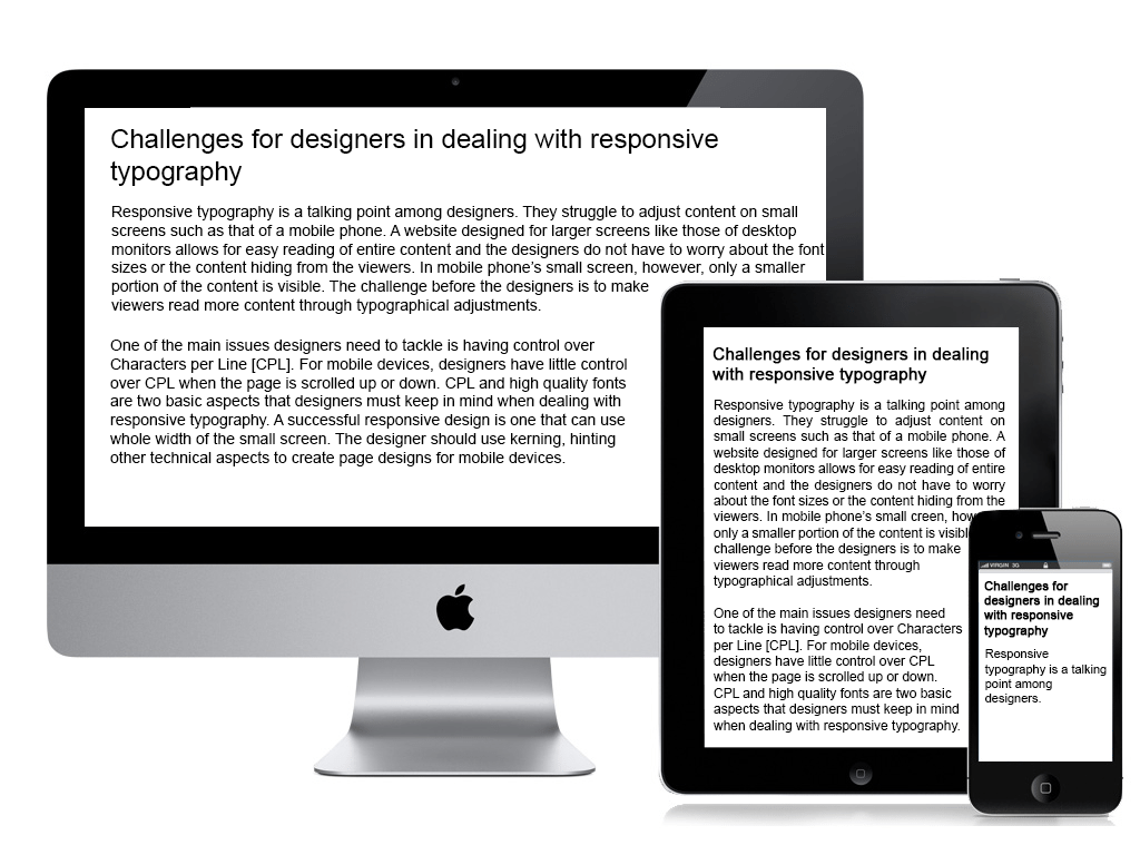
Responsive typography is a talking point among designers. They struggle to adjust content on small screens such as that of a mobile phone. A website designed for larger screens like those of desktop monitors allows for easy reading of entire content and the designers do not have to worry about the font sizes or the content hiding from the viewers. In mobile phone’s small screen, however, only a smaller portion of the content is visible. The challenge before the designers is to make viewers read more content through typographical adjustments.
One of the main issues designers need to tackle is having control over Characters per Line [CPL]. For mobile devices, designers have little control over CPL when the page is scrolled up or down. CPL and high-quality fonts are two basic aspects that designers must keep in mind when dealing with responsive typography. A successful responsive design is one that can use the whole width of the small screen. The designer should use kerning, hinting at other technical aspects to create page designs for mobile devices.
The designers should also consider bandwidth to tackle typography challenges. Since responsive web design aims at creating websites for mobile devices, the designers often sacrifice some design elements in order to reduce bandwidth. Keeping this in mind, the designers play with fonts to find out the right fonts for different screen sizes of mobile devices. They need to look for web-friendly fonts. So, the designers tackle the issue of adjusting the fonts so that the fonts are visible easily even from a good distance from the mobile screen. Proper use of CPL ratio is 50-75 and it should be maintained in creating responsive web design. Instead of icons, the designer may also think of using fonts as they can be resized.