Last updated on October 26th, 2021
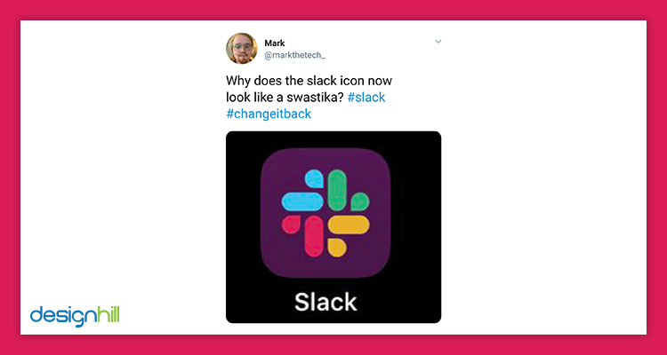
The recent logo revamp of Slack — a leading team collaboration tool— has attracted controversy since the time of its launch. The controversy is over its look which seems to be a Nazi Swastika. It’s because of the negative space used in the logo design.
The logo designed during the inception of a company has usually emotional attachment with the entrepreneur. But with the passage of time, companies grow and need to revamp logos to give brands a fresh look. Mergers and acquisitions happen. New missions, products or services get launched.
Transformations happen on regular intervals which are generally celebrated as an indication of growth. Sometimes, these changes in the overall status of the company make the original logo less relevant. A strategic and thoughtful redesign of a logo can only help them to give a new direction.
Logos are the most identifiable branding element a brand can have. It signifies the brand, reflects its goals, and stays relevant to the emerging trends. Hence, it is vital for brands to consider logo redesign at some point to stay relevant and draw attention to the key of the company.
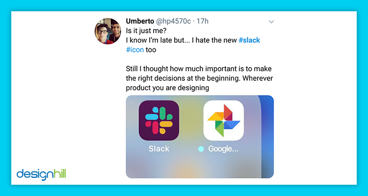
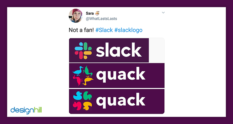
Swastika was a German national symbol of Nazi Party and somehow associated with the World War-II. Since then, swastika has been labelled as a symbol of hatred and racial bias. The usage of the symbol is banned in many countries, and if someone displayed the symbol publicly for non education purposes, it is considered as criminal offence. Many people have also compared Slack’s new logo with Google Photos design. Below are some of the controversial reviews made by people on Twitter.
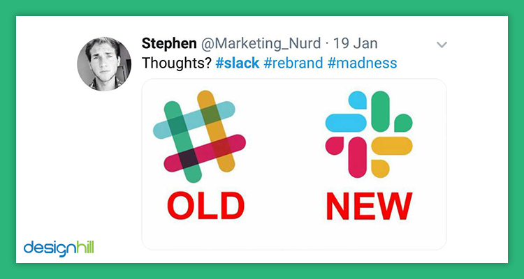

Slack started its journey in 2013, and within a short period, it became one of the most favorite internal communication platforms for both big and small companies. It has introduced its new logo. If you look into its old logo you will see a hash icon in four different colors signifying it a private. At the intersecting point, you will find different colors, giving a nice touch to the overall image. The name of the brand was placed adjacent to the icon, and the grey color was used while writing the name.
But the new brand identity includes several big changes. The new logo has a symmetrical arrangement of arms and water drop-like shape. The company has kept its original logo inspiration of four primary colors, but it has been given a more manageable look than its previous one. The typeface is still the same with a minor change in the letter “a”. The color of the typeface has also been changed from grey to black.
Conclusion
Well, the company has rolled out its new design. It has given a statement that they are restructuring other elements of its marketing materials, website, and its products. The new logo will get live after few months on all the platforms. No matter what the size of the company is, change is a need. It takes time for things to get settled and for people to get used to it. What do you think of the new logo? Share with us in the comments section below.