Last updated on October 5th, 2021
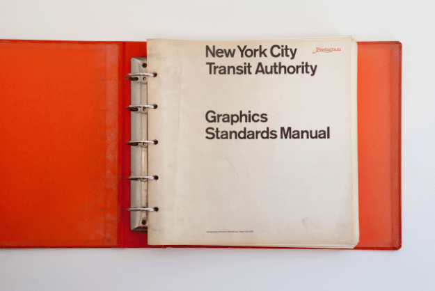
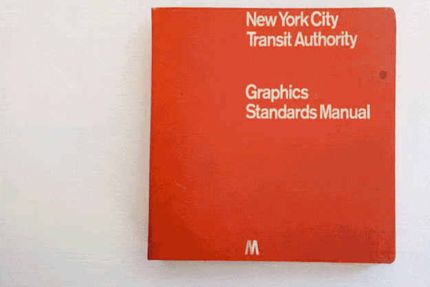
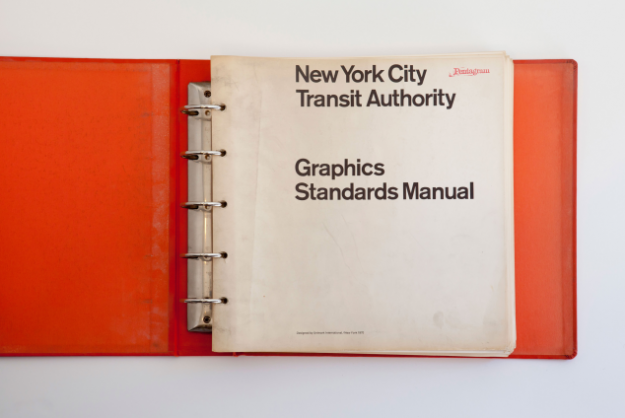
Produced for the MTA by designers Massimo Vignelli and Bob Noorda back in the 70’s, graphics Standards Manual’ had a distinct design language which included a very simple yet powerful feel and was created to portray information and direction to millions. Developed at a time where corporate identities were yearning to be prophetic icons in order to connect with users, the style is still relevant decades later “a symbol of great design.
Discovered accidentally in the basement of NYC-based design firm Pentagram by three young designers looking for a tarp for a Foosball table, the book was in perfect condition when found.
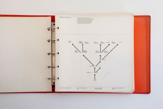
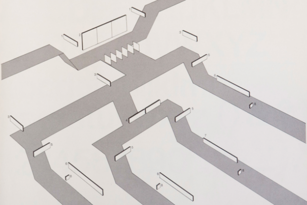
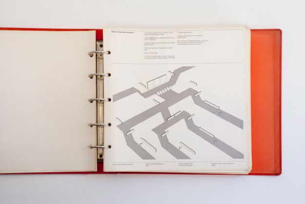
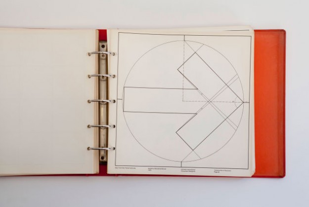
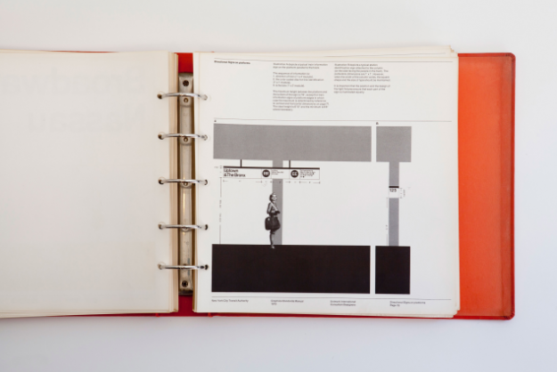
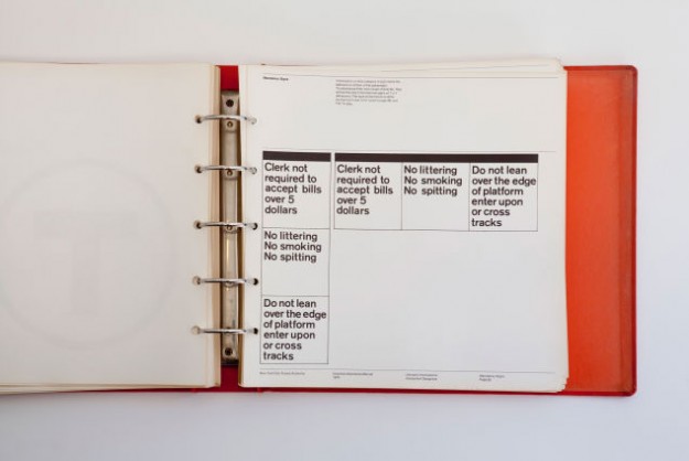
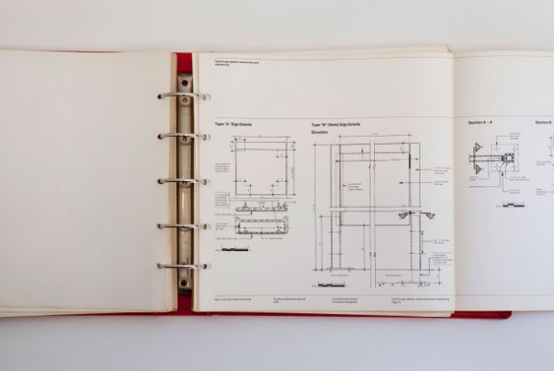
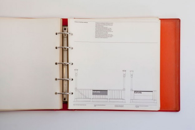
The manual starts with the basics of how information should be conveyed to the city’s riders, and delved deep into legends that assist riders at their points of decisions, what to do and what not to do, architectural details including entrances and exits, spatial icon and typography positioning, signage and colors.
Graphic Designers everywhere should be glad that such a gem of a manual was preserved digitally for all to learn from.
Source By PSFK
Looking for Customized, On time, Logo Design? Launch a Logo Design Contest today. Choose from 100+ designs. Take your pick!
We offer a full 100% money back guarantee! Finally, a risk-free way of getting a customized design.
Like our blog? Follow us on Twitter, Facebook and Linkedin.