Last updated on October 25th, 2021
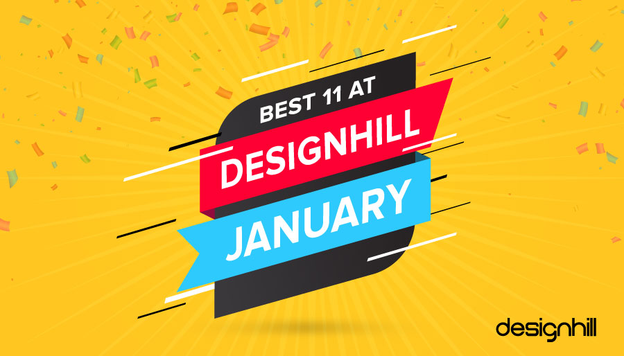
The countdown is over. It’s time to announce the Winner of ‘Designhill’s Best 11’.
Every month we present the top 11 designers who have been chosen by their respective clients – the ‘Best 11 at Designhill’. You, the members of the community, vote for your favorite designer. The winner gets a chance to be featured on DH Blog and other Social Media platforms. Getting exposure to as many as 150k+ followers is a big deal.
And, The Winner Is… Mr Bros By Catalin Dumitru
01. Mr Bros:
The creative touch given in the logo makes the brand stand apart from its competitors. The main character ‘Mr. Bro’ has been used to portray the funny spirit of a casual Mexican restaurant. The logo also reflects a ‘beachy’ feel, as specified by the client. Every design element in the logo is awesome. The contest received 44 designs, and Catalin Dumitra’s design was selected as the winner.
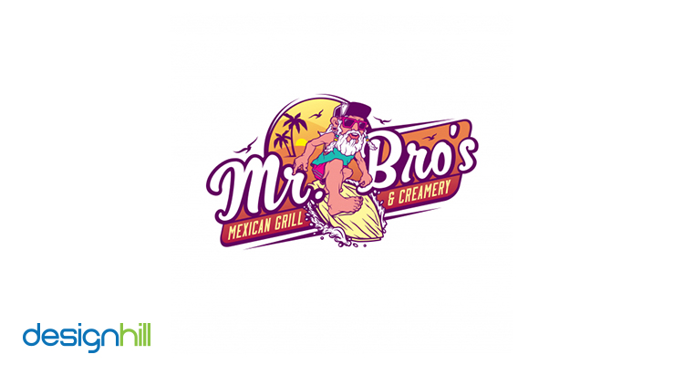
[Source: View Case Study On Designhill] [ Catalin Dumitru ]
Here Are The Other Top 10 Designs For The Month Of January
02. Pure Heaven:
Karen Himmel wanted to have a logo to covey that Alpacas are happy and that the fiber produced to make yarns is luxurious. The designer has fulfilled the requirements perfectly. The minimalistic design cleverly uses the negative space to illustrate the wool ball produced from Alpaca. The blue color has been used to represent trust and professionalism, and the fonts used in the design are Righteous and Century Gothic.
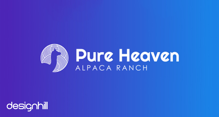
[Source: View Case Study On Designhill] [ Karen Himmel ]
03. Beaujourne:
The designer has chosen the wordmark logotype. Since the company is into luxury bath products, the black color has been used to represent power and sophistication. This is the design by Satu Nama, which has been chosen from a total of 121 entries.
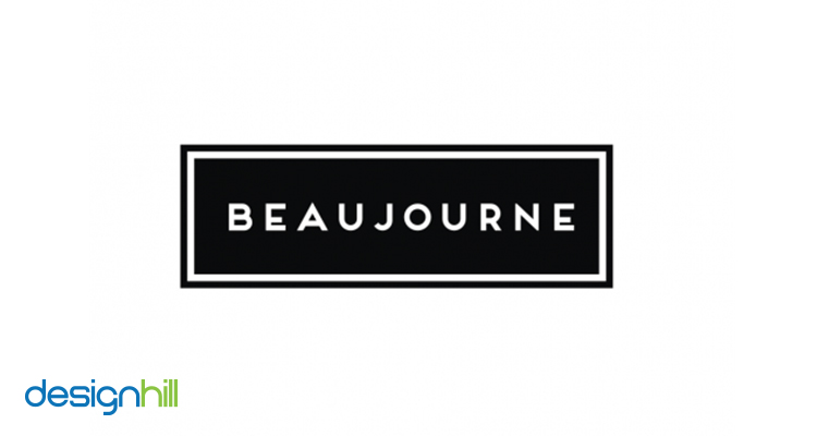
[Source: View Case Study On Designhill] [ Satu Nama ]
04. California Centre:
Cleverly designed, yet simple and catchy – that’s what best describes this logo. One of the requirements of the design was to highlight the California state identity. The designer has very efficiently fulfilled the requirement by using dots to draw the map of California inside the emblem. All in all, he succeeded in conveying the brand’s message perfectly.
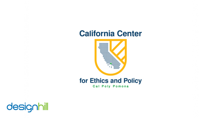
[Source: View Case Study On Designhill] [ Michael Cholbi ]
05. Wow Laundry:
The requirement specified by the client was a little technical, and it was not easy to fulfil it. There were 287 entries from different designers. Though all the designs were unique, Alhamdulillah took home the winner’s award. The logo captures the brand message perfectly and fulfils the project requirement exactly in the way it was desired.
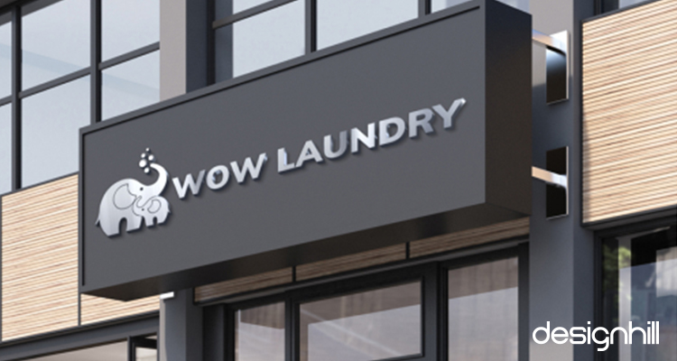
[Source: View Case Study On Designhill] [ Alhamdulillah ]
06. Tumbler Lock:
Tumbler Lock is into cloud architecture and security business. Being a tech company, the logo not only has to convey the brand message but also must look classy and modern. And this is what the client wanted. Among 231 designs from different designers, Jessica’s stood out and was chosen as the winner.
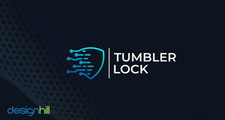
[Source: View Case Study On Designhill] [ Robert ]
07. Therapy LLC:
The client wanted a logo that would be ‘eye catching, modern, and chic’. The icon-based logo clearly serves the purpose and depicts what the brand is all about. The negative space used in the icon showcase an individual sitting calmly for a therapy. The brand name is positioned below the icon. The fonts sync perfectly with the brand personality. The logo is beautifully designed to represent power, positivity and hope.
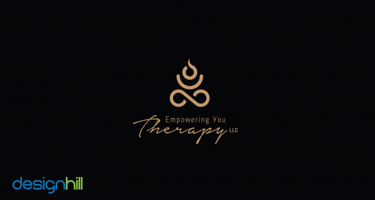
[Source: View Case Study On Designhill] [ Atiff Hamadah ]
08. Sea & Cellar:
Just like a brand name, the designer has created the icon in a skillful way. The anchor shape has been used to depict that the store is located in a coastal town. ‘Est 2019’ has been written inside the icon to give a vintage look, just like it mentioned in the bottles of old wines. And the best thing is that the designer has also synced the name of the town and state in the rectangular border seamlessly.
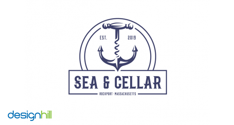
[Source: View Case Study On Designhill] [ Catalin Dumitru ]
09. Finch Botanicals:
While posting the contest, Charles Taylor clearly specified that he wanted to incorporate finch bird in the logo. The designer came up with a design that reflects all the specifications given by Charles. The logo perfectly reflects the luxuriousness of the brand, while the bird stands for nature and the ‘Botanical’ part.
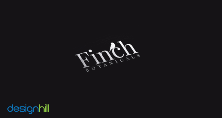
[Source: View Case Study On Designhill] [ HR Motion Design ]
10. Three Hares Jewellery:
The logo has been designed for a jewellery brand. The designer, Nacer Percian, came up with the design that clearly specifies the nature of the business. The name of the company, ‘Three Hares’ has been used and the flower shaped necklace has been designed around their necks. The design is simply outstanding, as the client thought. What do you think?
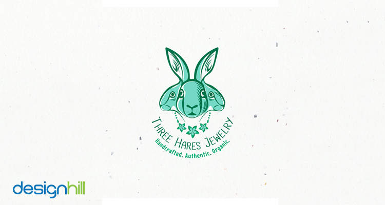
[Source: View Case Study On Designhill] [ Nacer Persian ]
11. Bamboo:
James had very basic design needs. He wanted to have bamboo sticks in the logo design. He further added that the logo should be clean, trendy and bohemian style. Archidesigns followed the guidelines and was chosen as the winner. We chose it to be one of Designhill’s Best 11.
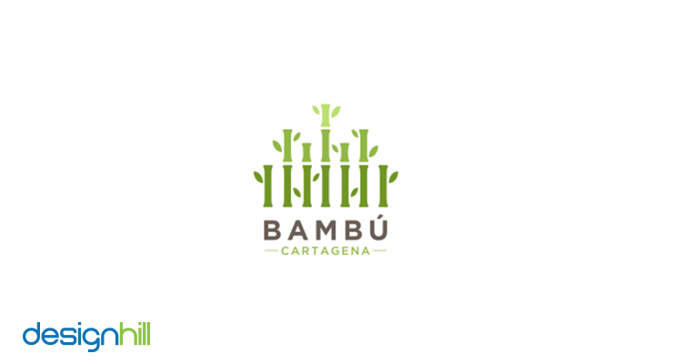
[Source: View Case Study On Designhill] [ Archidesigns ]
Stay Tuned!
Keep visiting Designhill blog and stay updated with the recent developments in the world of business. Create contests if you have graphic design requirements. We’ll be back soon with Designhill’s Best 11 for the month of February, ’19. Till then, have a great time.