
Last updated on January 24th, 2023
Have you ever wondered what ensures the maximum email open rates? Are there any practices that can make your email marketing campaign successful? The first impression may not be the most important criteria in this email world but it does decide the success of your email marketing campaign. So, what are the ideal ways to keep in mind while creating your email templates? In this post, we’ve shared the best email design practices that will help you to improve user engagement and achieve the maximum open rates. Have a look!
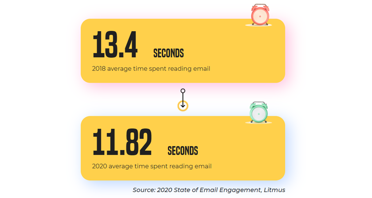
Statista has revealed that 306.4 billion emails were sent every day in the year 2020. This figure is believed to cross 361.6 billion in the year 2024.
This huge number implies that your subscriber’s inbox is inundated with emails and they might not have time to read every email. It comes as no surprise that the average time spent by a subscriber on an email has reduced by 12% from 2018.
People are simply scanning through the emails. Therefore, you must make sure that they understand the purpose of the email without spending too much time.
What if your email looks something like this?
It will ruin the user experience and might compel them to unsubscribe or report your email as spam. That’s why creating a well-designed email is of utmost importance.
Here Are The Email Design Best Practices That Will Take The Customer Experience To The Next Level And Increase The Conversion Rate
01. Use A Familiar Sender Name
Your sender name is the first thing that the email recipients see whenever they open the email inbox. Your sender name must let the user know who the email is from. Make sure you use an identifiable sender name that reinforces the subject line and preheader text.
For Example: Alice Jackson from Designhill or Alice from Designhill can work well as sender names.
02. Craft A Subject Line That Stands Out
To cut through the noise of a flooded inbox, you must write an engaging subject line that persuades the user to open your email. Personalize the email subject line with the user’s first name, demographics, and past purchases.
Additionally, you must experiment with different types of power words, questions, and puns in the subject line. Some marketers even include numbers to leave an impact on the subscriber’s mind while some others see an improved rate by using emojis in the subject lines.
It is a good idea to keep the subject lines below 60 characters so that it does not get truncated in the email mailbox providers.
Avoid misleading your people with clickbait subject lines. Do not write the subject lines in all caps and refrain from using any words that can trigger the spam filters.
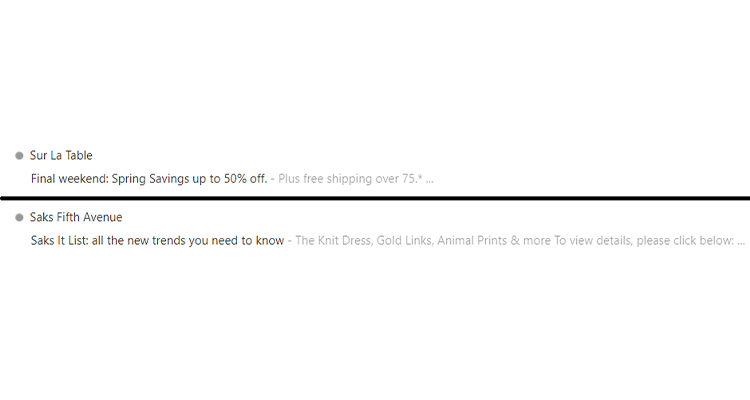
03. Do Not Neglect The Preheader
Preheaders work as extensions of your subject line. Through the preheader text, you can throw more light on what the email is all about. Use this space wisely so that you can pique the subscriber’s interest and get them to open your email.
The length of your preheader text visible to the reader is variable according to the email client used to access the email. Therefore, you must test it across all devices and email clients before hitting the “Send” button.
Here’s a screenshot to explain how your subject line and preheader text must complement each other.
Looking For an Email Design?
We have helped thousands of business owners from all around the world with their graphic design needs such as a logo design, website design, social media posts, banner and much more.
Get Your Email Design Ctreate Your Own Email Header
04. Have A Consistent Email Layout
Design your email in such a way that it instantly connects with the recipient and creates a brand recall. Generally, emails have a logo and header image at the top, followed by a short copy that reflects the purpose of the email, relevant visuals to go with it, and a clearly placed CTA.
Take an omnichannel approach, which means that your email design and layout are perfectly in sync with your website and social media posts. Let the colors and images used in your email serve as an extension of your brand personality.
In other words, if you have used 3D designs on the website, use similar designs in your emails too. On the other hand, if you like flat designs, you must stick to that across all the marketing channels.
05. Use Legible Fonts That Go Well With Your Brand Personality
All your efforts of drafting an interesting email copy will go down the drain if it is not readable. So, choose the right fonts that perfectly match your brand personality and the purpose of sending the email.
For example: If you are sending out an occasion-based email to wish the subscribers, fancy fonts might work for you, but if you are sending out an apology email, you must use simpler fonts that reflect sincerity and honesty.
Your email must not have too many different fonts as it would fail to leave an impact on the subscriber’s mind. Use web-safe fonts like Arial, Tahoma, Times New Roman, and Verdana.
The size of the font is also equally important. Keep the header font size at 20-22px and the body font size at 14px for better readability. You can also create a custom header for your email using email header templates.
06. Always Design An Accessible Email
Consider the physically challenged and visually impaired subscribers while designing your emails. Your email must be accessible to every user, irrespective of such disabilities.
Here Are Some Best Practices To Help You Create An Accessible Email:
- Avoid a center-aligned email copy as it will be difficult for the dyslexic patients.
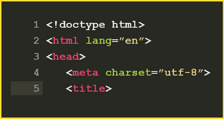
- Set the email title with the <title> tag so that people using screen readers can easily understand your email.
- Do not set titles on links, otherwise it will be difficult for screen readers to figure out the email flow.
- Use the HTML language attribute to let the screen readers know which language is used in the email.
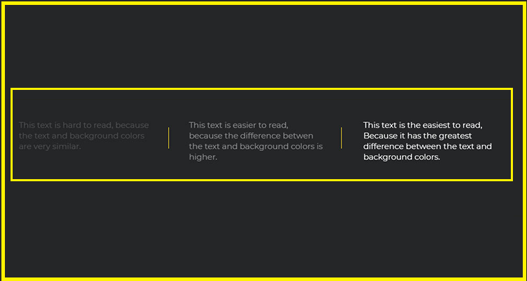
- Follow the Web Content Accessibility Guidelines (WCAG) 2.0 for the right contrast ratio in emails. 4.5:1 is the minimum contrast ratio if you want the fonts to be easily readable in the background.
Here’s A Screenshot To Demonstrate What It Means
- Follow a logical reading order to enable easy communication with the readers, especially those who are suffering from dyslexia.
- Highlight the links with bold fonts and make sure that they are easily clickable.
- While using GIFs, remember that the flashing rates of the animation is not between 2 Hz and 55 Hz. This will worsen the problem of photosensitive epilepsy.
07. Add A Suitable Alt-Text To The Visual Elements
A well-designed email is not complete without adding suitable visuals. Humans are programmed in such a way that they consume visual information more easily than long paragraphs of plain text.
If you have a lot to say, you can use rich media elements such as GIFs, videos, and interactivity like menus, accordions, and sliders to convey more information in the limited space.
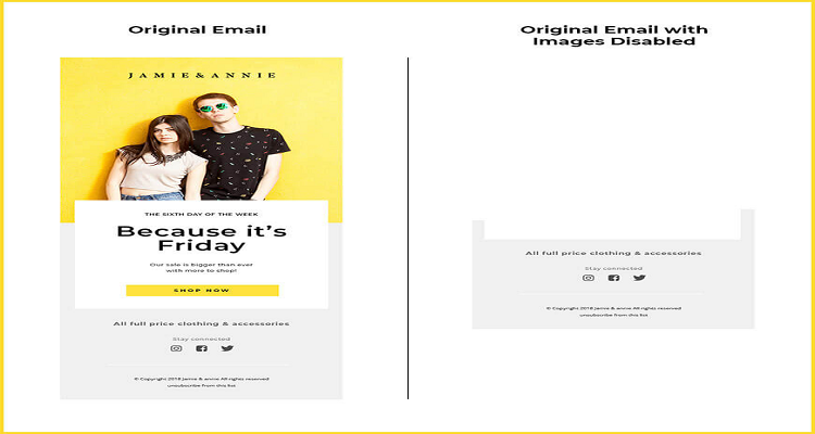
However, you must not forget to add relevant Alt-text to the visuals so that people can understand the purpose of the email even if the images are turned off. This is also important from the point of view of accessibility, for people using screen readers.
In case you forget to add Alt-text, your email would look something like this, and not make any sense for the reader.
Furthermore, you must add proper fallback in case the email client does not support that particular interactivity.
Recommended Reading:
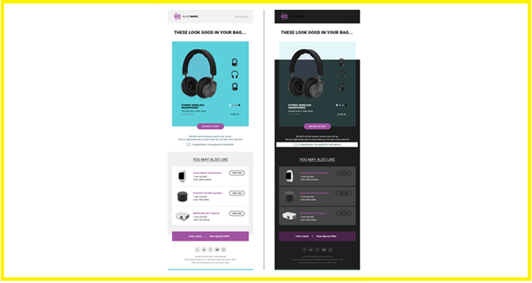
08. Make Sure Your Email Is Compatible With Dark Mode
Dark Mode is getting immensely popular as most of the people prefer to use Dark Mode settings on their devices.
According to Android Authority, 81.9% users have already started to use Dark Mode on their devices. Keeping this figure in mind, you must design Dark Mode compatible emails that render well across all email clients and devices.
If your email is not designed with Dark Mode compatibility in mind, when the user open the email, it might end up looking something like this and turn off the subscribers.
09. Check The Loading Speed Of Your Email Before Hitting The ‘Send’ Button
Often, you add a number of visuals which might cause the emails to load too slow. While using animated images and embedded videos in emails, you must test the loading speed without fail.
Do not add any heavy images in the email. If your email is taking too long to load, try compressing the visuals or using light-weight imagery.
10. Draft A Succinct And Interesting Copy
A wall of text is the last thing your subscribers are looking for, in an email. Do not send out an unreasonably long copy in the emails. Instead, try to convey your message with the help of visuals or interactive elements.
Alternatively, you can also include the gist of the communication in the email and redirect the users to a landing page where they can get detailed information.
Your subscribers appreciate minimalistic emails more than those long scroll emails. After all, less is more and simplicity is the ultimate sophistication. So, keep two or fewer scrolls in your emails.
11. Place The CTA In Such A Way That It Instantly Draws The Subscriber’s Attention
Your CTA button is the gateway to conversions. Place it strategically so that it draws the subscriber’s attention instantly.
If your email is too cluttered, the subscriber might not be able to find the CTA and it will hamper your conversion rate. 44 x 44 px is the ideal size for a CTA button so that it is easily tappable on mobile devices.
12. Avoid Using Gaudy Colors
Loud and bright colors do not reflect professionalism and fail to impress the subscribers. Try to use mute, pastel colors that impart an elegant look to the emails.
Unless you are sending out an occasion-based email that must evoke a festive vibe, avoid any flashy shades of red or blue. Moreover, loud colors are not compatible with Dark Mode settings, which might lead to rendering issues.
13. Build A Responsive Email
As the majority of your subscribers are accessing your emails on mobile devices, it is inevitable to design responsive emails. It is advisable to stick to a single-column layout whether you take an omnichannel approach or do multichannel marketing.
Pay special attention to the font size so that your subscribers do not have to struggle to read your emails on mobile devices. Keep the size of the CTA button such that it is easily tappable. A short and sweet email with minimum elements is the basis of designing a good responsive email.
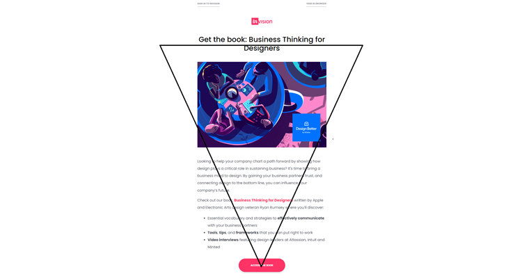
14. Follow The Rules Of Visual Hierarchy
Lay out the email design structure, considering the inverted pyramid model. According to this model, the email header image goes at the top.
Place the copy below the hero image, followed by a CTA button. This structure guides the reader’s visual flow and gets them to click through the CTA. Ultimately, it will direct them toward conversion.
Invision sets the perfect example of adhering to the inverted pyramid model in their emails. Here is an example
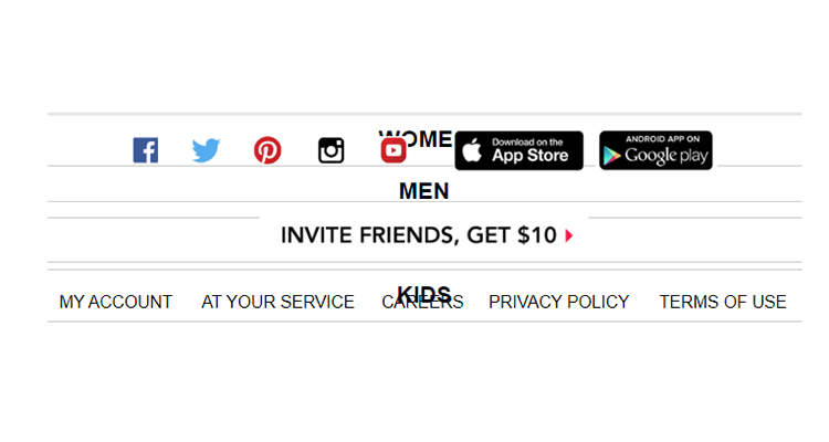
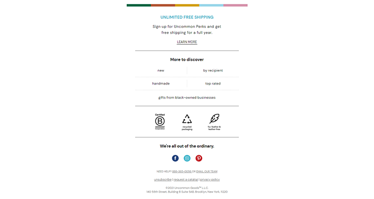
15. Pay Attention To Email Footer Best Practices
Your email footer must include the physical address along with the Unsubscribe link and privacy policies. That’s the guidelines laid out by anti-spam laws like CAN-SPAM, GDPR, and CCPA.
A good idea would be to design a template and use it throughout your emails. Doing so will also ensure consistency while helping you to avoid any mistakes.
See how UncommonGoods designs the perfect email footer for their emails.
16. Test The Emails For Flawless Rendering
Always test your emails and see whether they render well across the diverse email clients and devices.
Double check the placement of images, CTA, email copy, and any other interactive elements that you have used in the emails. Also, check your emails for Dark Mode compatibility and accessibility.
While Litmus and Email on Acid are the most powerful tools to test the emails, you can also send a test email and check it on the actual devices as well as email clients.
I strongly recommend you to include a ‘View in Browser’ link in all your emails just in case there are any rendering issues.
Wrapping Up
Most of the marketers opt for DIY email editors with drag-and-drop functionality. However, if you are creating customized emails from scratch, you must follow all these email design best practices. It will not only help you in creating classy emails that will delight your subscribers, but also skyrocket your conversions.