Last updated on January 6th, 2020
We see colors everywhere and get guided from them emotionally. In fact, the emotional aspect of colors is now well documented under several studies & same goes with logo design. This should make it clear to the professional graphic designers that they ensure a careful choice of colors when incorporating these elements in designs, especially logo design.
A logo design is representative symbol of a business or company and so its color scheme is central to its overall impact on the viewers.
Colors are important from the point of view of creating brand recognition as these elements are powerful enough to trigger strong emotions. But due to cultural influences, we tend to perceive colors differently and this factor also should be accounted for in designing of logos.
Colors are strongly associated with emotions. For example, blue is the color that we generally associate with emotions of loyalty. Purple is the color with spirituality and royalty. Green is the color evoking the emotions for nature and so this color is often used to represent businesses related to health products. Similarly, yellow represents intelligence and in some cultures it also is a color for peace and spirituality. Red evokes the emotions of energy, enthusiasm, love and anger. We can easily say that we all react to colors emotionally.
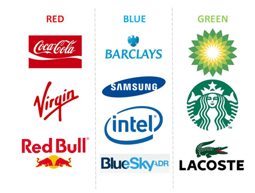
In the following logo design, you can see that different colors are used by the logo designers. These colors are thoughtfully incorporated by considering the nature of the business. For example, Coco-Cola logo has red which is the color for energy and youthfulness as the company targets the young people for its soft drink business. Leading banking and financial services company, Barclays, logo has blue as this color is for intelligence and socializing, which are crucial for dealing with financial matters. Blue is the color also for Samsung, Intel and blue sky. Green is the symbol of health and good food and so it finds place in Starbucks coffee logo.
Cultures surely have an impact on how we perceive colors and the logo designers should consider this aspect. For example, in western cultures, white is seen as a symbol of chastity, virtue and cleanliness. On the other side, Chinese people take white color as a symbol of mourning and grief. Similarly, black is known as the dark side of something and carries a negative emotion. So, there are words like black magic, black plague, blacklisted and so on. This means that the logo designers must first study how a certain culture is going to see the colors in a logo.
![]()
Buying decisions are mostly based on colors
Colors are the basis for a majority of customers to make buying decisions. Many studies have shown that people are influenced by colors in a logo when they see a product and buy the product if the color has evoked the desired emotions. In fact, research shows that 60% of a decision to purchase a product is based on color. This is the reason that logo designers strategically choose the colors to influence the customers’ buying decisions.
However, colors evoking certain emotions do not mean that similar colors should necessarily be used in logos in similar industries. For example, while a majority of businesses in beach resorts and coastal destinations use medium soft blue in their logo design, some also use yellow and orange in their palettes. Sky resorts use white and a lot of cold blue. So, the logo designers should select the colors carefully when experimenting with shades and hues of colors.