Last updated on September 16th, 2021
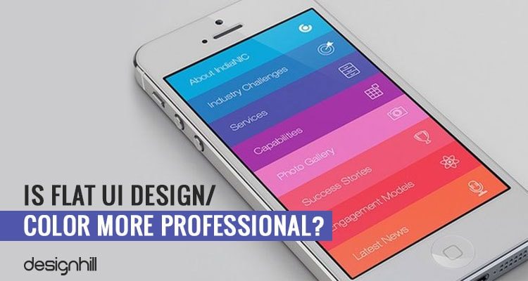
Flat UI design trend has been making round for past years. But now the experts have started questioning its usefulness. Many of them even asked if flat UI design/color is professional and if yes then to what extent? Does this trendy design is easier for the users or is it more stylish?
Design professionals even have raised doubts whether or not the flat UI design users find it comfortable when they use it via touch devices. Does the design really create any feeling of easiness?
Before we dive into the concept of flat design, let’s precisely know what Flat Design exactly is.
Flat design is a minimalistic design approach as opposed to flashy animations and illustrations. The design emphasizes on simplicity & usability and features bright colors, open space and two-dimensional illustrations.
Flat design gets its name from its two-dimensional qualities including use of flat shapes. The concept has it roots in the simplicity and works without incorporating any embellishments such as embossing, shadows, highlights, gradients or textures.
Looking For a Graphic Design?
We have helped thousands of business owners from all around the world with their graphic design needs such as a logo design, website design, social media posts, banner and much more.
Here Is A Sneak-Peek Into Some Features Of Flat Design
- Flat Design is user-centric and any kind of embellishments & ornamental elements are viewed as distraction. As per the rules of flat design, if any particular aspect serves no functional purpose then it is just a glorified clutter. Many Graphic designers criticize it by calling flat design as boring. However, if it lacks flashy design and does not favours artificial design does not mean this design style is boring rather it embraces classically digital aesthetic.
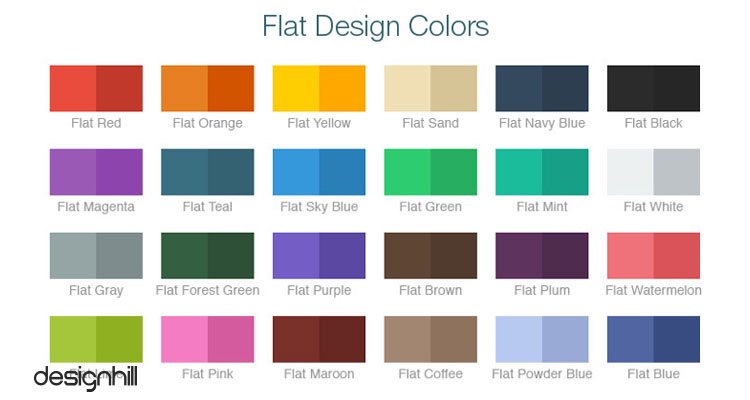
- In addition, flat design uses bright, contrasting colors that instantly make illustrations and button clearer as they pop out from the backgrounds effortlessly.
- Unlike other designs, flat design uses minimalistic imagery and this is a major factor that contributes to the success of flat design. Simple images look great and convey messages quickly as compared to detailed illustrations.
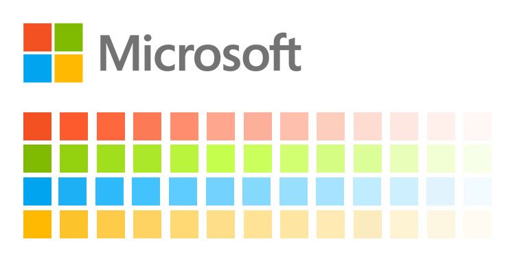
Flat design started becoming a recognizable trend in the year 2012 and 2013. Microsoft is considered as one of the first to apply flat design to its interface.
Recommended Reading:
Now on the flip side, when it comes to giving complex user experience, flat design is not a good option as it fells flat in this category. Further, flat design styles hinder usability as users are not well aware about where to click or what is clickable.
Besides, in the flat design you cannot include more information as less information density is preferred in this design concept to achieve simplicity. Again, in flat design, designers do not get much creative freedom and thus there is no to less scope of innovation.
We all have witnessed the rise of this flat design trend for past two years. Another shortcoming of the design is that users have very few options. The page has only selected choices to offer as the emphasis is to cut the clutter. However, as the trend is to create simplicity, the design styles are looking similar and standardized.
Because of the similarity of the UI design, an advantage is that it can be standardized. But its adverse impact on the users is that it fails to arouse them with any deep feelings.
There is hardly any real life experience for the users in the absences of texture, dimension etc. In fact, many UI designs are even flatter than a colorful plastic paper.
Clearly, the flat UI design was a trend which had to fade away one day. It is now showing signs of tiredness and professionals are now analyzing it for its pros and cons. They may soon come out with a new trend of the design that has a bit more variety for the users.
Conclusion
No design concept is perfect but based on your project needs you can use different design concepts to your advantage. Design is beyond look and feel rather it is about usability and functionality.