Last updated on October 5th, 2021
Glenn Greenwald’s new book No Place to Hide based on his work with Edward Snowden is unlikely to change many minds on National Security Agency surveillance given the vast amount of information that the Snowden/Gellman/Greenwald/Poitras crew has already brought to light. But Greenwald is publishing a bunch of new documents to the web concurrent with the book’s release, and these let us explore a subsidiary issue that Snowden has brought to public attention: the NSA’s addiction to ridiculously ugly PowerPoint slides.
Seven of The Most Egregious New Offenses:
3D Charts
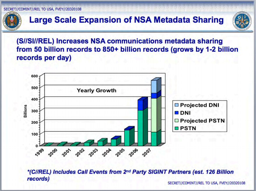
There is basically never a valid reason to use 3D charts. In addition, the stacking makes it hard to do year to year comparisons. Maybe an area chart would work better.
Meaningless Flow Charts
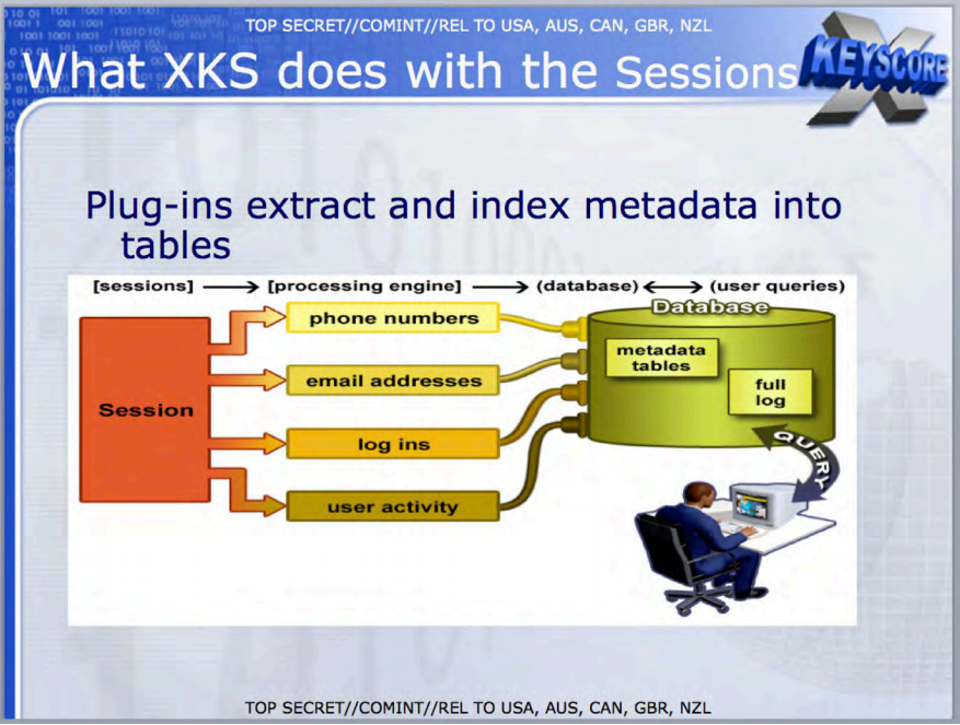
There is a time and a place for flow charts, but this one doesn’t say anything. Whether the NSA is trying to get your email address or your phone number or whatever, it all goes the same way.
Terrible Color Choices
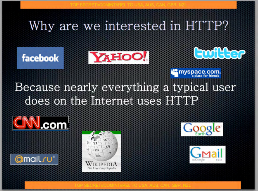
Not only are the copy-and-pasted logo designs here are ridiculous, but the yellow text on orange background is illegible. And a good thing, too, because claiming that websites use HTTP is some kind of “top secret” insight is laughable.
I Can’t Even
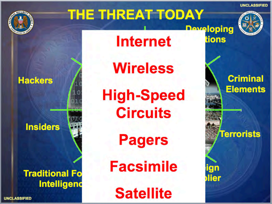
What?
Maps Nobody Can Read
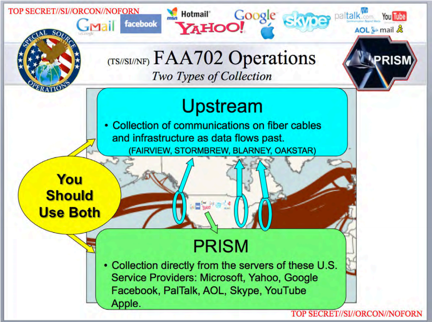
Maybe do the flowchart or the map.
Clustered columns would work here
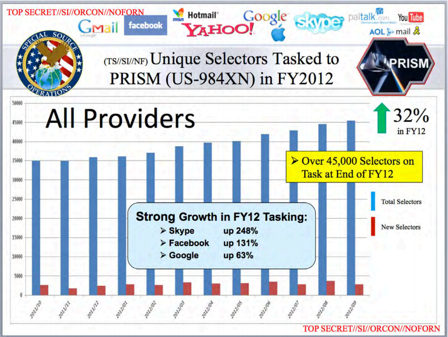
Much logos. very illegible numbers. Wow.
Blarney
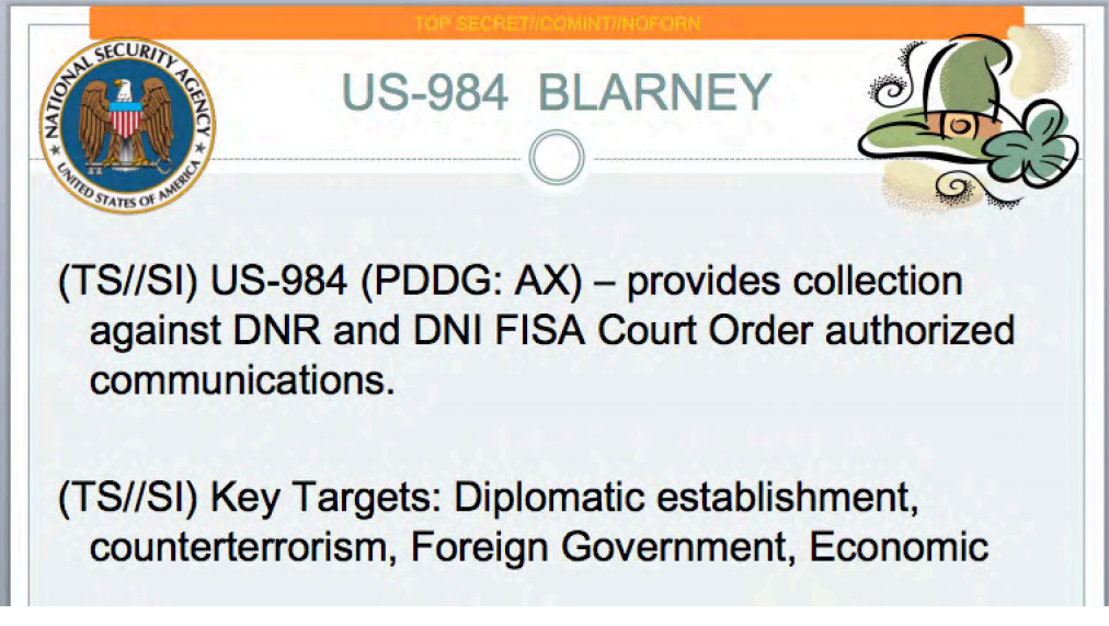 That hat!
Source By Vox


