Last updated on October 5th, 2021
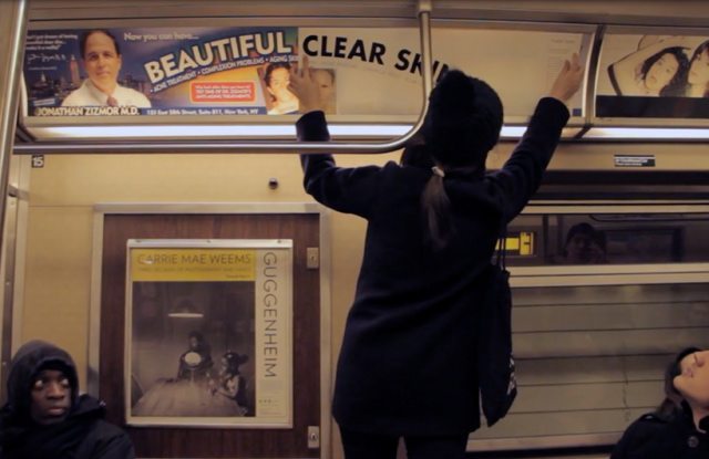
Regardless of what he looks like in real life now, Dr. Zizmor’s iconic ads are an integral part of the subway. Dr. Marvin Lagstein just doesn’t quite cut it, ya know? But one graphic design student at the School of Visual Arts had an aesthetic allergic reaction to the ads—and made the controversial decision to “redesign” them.
“New Yorkers are familiar with the iconic Doctor Zizmor’s Beautiful Clear Skin subway posters,” Hyo Hong wrote us. “As a designer, having to see this ad every day in my commute really bothered me. Therefore, I had to do something about it.” She said she’s “improved” 26 of his posters so far, and promised to do more, although we haven’t encountered any in real life recently.
It’d be one thing if Hong had decided to update the ads to make them align with reality—but her decision to use a bland white covering definitely does not improve on the Lisa Frank-esque perfection of that ‘clear skin’ rainbow.
So if you happen to run into Hong putting these up, it is every New Yorker’s solemn duty to direct her to a different ad, like say, those Lucas Venmo ads. Even he agrees his mustache could use some pruning.
Source By Gothamist