Last updated on November 17th, 2021
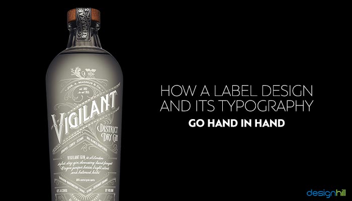
Think of the labels of some of the most iconic brands and how you feel about them. Coca-Cola, the big flowly free-spirited image pops up; Dove, a quaint and dainty feminine emotion rises while a solid Colgate will make your trust it enough to use the product internally!
These emotions and reactions are caused not just by the packaging of the products but also thanks to the design of the logos and the typography used on the label design.
It’s not enough to just let the logo do the talking; the rest of the typography also needs to synchronize with the logo to create an everlasting impression on your customer.
Typography is the style and art of arranging the type or lettering to make it readable and appealing in display. This is especially important on a label design because your customer is going to pick up the product and read what it is about, the features, the ingredients, and even the price!
Our packaging designers at Designhill vouch for the fact that typography is the most important element of a label design and that you just cannot create a beautiful and attractive label design without great typography.
In fact, typography is an exclusive art, and several label designers specialize in the art of typography.
Here’s why Label Design And Typography Go Hand In Hand
1.Focus On Text
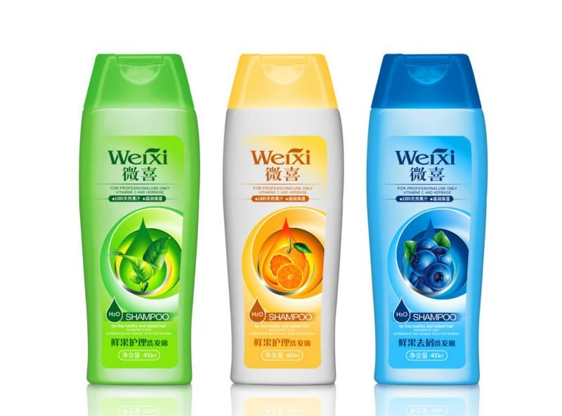
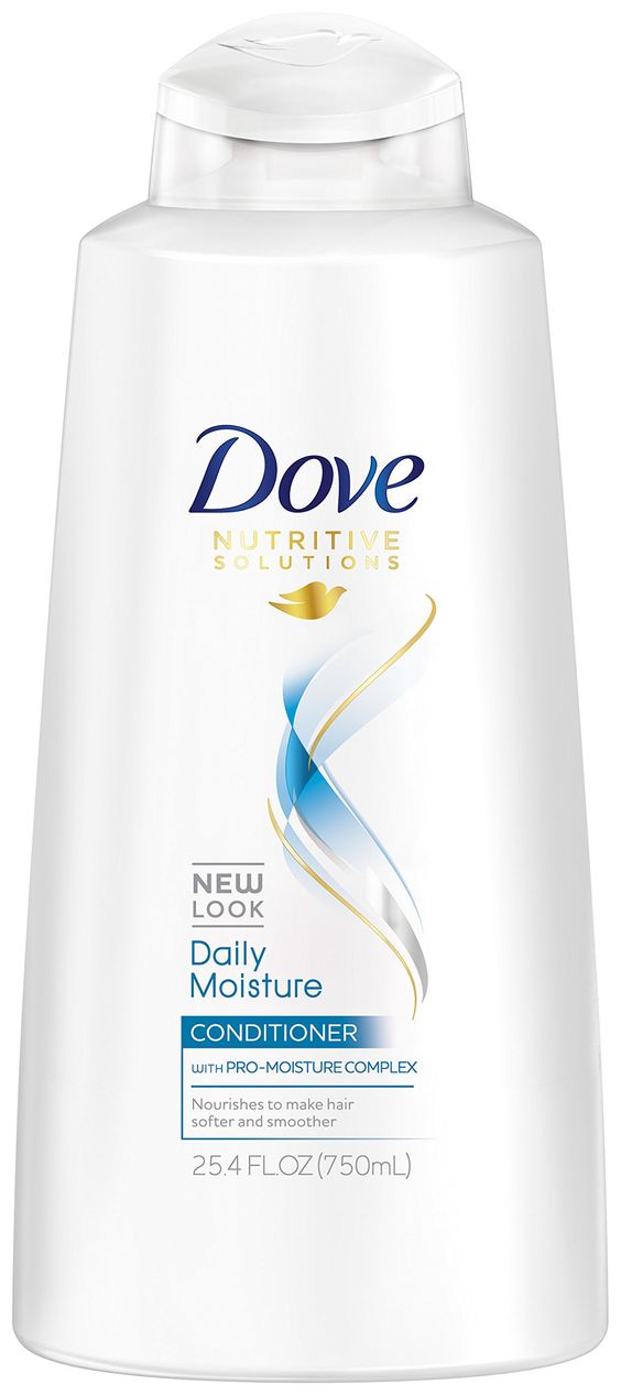
A label design is why your customer is going to pick up your product, but just the images are not going to serve the purpose. For instance, an image of a woman with lustrous hair was to serve the purpose then it should have been enough to place that on a shampoo bottle.
But one of the highest selling shampoo producers, Dove rarely uses images of either the ingredients or women on their labels. They are text oriented and focused on sending the message through their beautiful typography.
2.Font Size Fits The Product
This is one of the most crucial aspects that a lettering artist will pay attention to, how the font size fits the label of the product or what is suitable to the product. It depends on who is reading the product label and what is the attention you wish to garner.
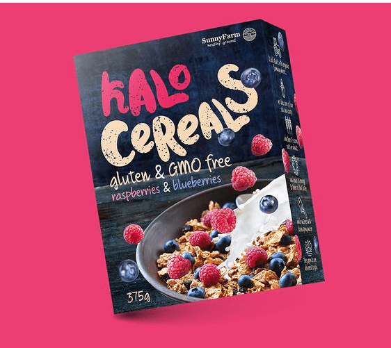
Compare a condom label which has smaller fonts as consumers are likely want to be discreet about their purchase and in contrast cereals!
If you are a cereal brand, you want your product to scream out of the aisle, especially catch the eye of kids at lower heights. Hence, the focus of font size is crucial to an effective label design.
3.Choose The Right Font
Our packaging design experts at Designhill say that the Font on the label design can make it or kill the brand altogether! The font is probably the essence of typography; it decides how and which way the design is heading and sets the tone.
It is important that your designer understands what the product is about and what it stands for. If you own an organic products company then you can’t probably use a funny looking font staring at your consumer, it takes away the strength and seriousness behind the brand.
At the same time, you can use elegant fonts for children’s products and your label designer needs to understand this. A lot of big companies hire typographers especially from Designhill to create unique fonts for themselves.
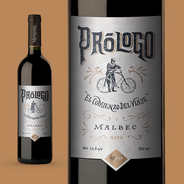
Read More Similar Post: 30 Eye-Catching Wine Label Designs For Inspiration
4.Don’t Use Too Many Fonts
A label design has several elements like the name of the product, the name of the variety if there are multiple varieties, the images associated with the varieties, ingredient and nutrition information as well as manufacturing details.
Now all these cannot be in the same font or size understandably, but great packaging designers will understand that good typography means to use limited fonts.
This will create a sense of uniformity in the label and not look haphazard. The typical design elements and rules also apply to label designs.
5.Coordinate The Colors With The Product
An element of typography involves the use of color in the lettering or type. When it comes to products they inherently have their own colors or colors that are usually associated with it, hence it becomes important to use the right colors for the lettering as well.
The easiest and safest way is to go with black or white colors as they blend in with the other colors on the label. However, for the main type, several designers use complementary colors to the theme and product.
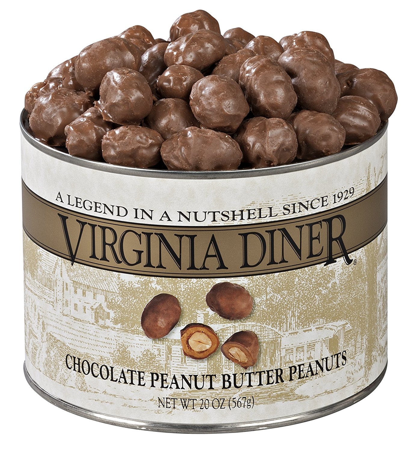
This can be seen vividly in chocolates, for example Reese’s Chocolates, the brown with the yellow lettering can instantly create images of yummy peanut butter encased in chocolate!
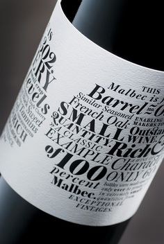
Read More Similar Post: Leonard Lude Gets Impressive Wine Bottle Label Design
6.Complement The Container
Today thanks to technology you can create containers or packaging that can border even on the bizarre!
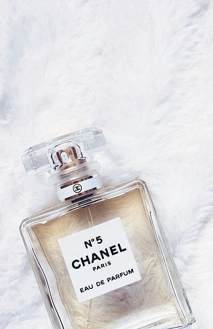
This means that your design label has to seamlessly fit the package and container as well as look appealing. One of the elements of making sure this happens is by using effective fonts; this can be seen the best in perfume bottles.
You often see perfume bottles in the most exotic shapes and designs, these are complemented with elegant fonts and types that enhance the feeling of the perfume. It becomes an experience instead of a just display of information.
If the same bottles were put up with Times Roman Font, then the impact is not going to be the same.
7.Connect To The Audience
Label design plays an important in connecting the product to your consumer and their lifestyle. Labels often define and decide where the product fits in, for instance, a consumer without even looking at the price decides from the look of the label if it fits their budget or not.
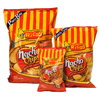
You cannot have a fun pack of nacho chips with an elegant font that is a design fail in itself! Decide on whom your customer is going to be and what he/she is looking for if its value then the labels have to be more bold and graphic, while generally luxury goods have a more refined type used.
Make sure that your label designer understands this well, usually graphic designers at Designhill are briefed and given information about the products to understand this well and create designs.
8.Texture Plays A Role
Label materials are no longer of just one sticky matte paper finish; manufacturers are going wild with the variety of label paper varieties. You need to pay attention to the kind of texture your labels are and ensure that the writing and type of the label is printed well on it.
Sometimes, a rough or grainy texture doesn’t bode well for exquisite font types while you can choose whatever you wish for when using a regular label paper finish.
The label texture also plays an important part of your product packaging, as it usually covers a considerable portion of the product itself.
9.Timelessness
Every designer dreams of creating the most perfect design that is eternal but packaging designers make peace with the fact that their designs are going to updated often based on the product updates.
However there are certain products which are manufactured for years together and continue to have the same ingredients, these products become legendary, and manufacturers don’t prefer to even change their design to retain customer attention.
You never know if your product is going to become one of these eternal products, so you need to ensure that your typography on the label is timeless and can be used years hence. It should not be something that the next generation thinks is ridiculous!
These were some of the reasons why packaging designers believe that label design and typography go hand in hand. Let us know what you think about them!