Last updated on November 13th, 2021
The term infographics (information through graphics) itself talks about its basic nature and usage.
Quite expectedly, infographic design appears to be the most obvious choice when it comes to explaining complex information or sequential data analysis in an easily understandable way.
In fact, a good infographic design has the capability of condensing otherwise complex information into an utterly simpler form.
However, designing an infographic that flows well on information parameters and understanding levels is not a cakewalk. A lot of information and efforts have to be pooled down at one place to make it easy for the viewers to deduce meaningful messages from an infographic.
In this blog, you will understand how to craft a really outstanding infographic design.
Be Laconic
Before initializing the design process, you should frame a proper road map of your infographic. This will help you achieve your objective easily and effectively.
Since you are about to address a specific subject, it becomes essential to introduce an interesting graphic for the subject in question in the first place.
When you are done, you can try including additional data or information facts to add weight age to your graphic. Brief and precise explanation of your chosen topic will help you paint a realistic picture through your infographic design.
The following inforgraphic of Argon Globe is a good example of how you should be concise when planning to spread information through an infographic.

Explore creativity
Do you know what distinguishes an infographic design from a normal chart or a graph? It is the originality of idea and the uniqueness of the design. And when these two are blended together in equal measures an outstanding infographic if created.
So, it always helps to carefully mull over the design of your infographic beforehand. Remember don’t lose track of the information you wish to incorporate.
Be imaginative; make judicious use of typography, icons, images, illustrations, colors, shapes and lines to craft a creatively inspiring infographic design.
Here, is an example of a creative infographic that makes righteous use of typography, icons, images, illustrations, colors, shapes and lines.

Focus on visual conception
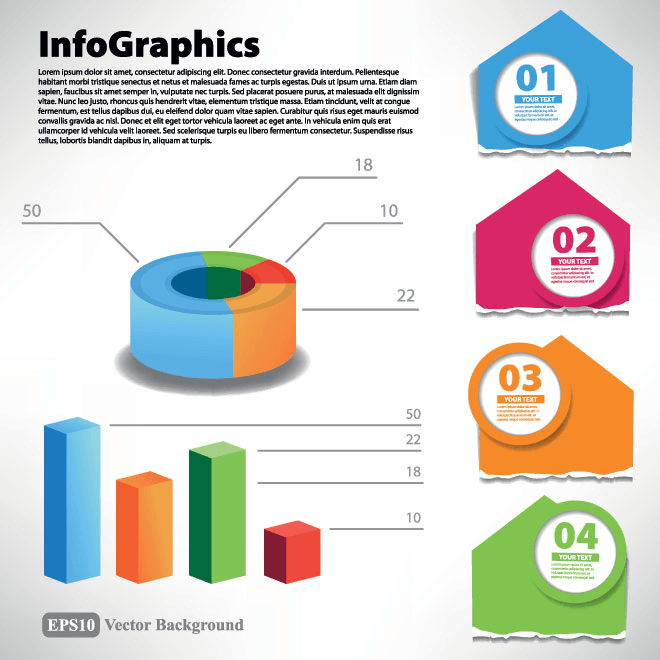
No one would like an infographic that is simply a textual representation of information; therefore use of geometrical shapes, diagrams, symbols, bars, pie charts and sometime 3D images is important.
Moreover, it helps people comprehend the ‘info’ portion of your inforgraphic image relatively easily. Thanks to the cutting-edge technology of today, you can now make your inforgraphic interesting and informative in equal measures.
Here’s an example of an infographic which is interestingly appealing and informative at the same time.

Systematized and contextually organized
Systematically and well-arranged information acts as a strong building block for crafting an amazing infographic. Therefore, it is smart to check and analyse the data you are going to use in your infographic.
Information should be objective and must hold relevance in context to your subject matter. If your design is elegant and classy but fails to deliver the correct information, then it won’t be accepted and liked by your readers.
Carry out an in-depth research; visit websites, study books, magazines, newspapers, consult experts, but ensure that the info element of your inforgraphic design is accurate and to-the-point.
Here’s an example of an infographic that has been designed after a careful analysis of the data.