Last updated on March 25th, 2021
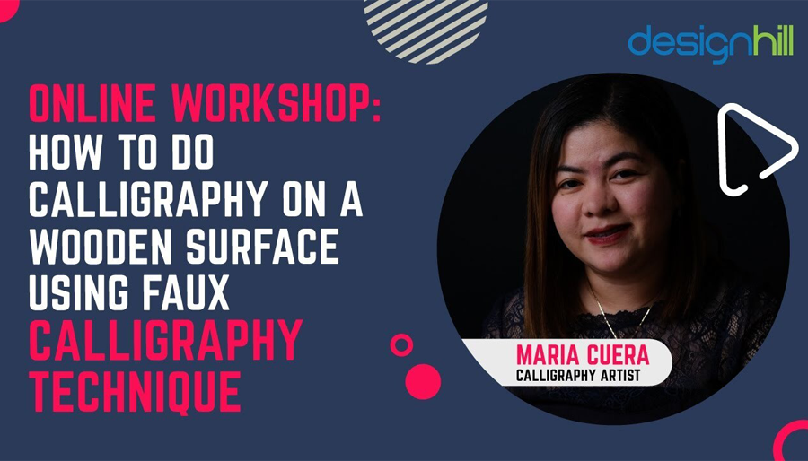
Calligraphy is one of the most cherished forms of the art of letter writing, which many ancient cultures have been following. Today, faux calligraphy is being practiced in a variety of ways. While doing calligraphy on paper is common, practicing this art on a wooden surface is popular. In this webinar transcript, Faux calligraphy expert Maria Cuera shows how to create letters on a wood surface. Have a look!
Calligraphy is the art of writing letters by creating a contrast between thin and thick strokes. A general rule is that when writing upward the line will be thin while bringing the pen or brush downward, it should create a thick stroke. So, every stroke should follow this basic rule.
But, faux calligraphy breaks this rule a little. When it comes to creating a thick downstroke, under this calligraphy, the downstrokes will be just on the same side across all the letters of a word in the entire text. This means that the thin strokes also will be on the same side of the letters everywhere. In this way, faux calligraphy looks distinctive and stands out from other lettering forms.
Creating the letters in an artistic way on a wooden surface gives the letter different and attractive looks. People use lettering on wood in many ways such as using it as a nameplate or simply writing an inspirational quote.
Designhill, the leading creative marketplace, invited faux calligraphy artist and expert Maria Cuera to do a workshop for the letter-writing artists on 13th November 2020.
During the workshop, Maria shared her knowledge and technique of letter formation and how to do calligraphy on a wood surface.
About Maria Cuera
Maria Cuera is a self-taught calligraphy artist, living in Qatar. She learned it all by herself, watching calligraphy videos and kept on practicing the art. She has made friends through this art and inspired many to take up calligraphy as a hobby.
Here Is The Video Of The Workshop With Maria Curea

Here Is How To Use Faux Calligraphy On A Wood Surface
Maria Curea: I am going to teach you a very simple technique for calligraphy. You may see a lot of beautiful handwriting over the internet or elsewhere. And probably they also like to achieve that kind of penmanship or that beautiful handwriting.
The Art of Writing Letters
Let me just start by defining what calligraphy is. Calligraphy is the art of writing letters, and it is solely based on your penmanship. So, with calligraphy, you are not going to try to change the way you write or you are not going to copy somebody else’s penmanship. You are practically writing based on your own style, or how you naturally write,
But to make it beautiful and artistic, you just have to define your thin and thick strokes to make it more appealing than the usual. To do that, there are certain tools that you have to use. I started learning using a brush pen.
Modern Calligraphy is Flexible
My style has always been modern calligraphy, which is just very natural. There is another calligraphy that is traditional, like copperplate, or Spencerian, where you really have to copy how they write the alphabet, from A to Z. So there are certain styles that you really have to follow.
Whereas with modern calligraphy, it’s very flexible, stylish, and. straightforward. I started learning calligraphy using the tool called brush pen. But not a lot of people know how to use a brush pen.
Know How To Control Your Strokes
You have to be very consistent. This is because if you’re learning calligraphy, it is important that you have to build your muscle memory. You must know how to control your strokes, and brush your pen. It is going to be difficult for most of the beginners or those who really don’t have any experience at all.
Let me just show you what a brush pen looks like. A brush pen just looks like a normal marker. But its tip is felt or it’s like a brush that’s why it’s called a brush pen. So, to use this you really have to know how to control your strokes. It’s going to be quite difficult.
For today’s workshop, I am going to teach you a technique called faux calligraphy. Just a quick background of what faux means. It is a French word that means artificial or fake. Okay, so that’s what we are going to tackle today and at the end of this workshop, we will have a simple project. The project will be about writing on a wooded surface using the technique called faux calligraphy.
Pros and Cons of Using A Brush Pen
Let me just explain to you the pros and cons of using a brush pen. The advantage of using a brush pen is that it can give you both the thick and thin strokes. That is the very basic principle of calligraphy. As I said, it’s the art of writing letters, but you have to define your strokes.
So, the basic principle that you have to remember is that whenever your stroke is slowing down, it should be thick. And if your stroke is going up, it should be thin. That is why I said, it’s important that you have to build your muscle memory to control your strokes. If you’re using a brush pen, it is easy to achieve a thin and thick stroke.
But, this brush pen is not ideal to be used on a wooden surface. This is because number one, your wood is not smooth. So it means that it will damage your brush. And the ink doesn’t sit well on a wooden surface. So it’s not going to work.
Use A Permanent Marker
If you are going to write something on a wooden surface, you have to use a permanent marker or any marker that has this tip, which is the usual one. You can get this everywhere. This is a permanent marker, it doesn’t have a brush tip. So you can see the difference right, this one has a brush tip and this one has to find it.
If you use this marker, then it is beneficial as all your strokes are borderline, it cannot give you a fixed stroke. It’s all uniform. No matter how hard you press it, it only gives you the same size of the stroke.
You should know how this will work. We have already said that the principle is that all the strokes going down and all the strokes will be up with it. So even if I press it hard and if I press it very lightly it will give me the same stroke. That is where full calligraphy comes in.
So, today I just have all these materials with me and I believe you can also get this from your house or wherever you are. These are very basic materials that we’re going to use. Of course, we need a piece of paper. I need you to use a pencil or a pen, whatever you feel comfortable with. So I am going to show you how to do faux calligraphy.
Recommended Reading:
8 Basic Strokes
First, let’s start with the basic strokes. Maybe I can see some people who have been my students here in the arts from the workshops that I did. And I’m sure that they already know what the eight basic strokes are. But for the benefit of those who are just joining us now, and for those who haven’t tried calligraphy before, there are eight basic strokes in calligraphy.
01. Entrance Stroke
The first stroke is called the entrance stroke. It is a very thin stroke. But, how do you achieve a thin stroke? It means that you just have to start moving your pen or your pencil from down going up.
02. Downstroke
The next stroke is called downstroke, which is a very thick stroke that starts from up and goes down. How can you achieve a thick stroke using a brush pen? You have to put a little pressure on the pen. So, just start from up going down with a little pressure on the pen.
If you are using a normal pencil or a normal pen, a thin upstroke is easy, because naturally, it will give us a thin stroke.
But how about if it’s a thick stroke? Even if we press very hard, as I said earlier, it will only give us the same line. How do you achieve a thick stroke? It is very simple. You create two lines and then you shade them. So, you shape it. So now you have a thick stroke.
03. Oval Stroke
The next show is called an oval stroke. It is very self-explanatory and is a circle. So, you start from up, go down, and then go up again. But, as I said earlier, all the strokes are going down to get thick. We started at the top and then we went down. It means this is our thick stroke. How do we achieve a thick stroke? We create another line and we shade very thinly. So this is thin, and this is going up so there is no need to shade it.
04. U Shaped Stroke
Now, we have our under turn or the U shaped show. Okay, again, there is a stroke going down. So we started from here, so we should create another line and start shading. This side doesn’t need to be shaded because it’s going up so it should be a thing.
05. Over Turn Stroke
Okay, next we have an upside-down U shape stroke. We started from the bottom and then we went up and then went down. So this is the part where it should be shaded. We create another line closer and then we shade.
06. Compound Curve Stroke
Then we have what we call a compound curve stroke. It is a combination of the under turn and overturning strokes. Start from the bottom you go up. This doesn’t need to be shaded but this part is going down. So this is the part where you should shade.
07. Ascending Stem
The next stroke is an ascending stem. You start from around the mid and go up, and go way down again. So this is the part where the stroke went down. We have to create another line and start to shape an ascending stem.
08. Descending Stem-Loop
Then last but not least, is the stroke called descending stem-loop. We start from the top, then go down, and then go up again to form a letter j like shape. This is the part where the stroke was going down. So, we create another line and start pushing.
You can see that these strokes are easy to create. But you may be wondering what all these strokes are for. These strokes are your building blocks and foundation for calligraphy. This is because these are the parts of every letter in the alphabet.
For example, the strokes you use for the letter O, but you also use the strokes for the letter a, b, and d. Then, you use the under turn stroke, you see in the letter u, y, and w.
Then the compound curve, you see this in the letter h. You use the ascending stem-loop when you are writing letters b, d, f, h, and k. The descending stem stroke can be used in letter j and y. So these are the very important things that you have to remember when you’re learning calligraphy.
It Takes Time
A disadvantage of using a normal pen, or a normal marker, if you’re doing calligraphy is that it takes time to create letters. This is because you will do all this shading. But it is easier, especially if you still don’t know how to draw your strokes.
Designhill: How can you understand where we use thick stroke, and where we use thin stroke?
Maria Cuera: Okay, for example, let me just write a letter, for example, letter eight. How do we normally write that a, we have been taught how to write since I don’t know, since maybe we are first-graders or even in the nursery or something? We have been taught how to write our alphabet sprites.
For example, I’m going to write a letter lowercase. So, you start with a circle. And with this, right, we all believe that this is how we write lowercase a. I mean, basically the English alphabet, this is how we write a. When we did the circle when we started writing, we knew that we started from up and we went down, we went down and then we closed the circle.
So, it is very important to remember all the strokes. When you are writing all the strokes that are going down into thick and all the strokes that are going up in thin.
Recommended Reading:
Designhill: What kind of brush pen you can recommend for beginners?
Maria Cuera: When I was starting, I used a brush pen from a famous brand called Tombow. I think it’s from Japan. So, this is a brand combo, although this is the one tip you have a brush there, and you have a fine tip. If, ideally, you should use the brush deck. But if you use this, you really have to practice consistently to be able to build your muscle memory. That is the way to control your strokes to create a thick and thin stroke. It means that you have to know when to put the pressure on your pen head and when to release the pressure. It is a good brand and it has over 100 different colors. So this is what I would need to come in.
However, since it’s a big step, your numbers or your strokes are also bigger. And it is not ideal. If you have very limited space, for example, you’re going to write a greeting card or a small note or on a very small piece of paper. This is not a very ideal use. But Tombow also has a smaller tablet.
But you can look at our combo for the new brush pen. It’s about this size. But this is another brand that I would recommend as a beginner, it’s called the Pantone few touch. It is also a brush pen, it looks like this. It gives you the same effect it gives you a thick stroke. So when you press it will give you a thick stroke. And if you start writing in a very light direction, or you don’t put pressure on your end it will give you a thin stroke. These are the best brands that I can recommend combo and until you touch.
These are also brands and pollinators are also one of my favorites. But if you’re just a beginner, I don’t really recommend you to keep on buying a lot of pens. Maybe you can just buy one large and small dip. That said, just keep on practicing before you keep on buying.
Now, let’s try to make our alphabet formations or the letters A to Z. I’m going to show you both the uppercase and the lowercase. And if you have your materials with you right now, I would suggest that you do it with me, so that we are on the same page.
Letter A
Let’s talk about the letter A. So let’s start with the uppercase. Basically, this is how you should write your letter at uppercase. Let’s just go for a very simple one, the very basic one. First, you will start from the bottom and then go up. This is called the entrance stroke. You remember the entrance stroke that we discussed earlier. It is a thin stroke from the bottom going up, and then going down. And then this part is on the line or the cross line. So this is how we write our letter A. So now let’s just go through the strokes one by one.
We start from the bottom and go up, which is an upstroke. It means that it should be thin and this is already a bit thin. We don’t need to do anything and keep it that way. But this stroke started from the top, and then we slowly went down. So this is called a downstroke. So we remember that we said or we discussed earlier that all the strokes going down should be thick. So right now it’s not thick and what do we do to make it thick is to draw another line going down.
And then we do a horizontal line, or across the line. We don’t need to change anything with this, because as we said, all the strokes are going up to be thick, this is already thin. So we don’t need to change it, we don’t need to do anything. But, this stroke started from the top going down. It means that it should be thick. Now, to achieve a thick stroke, we create another line and start to shade. That is a very basic and simple way of doing faux calligraphy or doing a letter A. Use the crossbar or the horizontal line, we keep it safe, we don’t need to do anything. That is a very simple letter A.
Now let’s try to make it more artistic. So just follow along, I’m going to do a few curves. Again, I will start from the bottom, go up, and then another nine from the top going down. But this time, I’m going to do a little bit of a curve over here. And then the party’s on the knife or the crossbar. Again, we started from the bottom, we went up, so this is an upstroke. It should be a thing, we don’t need to do anything about it, just keep it that way. But this drop is going down. We started at the top and went down. Now we create another line. And we say Alright, so now it’s looking more beautiful.
Letter a
Let’s now create a lowercase or a small letter. We have discussed, I did an example earlier, on how to write a small letter a or lowercase letter at the side with an oval or a circle. Now, we do a downstroke. This part was going down from here, we created another line and machine. And this line also went down from the top going down, so it means it should be thick. So, we create another line. And we shade. It is easy and basic.
Now let’s try to make it more artistic with a cursive letter a. So again, we start with a small circle. Instead of making a straight line, it’s trying to do a little curve over here. We do the same, this part is going down. So, we make another line. This one is also going down. We make another then you see if you want before you shave, I’m trying to analyze it first. Okay, think about where you made a downstroke in this part, make another nine first before shading all of them so that maybe it’s a lot easier for you to figure out first which is true or downstroke before you proceed.
Letter B
Now let’s try creating letter B. We go down with a thin line and then we make two small circles or half circles. Then we start shading or we start making two lines for all the strokes. Going up to our semicircle. We started going up, and then this part is going down. So we make another line. Same on the lower portion, these are all going down, so, we make a line here. Now we start to shape.
So this is a very simple method B. Now let’s try to be a little more creative with identity. Instead of closing the lower part, let’s try to make this part a little curl over here won’t hurt. It is very easy. Again, we start to two lines or another line for all the strokes that are going down. So this part, as well as going down, this was going down to swim. And this part, this curvy thing, or this skirt over here that we did, they’re going up, so we don’t need to do anything, we don’t need to touch. So now we start pushing.
Letter b
Now let’s start with the lowercase b. We start at the top and go down. Then we start drawing a semicircle. So we know that we started from the top we go down, so this should have another line going down. We create another line and we shade.
This is a very simple, lowercase b. Let’s try to be more creative. Let’s try to make it look more persuasive. So we start by doing the stroke that we discussed earlier, the ascending stem. We start from here, go up, and then go down. And from here, let’s make a semicircle. But let us do a little bit of curl. That’s not the close entirety.
And then we analyze all the strokes that we made, this is going down. Remember, we started from here. We went up, and then slowly we went down. This should take so there should be another nine. And in our semicircle from here, we went up, but we went down. So this should have another nine. And we start to shade.
Know that if we own a normal pen, or a normal marker, where it has a fine tip as I said, it can only give us a single stroke, it’s all a thing, it cannot automatically give us a fixture. So, it means that we have all this shaping, it’s time-consuming. Whereas if we use a brush pen, and if we already know how to control our strokes, it can easily give us both the pen and fixture. It requires patience.
Letter G
Now, we do a simple letter G, which is like the letter C. Then you do this, right. But this is like the whole course starting with the whole letter. It is like, half over. So, we started from here, and then we went up, then we slowly went down, which is the part where it should be thick. And then here, it’s already going up.
We don’t need to do anything. The crossbar, as I said, should be thin. You don’t have to do anything. Basically, this is just the part where you have to shoot because this is the stroke going down and that is it.
So now let’s do the lower case which goes like this. Overall, small, okay. Again, this is the part where we went down so they should be shaded. And then we go down. We make lethargy, remember the basic stroke, which we discussed earlier and we started from the top and then we slowly went down. So, we create another line here and we shade to complete the letter.
Now let’s try to be more creative. Let’s try to do a cursive letter g. For me, this is in calligraphy. So a small circle or half oval, and then like a better shade. So, I started here and then I went down over this part. This one also is a stroke going down so I make another line and I shade. It’s the same version four and a small or G. So semi-circle or small oval then this and that part is shaded.
Letter J
To write the letter j, we start from top to go down, and we shade this. The small letter j is simple to create. So this is the part we create the line and shade everything. But for cursive, this is how I write my letter j, we start from the bottom and we go up and lift them up. You don’t have to do all your strokes in one go, you can always stop and lift your pen. So from where I left off, this could be you with a downstroke. And then I go up.
So this part is going up. You don’t need to make it thick, because naturally, it should be there. But this file, this part should be thick, so we create a line initially, you can also try to make this a little closer, then for a small letter j, simply like this. I’m going down. So, in this part, we started from the top going down to complete the letter.
Letter S
Simple letter S or block letter S like this shape. To create the letter S, we start up and then, going down. From here, this is where we start to be in another line, then also here is going down and you’re slowly going up. So this is only the part where you have to create another line. And then you shade.
Small letter s
So you do the same fun small letter S. Now let’s do a cursive letter S, just like this. People have different styles. I guess they are not wrong. There’s no right or wrong. Whatever you find comfortable with you follow that but just remember to incorporate the thing in the fixed stroke principle. For me, this is how I made the press in cursive. So, I start from the bottom, go up. And then I cross it over here, and then it goes up.
Okay, so this is the pipe right side that is going up. It should be thin. I don’t need to change anything. But from here, this is the part where I started going down. So I paid another line and there is no rule on how thick you should go. It is really up to you. If you really want it to face thick. By all means, you can do that. This is the part where I went down and shade it.
Letter X
Letter x is very simple to create. You start with here the first line is like a slash, from the top going down. It is a downstroke that we started from top-down. So you create another line inside of it and you should shade. Now, the second line should start from the bottom, going up. This is your thin stroke.
Small letter x
So it’s the same for that small letter x. So again, you shade the downward thick stroke line. Now, let’s try to be more creative to do cursive letter X. So, let’s try to do a little curl. Draw a curved line starting from up to downward and finish it with a right side curve and then draw a thin slash-like line starting from down to up. Then to draw a small curvy letter x, repeat the same procedure.
Letter T
The letter T is very easy to create. Block letter T is a stroke going down, and it has a crossbar or horizontal line. So, the line down is the only part where you have to shade because this is the only stroke that is going down. But yeah, put your crossbar on the line in the middle.
Now let’s try to make a cursive or more artistic small letter t. I just tried to make a little curl over the top side at the juncture. Then, draw a downstroke. You don’t have to make another line while curving up from the bottom because this part is already going up. So, it shouldn’t be thin. You only do your shading on the parts where it’s going down.
Writing It On Wood
We know basically how calligraphy works. Now, know how to use that technique when we’re writing on a wooden surface. I bought this wooden slice from a local art shop here in Qatar. You can have it from wherever you are. But it’s important that you use a topcoat. But these are gonna be smaller than out your wood. So now let’s try to write a word hello and make it more simple.
I am using a normal marker, but you can definitely use any other marker. Let us start writing the letter h, the first letter in the word hello. So like I said, all the strokes that are going down should be thick and the strokes going up should be thin.
So, when using a permanent marker, I would suggest that you use a pencil first, but it is not going to be very visible on your board. So maybe you can use chalk or whatever material that you have that can easily see as a guide. But for now, let’s just assume that we have something here and just basically showing you how to do it.
For the letter H, draw the lines of the same thickness and strokes. So again, to achieve our thick strokes, we create a line and then we shade it. Then, let’s write a letter e, but do not try to make it too far from our first letter. So. to create e, first go down in an oval shape and make it thick.
Now, how can we write our small letter l? I would like to make it look like they are cursive or they are connected to each other. And to do that, I would start by connecting my small letter l from where I stopped ending the previous letter e. This is the part of the letter e raised up so this is also becoming the part.
The lines of the downstroke of the small letters l will be shaded. And then again, I want to connect my letter o from the last letter curvy l, that I wrote. So I make sure that they’re close to each other. That is how you do calligraphy on wood.
Designhill: Are you using a permanent ink marker now on the wood, and what other writing material work great with wood?
Maria Cuera: I am using a permanent marker, it is called a paint marker. which is oil-based. It’s not like a normal, permanent marker, which is water-based. But these markers can work with wood as well, like a sharpie. If you have a sharpie that can work well with bit wood. But I would recommend using the oil-based marker.
Designhill: Do we need to climb the wood and then coat as well?
Maria Cuera: I suggest that you do a topcoat. For me, I use a mod podge. If you are familiar with mod podge, it’s like a colorless top code. and comes with a matte or glossy finish. The reason why I would recommend you to do that in case you use a permanent marker on a word, sometimes the ink would bleed. So, I think the wood is absorbing it so much that it looks like the inks are scattered over or they are like smudges.
So, we hope that you learned the new techniques of writing letters beautifully on a piece of wood. If you can master this craft, there are plenty of opportunities there in the art market to explore. You can make a good living out of your career.
You can sell your calligraphy artwork from your online store as well. Just start your online store at PrintShop by Designhill to earn from selling your art.
At this platform, you can sell your art and set your prices to earn a profit. This is a print-on-demand site that takes care of all your sales issues and sends your artwork to your customers.
Wrapping Up
Writing letters in a beautiful way on wood is a little different from doing calligraphy on other material surfaces. You have to care about using the marker and ink. but the calligraphic principles of upstroke and downstroke, etc. must also be learned first.