Last updated on January 31st, 2023
Firefox is one of the best web browsers around the world, and is in existence for quite a long time. These days, it is getting a lot of web presence not just because of its features, but for its creator — Mozilla — which has started revamping the traditional Firefox logo.
A logo always leaves a great impact on the business. Sometimes it gets right at first time, but more often it requires changes. Usually, companies stick to their old logo, but many of them undergo changes. Changing a logo can be very risky for any business.
People get irritated when they can’t find what they are looking for. But things changes with time. In order to match the interest and changing needs of a consumer, companies redesign their logo so that they can stay ahead in the industry.
Firefox Logo Getting A New Look
Most of the companies don’t go for open discussion about selecting a new logo. But Firefox has opted for this approach before launching its new logo design. The company has asked the users to give feedback on the shared designs that can help them in revising and refining a new brand identity.
We all are aware of its fast fox flaming tail logo. Recently, Mozilla’s Firefox creative director Tim Murray released an article in which he stated that company is evolving the Firefox brand. He stated that the reason for changing the logo is not just to create a new icon but to design an icon that can fit the brand’s new ventures — from mobile and VR browsers, to screenshot and file sharing tools.
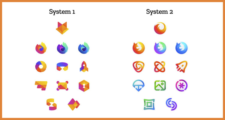
In order to represent the entire new product family, Mozilla has shared two design system approaches. Both the designs start with a masterbrand icon, followed by a line of singularly-focused browser icons, icons for applications within the browser such as Firefox Focus and Firefox Reality, and finally five icons for new services at the end. Both the designs support the fox in their unique way.
Looking For a Logo Design?
We have helped thousands of business owners from all around the world with their graphic design needs such as a logo design, website design, social media posts, banner and much more.
Get Your Logo DesignGet a Free Quote
System 1:
The first icon has a geometric fox head in orange, red and pink color that doesn’t present fire, like its old logo does. All other secondary icons in the logo are also in a geometrical form.

System 2:
The second one keeps the iconic look and represents the brand in a more modern way. Other icons in the image are in an abstract form.
![]()
On look at these designs, it is clear that designers have gone for flatter design which is gaining popularity these days. It is a serif typeface that designers mostly use to create applications.
Recommended Reading:
Mozilla Has Given Few Points Which Need To Be Considered While Making A Choice:
- Do these two systems still feel like Firefox?
- Are they visually connected and supporting each other?
- Can these design logic help in embracing new products in the future?
- Do these systems support the speed, security, accuracy and innovation that Firefox stands for?
Firefox is famous for its logo. But after several years of its iconic logo, the company is considering to create a logo. It is still working on more options. Each logo will undergo several rounds of improvement.
It’s been not even more than a year when the company opted to rebrand and introduced a new icon alongside the Firefox Quantum. It is worth mentioning that the company had followed the same process of graphic design services when it wanted to redesign the icons a couple of years ago.
Whatever will be the final decision, we just want Mozilla to stay foxy and hope it will set fire with its new logo.
We, at Designhill, love the second icon more than the first one as it represents the brand in more modern look. What do you think of the new logo?

