Last updated on December 4th, 2019
While logo designers use varied techniques to create logos that mesmerize the viewers, use of negative space gives the logos extra edge, attraction and sophistication. Even the designers of iconic status such as Lindon Leader took resort in the technique of negative space to design a globally renowned logo of Federal Express, which we will discuss in this article later. There are in fact many more logos created by the use of this technique to send a business message to the targeted audience and people at large.
What Is?
Negative space in a design is the one that the designer leaves vacant without creating anything in it. But the space itself creates an object related to the topic of the logo or any other design. This space may be inside the main design or outside of it. Called also as white space, the designers use negative space to create an illusion of some figure without creating the figure directly.
Since the designer does not create anything directly on the negative space, the figure emerges with the help of other surrounding objects in the design. It is with the help of these designed objects that we see a figure taking shape. This is the reason that the object in white space is seen little late after we see a design for the first time.
And, this is the beauty of the use of white space that the viewer is thrilled to discover something hidden within the design. Then, the viewer realizes that the hidden figure is actually carrying some message for the viewers. So, there is an element of surprise for the viewers in the design.
Here Are Some Examples Of Awesome Logo Design Created With The Help Of Negative Space
01. Guild Of Food Writers Logo – Stylish Use Of White Space
Known as one of the few classic logos, the Guild of Food Writers logo uses negative space in a stylish and tasteful way. The nib of a pen represents the writers while the spoon created in the space stands for food. So, the logo represents the business of food writing. The beauty and aesthetics of the logo is the spoon created in the white space while designing the pen nib. The designer 300 Million basically creates the pen nib but in such way that a spoon emerges up in the middle of the nib. Thus, the logo combines the two professions of writing on foods with the help of negative space.
![]()
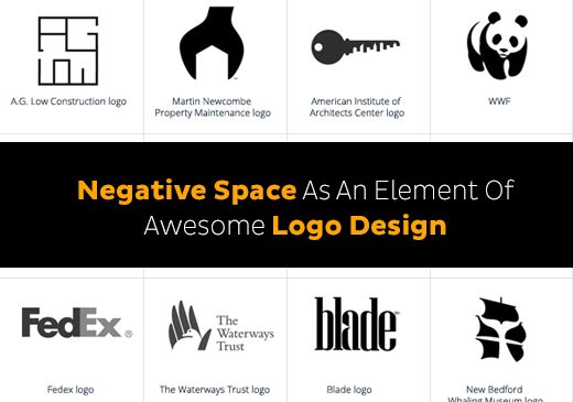
02. Fedex Logo – Use Of White Space For Brand Positioning
FedEx logo has attained iconic status in the world of logo design for its creative use of negative space to send a message. The globally recognized logo designer Lindon Leader uses the white space between the letters E and X in such way that an arrow forms in between the letters. The arrow suggests that the courier company moves forward and is progressive in its technique and services. The arrow thus is used by the designer for FedEx brand positioning in the global courier market. At the first glance, the arrow is not visible but when you locate it, you always see it in the logo and get the message of the company’s business.
![]()
Looking For a Logo Design?
We have helped thousands of business owners from all around the world with their graphic design needs such as a logo design, website design, social media posts, banner design and much more.
Get Your Logo DesignGet a Free Quote
03. Yoga Australia Logo – Use Of White Space To Promote Values Of Yoga
Yoga Australia logo is also known for its classic use of white space to send its message to the yoga lovers. The logo’s main design is in the shape of a young girl in a yoga asana. This asana inspires you to take up yoga as your healthy way of life.
![]()
While the asana or yoga pose itself is a message of leading a healthy life, the designer has cleverly created a rough map of Australia also by using the white space within the figure. So, the space creates a hidden symbol which makes this yoga logo an iconic one for the viewers.
![]()
04. Pittersbug Zoo Logo – Negative Space To Depict Wild Life
Pittersbug Zoo & PPG Aquarium logo shows wild life beautifully though wise use of white space element. The logo design is of a big tree and two birds flying over it. This creates an environment of the life in the wilderness. But there is a vacant space on left and right side of the tree. When seen for a little more time, there emerge two animal figures of a tiger and a gorilla.
![]()
There is no end to such logos that are known for their judicious use of negative space. Check out a few of them!
So, if these beautiful logos have inspired you to get one such aesthetical logo for your business, simply launch a design hunt contest at Designhill, one of the world’s most reliable crowdsourcing market places for custom designs, and let thousands of expert designers from across the globe create some awesome logo designs using the negative space technique for you.
For more idea about logo design you can also check the logo ideas.