Last updated on June 29th, 2020
Global companies market their products or services in a strategic way. But a common feature of all such enterprises is that their logos are unique and memorable. In fact, many such logos have become part of cultures. Hewlett-Packard logo was redesigned to give it a memorable and minimalistic look.
Most of the global companies have redesigned their logos. They do this to make their brands consumer-friendly and in sync with the changing times. Such companies understand that they need to rebrand their business in order to sell products to the new set of audience. It is extremely important that a redesigned logo is as effective for a company as the old logo was.
For example, Pepsi logo was redesigned many times to be in line with the new desires of the next generation of consumers. Sometimes, companies want to redesign a logo to make it more acceptable. Many other companies make it a point that they recreate their logos from time to time.
They want to create a simple logo either by hiring a professional designer or by using a logo maker tool that can catch the attention immediately when people are busy with their lives. Hewlett-Packard logo is amongst such business symbols that was redesigned by the company keeping the new customers in mind.
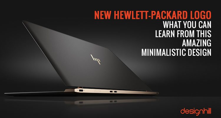
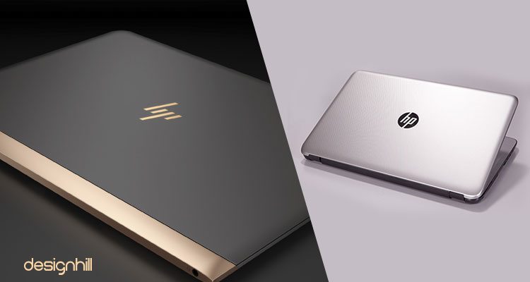
When HP [Hewlett-Packard] launched world’s thinnest laptop model Spectre 13 this year, it got quick attention for two major reasons. First for it being only 10.4 mm thick and second for its new sleek logo. However, while customers were expecting the company to come out with something extraordinary on technology department with the new line of laptops, they had no idea that the company created a new logo for the laptop model.
Redesigning an old logo is risky in most cases. People generally feel emotionally attached to old logos and symbols. However, the gamble paid off for the Hewlett-Packard. People soon started liking the logo and talked about the stunning impact the recreated Spectre logo made on them.


Invite your friends and families to learn more about our industry-leading graphic design marketplace.
When you join our referral program, you’ll be given a unique link to start sharing right away. You’ll earn 10% of your referrals total packages amount in cash whenever they complete their first contest through your link. Plus, your friends will also get a free $100 Super Upgrade!
But this is not the only company which took risk of redesigning an old logo. In fact, almost every global business from Instagram to Microsoft, all recreated their logos at some point of time.
There may be many reasons behind getting rid of an old design. But main reason is that the times change. With the time, the customers’ habits also change. Their preference for designs also do not remain the same as it was a decade ago.
Moreover, a company itself has evolved a lot over the year. So, if a company has added more products or services, it would like to reflect the development in its logo. If you compare famous logos, before and after, you will surely be impressed with the redesigned logo. This is because a lot of thinking, planning and research goes in giving an old logo a new look, keeping its originality intact.
The company redesigned its conventional logo especially for the new Spectre laptop model with a purpose. It wished to project a new brand image in target market. Also, since the new laptop was marketed as world’s thinnest laptop, the company thought it fit to launch the device with a sleek looking new logo.
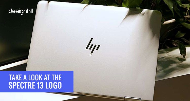
Take A Look At The Spectre 13 Logo
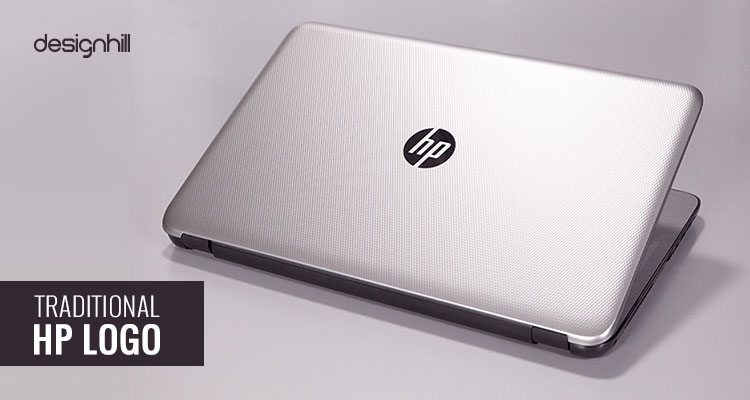
Here Is The Traditional HP logo
A deeper look at the new logo reveals that it is in fact a strategically tweaked design of the company’s traditional logo. Let’s discuss the logo in detail:
Looking For a Logo Design?
We have helped thousands of business owners from all around the world with their graphic design needs such as a logo design, website design, social media posts, banner design and much more.
Get Your Logo DesignGet a Free Quote
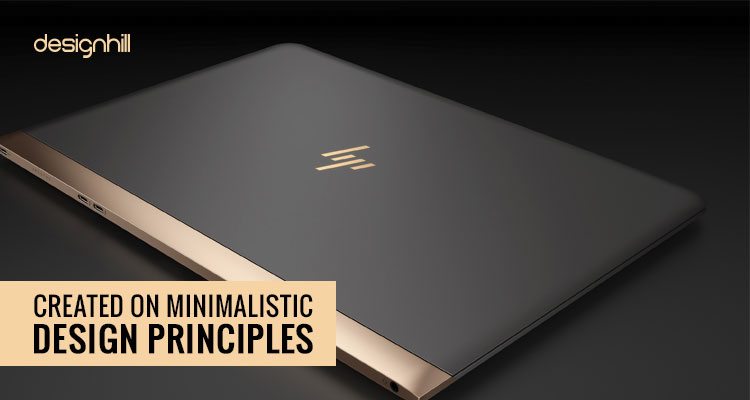
Created On Minimalistic Design Principles
As you can notice, the new Spectre 13 logo is a minimalistic design. Minimalistic graphic design is the latest fad amongst graphic designers. This design trend implies that bare minimum design elements that should be retained in a design to convey a message. Therefore, all extra colors, lines, symbols, images, shapes, etc. should be ruthlessly removed from a logo design to give it a simple but sophisticated look.
Minimalistic design is a new fad in the graphic design world. This design trend continues to be favorite of the designer. This is because graphic designers want to create as simple designs as they can. They understand that designs must be conveying a message instantly to the target customers. This they can do by creating simple but eye-catching designs.
In making a design minimalistic, a graphic designer gradually eliminates all the unnecessary elements. Only those elements of colors and typefaces etc are allowed that are enough to convey a brand message.
![]()
In the new Hewlett-Packard logo, the old style of letters h and p has been redesigned under minimalistic principles. Now these letters are in the shape of simple broad lines, giving the impression of h and p letters. So, since the new style of letters is conveying the message, the designer removed the old letters.
HP’s Spectre 13 logo also adheres to these minimalistic design principles. The new logo has four simple strips that, instead of spelling out company name, give a hint of the name. The letters h and p of old logo are non-existent in the Spectre 13 logo. In the new logo, old letters have been transformed into individual four strips of varied lengths. This logo is an excellent example of how you can improve typography in your designs.
Recommended Reading:
The four strips spell out company name and message without putting doubts in viewers’ mind. People are already familiar with old HP logotype that had company name in sans-serif typeface.
Memory of the old logo helps them to equate the new four symbolic strips with the company name. They can quickly recall the brand name by glancing at the strips. This shows that for turning conventional logos into modern minimalistic and simple designs, the designers do not have to make drastic changes. Instead, they just need to remove unwanted elements and tweak the design a little.
There is yet another aspect of the Spectre 13 logo worth noting. The typical slant of the letters in conventional HP logo continues to be there in the new one. The slant of the strips is the same as of old sans-serif logo of the company. The slant element was retained with a purpose. The distinct slant of the strips reminds audience of the old logo and they can recall the HP brand quickly.
Aimed At Loyal Customers
The new logo addresses loyal customers. The target customers for Spectre line of laptops are the ones who already recognize the company’s technological abilities. They can identify the HP brand by looking at the strip logo. However, fresh customers may take time to be familiar with the logo and associate it with the brand.

The Learning Points
Here are some of the lessons that logo designers can learn from Spectre 13 logo redesign.
- Make sure that the logo is a simple symbol of your business
- It should not have undesirable colors and typeface.
- You should recreate your old logo into a sleek design.
- However, ensure that the new logo is not entirely different than the older one.
- Your target customers should still be able to identify your redesigned logo.
- All you need to do is to tweak your logo here and there to give it a refreshing look.
- Follow some basic minimalistic design principles
Most importantly, keep only those necessary for conveying your new brand message. Design logos in one font and color only as a preference. This is a basic difference between complex and simple designs.
Remember that the need for redesigning a logo often arises usually when a company wishes to make a fresh brand projection in the market.
Therefore, know the brand message first so that you can incorporate and convey it in the logo design while tweaking the elements.
We are sure you will consider these tips when redesigning logos. After all, logos are responsible for introducing your brand to target audience and making a memorable impact on them with a message.
Now, if you are also thinking of redesigning your company logo, you should work on many ideas. But instead of involving yourself, it is better to let professional designers do the redesigning job. Even a better way is to crowdsource your logo redesigning work to Designhill, which is a prominent crowdsourcing site.
All you need to do is to launch your logo design contest at Designhill site. Shortly, dozens of logo designers will submit their design entries to you. You will have many new design ideas to choose from. In a week or so, you can get your memorable redesigned logo of company. If you do not like the logo, get back your entire money as the site offers 100% Money Back Guarantee.
Conclusion
New Hewlett-Packard logo is a memorable design, which was recreated from its old logo. The new logo design follows the principles of minimalistic design by eliminating unnecessary elements.