Last updated on March 12th, 2024
The logo design of a company can make or break its business prospects in the market. A perfectly created logo can establish a good rapport with the audience that a company and its business are trying to achieve. But a wrongly designed logo fails to communicate a business message and ultimately harms a company’s business. To help you out, here are some powerful tips to design an effective logo.
Modern businesses depend a lot on effective communication with their potential customers. Marketers make strategies to ensure that people can engage with a business in a variety of ways. Therefore, business owners spend a lot of money creating visual tools to engage people and interact with them.
Today, a logo is not just a business symbol to identify a company and its products or services rather helps in making a strong brand identity. Even logos designed using an online logo maker carries the same essence as a logo designed by professional designers.
A logo serves many purposes in the modern world of business. It can send the right business message to your target audience. A professionally designed logo has the power to convert people into loyal customers. There are many ways a well-designed logo can serve its company and business.

Here Are 21 Powerful Tips For Effective Logo Design
01. Know The Brand
Before you set out to design your logo, make sure that you have some insight into the brand. Keep in mind that the logo must reach a particular set of people, which is the target market and target customers.
So, write down what your business, brand, and market are all about. Find out what the brand ideology is and what inspirations it holds for the future.

Know the brand personality also. Is it a softer or tough brand in terms of its tone? What is the way it wants to project itself amid its market and customers?
All such details must be ready beforehand. Such information will serve you as a guide to make your custom logo design. You will pick your logo elements considering the information about your brand.
02. Reflects Nature Of Your Business
Make sure that your logo is fully capable of representing your business. The colors and images used in your logo should align with the business you run and the products or services you deliver. When a logo aligns with your business, it will create a brand identity for your company in the competitive market.

The targeted customers will also get your message when the design reflects your business and its values or attributes. So, whether you are freshly designing or redesigning your business logo, consider these three major tips in mind, to establish your business in a competitive market.
Looking For a Logo Design?
We have helped thousands of business owners from all around the world with their graphic design needs such as logo design, website design, social media posts, banner design and much more.
03. Know Your Audience
Before designing your logo, first, know your target customer of products or services inside out. Who is that one ideal person in the crowd to likely buy your product?
You should answer that question precisely to know the different backgrounds of that customer as a person. Find out their educational, financial, and cultural backgrounds so that you can reflect them in your logo design.
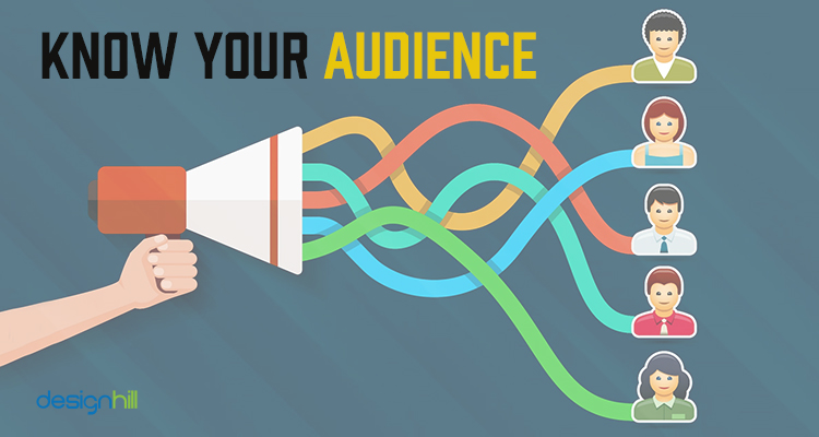
Once you have the ideal customer’s picture in mind, you can easily design a logo that they can relate to. You can select the design elements such as color and shape from the library of an online logo maker.
If you start creating a logo without knowing the audience, that will leave you roaming around directionless on the drawing board or a logo maker software.
04. Find Out More About Your Competitors
Do not restrict yourself to knowing your target audience. You should try hard also to understand your competitors. Even if your niche market is not vast, there are still many businesses active there. Find out about their offerings to the customers. What strategies do they adopt to lure their audience?

Most importantly, have a closer look at their logos. What colors and fonts do they have in their logo designs? What logo shapes do they prefer? Know these aspects minutely to design your logo differently to stand out in the niche market.
05. Make Sketches
Avoid going directly to the drawing board or a logo maker without first having some quick sketches of your logo. Draw as many sketches as you can quickly on a piece of paper. That will let you have various logo ideas you have in your mind.
All you need to ensure that you let loose your pen or pencil on the paper and draw whatever comes to your mind. Do not worry about the right or wrong sketches and being messy. Instead, rapidly jump from one to another drawing.
These sketches let you have a picture of the logo, and you can pick one drawing that you find impressive. But it is not about which sketch you like. It is more about which sketch makes sense. Then, develop that sketch into a logo using an online logo maker.
Besides doing some sketch work, you can also use a logo maker tool to get a lot of ideas that you can further develop as your brand identity. So, if you need a podcast logo, create its sketches and use a DIY tool also to generate different logo ideas for your podcast.
06. Get Inspiration
Do not work on your logo design without first having some inspirational ideas. Inspiration can come from anywhere, but there are many online places where you can observe plenty of logos.

Such places include Pinterest, Behance, and Instagram. There are uncountable logo ideas on such platforms, and go through them casually and see which of them catches your attention.
But to get inspiration does not imply that you copy the idea. Instead, that idea should stimulate your creative brain to develop such an impressive new logo design.
07. Pick A Design Style
Another thing to consider while designing your logo is to pick a logo design style. Which design aesthetics do you want to opt for when planning to create a logo? You should consider your brand’s identity and personality.
Though there are many design styles, some of the main styles include classic, retro, modern or minimalist, fun and quirky, and handmade. Choose your style carefully, considering your brand.
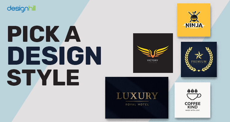
A classic style gives a design a permanent look that builds trust in a brand. But a retro style is about something from the past. Modern or minimalist style is all about keeping a design as simple as it can be.
Fun and quirky designs make a logo look unique and different from other brand logos. Handmade and handcrafted logo style is usually for the brands that sell handmade products.
08. Make It Stand Out
If your logo looks somewhat like your competitors’ logos, then redesign it. Remember that a logo is your brand’s identity. People should not get the impression that your brand is similar to a particular brand in the market, and such a perception will speak ill about your business.

So, make sure that your logo stands out in its use of colors, fonts, shape, icons, symbols, etc. Try to look entirely different from the other logos in your target market. This is why studying your competitors’ logos is crucial to designing a logo.
Recommended Reading:
09. Make It A Memorable Design
While you have taken most of the design aspects into account, check if the logo is memorable or not. Will people keep that design in mind? Can they recall your business instantly on seeing your logo?

All global brand logos are memorable. For instance, we all have that Apple logo with a bite in our mind. Similarly, the Twitter logo bird is a unique element that we instantly recall.
You should pick some symbols or give some twists to your text-based logo to make it memorable. So, you can even add some quirky and fun elements to the logo that people like. Think of using an online logo generator tool to get some memorable design ideas.
10. Impression Is Crucial
Your logo design should make a lasting impression on the market and the customers. Just a glance at your logo is enough to mesmerize people. The logo functions for a company by enticing the customers again and again once they have a good impression of the design.

To create an impression, make sure that your company’s logo is unique, which means that its design should be based on a new concept so that it stands out in the crowd of logos in the market. The logo must also be better in design than your competitors.
11. Use Colors In A Planned Way
Colors play a crucial role in determining a brand’s message. For example, if you use red as the main color in your logo, it will send the message of the brand being aggressive, passionate, and energetic. This means that your brand intends to target young customers.
If blue is the chief color, it will evoke feelings of intelligence and togetherness. This is the reason that most of the social channels such as Facebook have logos in blue. If you want to create a social media page, think of having blue as its main color in its design.

Use bright and bold colors to grab people’s attention. But these colors should speak about your brand personality as well. Remember that every color evokes an emotion, which becomes its message for the viewers or customers. There is a science behind colors, which modern graphic designers effectively use.
12. Pick Fonts Carefully
Many designers just do not pay attention to the selection of typefaces and choose them randomly. According to M Agency, typefaces speak about the personality of a brand.
A typeface used for a toy company’s logo will most likely be a handwritten typeface. This is because the children are the target customers and you want to project your brand as a child-friendly business.
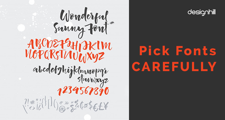
Similarly, if you create a logo for a rock music band, pick bold fonts that create a strong personality. So, make sure that there is not a mismatch between the typeface you chose and your brand personality. If the choice of typeface does not speak for your brand, the logo will send wrong signals to your potential customers.
Also, avoid using gimmicky fonts. If possible, use the unique fonts that should be created especially for your logo. You can also think of using very high-quality fonts that are now available free on the web.
Logos such as that of Coca-Cola are recognized for their custom fonts. By using the right colors you will create a logo and brand identity.
13. Chose The Type Of Logo
Do you want a logo that has your company’s name as the main feature? That could be the best logo idea. Such a logo is known as a logotype. Famous examples of logotypes include the logos of Ray-Ban, IBM, and Coca-Cola.
If you choose to have a logotype, your company name will be visible to the customers immediately. This means that your logo will become your brand’s advertisement as well.

You will not be spending much to generate publicity about your brand, and the logo will tell your company name to the people. Small businesses with a small marketing budget benefit from logotypes.
But if you choose to have a symbol as your logo, it will require you to spend a lot of funds on generating awareness about your brand name. Famous companies using symbols as logos include the Apple logo that has a half ‘byte’ apple as its business symbol.
You can also think of a combination logo that has both the symbol and company name. Such a logo will speak out your company name along with a business message from the symbol.
14. Keep It Simple
Every expert logo designer and any graphic designer will lend you this advice. They all lay extra emphasis on creating a simple logo design through their graphic design services.
When we speak of a simple logo, it implies that there should be the use of one or two colors, fonts, and other elements. The viewers should get the message at first glance of the logo.
But if there are too many confusing colors and fonts or a complex shape of the logo, then it will send a mixed signal to the viewers. A simple logo is also a memorable design. Most of the global business is represented by its simple logos.
Take for example the Nike logo. It is a simple swoosh logo. The Pepsi logo is made of two colors only. The Samsung logo has one color. The Apple logo has an application as a symbol of its business.

The simplicity of design is not restricted to logos only. All the graphic design products such as brochure design etc. should also be simple, neat, and clean.
Many companies have their name in the logo while others have only some illustrations. Both these types of simple logos are capable of fully catching the attention of the customers. Your logo can have colors and images but the targeted audience should be able to understand the design.
Avoid creating a complex logo having a riot of colors or fonts or a web of lines as such a design will be too ambiguous. You can see the logo of Google. The logo of Google is the simplest all over the world.
Remember that a simple design easily becomes part of memory and the audience does not have to make efforts to understand the company and business behind the logo again.
So, the simplicity of a logo goes a long way in creating a brand identity as the customers can easily remember the company and its business. That’s why the majority of businesses all across the world are using logo design contest sites to source simple and minimal logos for their brand.
15. Make It Scalable
Another quality of a great logo design is that it is easily scalable. Remember that your logo will feature a variety of advertisements. It should appear like an impressive logo in all the media.
This means that when scaled up to larger proportions on a billboard, the logo should look impressive. It should become part of the billboard design.

But if the logo loses its sense of proportion and some of its design elements look odd on a billboard, the logo is a failure design. Similarly, if there is a need to print a logo on a smaller surface such as that of a promotional product like a pen, the logo details must still be visible.
16. It Should Be Impressive In Colorless Version
Another effective tip to create a powerful logo design is to make sure that it is equally impressive in black and white. There are many instances when a logo appears without colors. It may be on documents, faxed documents, newspaper ads, stationery, and many other items.
For example, a newspaper ad generally is in black and white. This means that your logo should make a good lasting impression on viewers of the ad.

One of the tricks to create logos that are impressive designs in black and white is to make sure that they look great at the sketching stage. When you draw a pencil sketch, do not rely on colors.
Many designers think that the logo will become impressive after filling colors. A better way is to fill colors only when the logo is a memorable design without colors too.
17. Create A Timeless Piece
Avoid creating a trendy logo. Such a design lasts only up to the period of the trend and then you have to recreate it to make it look updated. When you redesign a logo, it hurts your target audience.
People often do not respond to the design kindly as they are emotionally detached. Moreover, repeated redesigning of a logo does not speak well for a brand.
Therefore, create a logo that stands the test of time. Stick to the design principles and create something that meets the standards of an effective logo design. Also, avoid adding elements from local culture in the design if you intend to reach out globally.
18. Tell A Story
People like stories as they can access a message easily. When people associate a story with a logo, they like it even more. For example, Domino’s, the largest pizza chain in the world, has 3 dots in its logo. These dots represent the first three outlets that the owner of the business both. Similarly, the fashion brand logo Gucci has two ‘G’s. That is because the logo is paying tribute to Gucci’s father and Guccio Gucci.
So, find out if you can incorporate one such story in your logo that you tell to the audience later. People would love to hear that from you and your logo design.
19. Don’t Be Literal
You do not have to incorporate an image of a restaurant in your logo design if you run a restaurant business. There is no need for your logo to have an image of a toy if you make toys. People do not like such a literal logo, which is too obvious and tells about its business through an image.

Take for example global brand logos. Apple is a technology company but its logo is a bitten apple and not any technology icon. National Geographic runs shows about wildlife but its logo is a simple yellow border as this is enough to convey their brand message.
So, instead of including some image of your business or industry, use something unique that looks aesthetic as well. But the image you use should be relevant and conveying your brand personality and message.
20. Think of Using Negative Space
Negative space is also an element of design, which graphic designers judicially use to create unique pieces of works. The space remaining vacant in between two letters or images is known as negative or white space. Often, graphic designers think of coming out with something unique and surprising by adopting this way to design a logo.
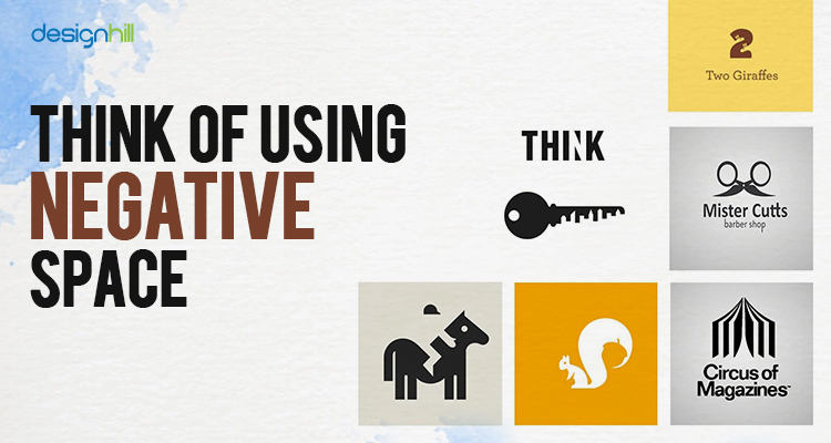
A famous example of a logo with the best use of negative space is the FedEx logo. The courier company wanted to convey its message of speedy service. For that, the design created an arrow between the letters E and x. Similarly,
The Yoga Australia logo has the map of the country between the hand and legs enclosure in the yogic asana. Another famous example of creative use of white space is The Guild Of Food Writers logo. It is a fountain pen nib logo, which has a spoon carved out in the vacant space in the middle of the nib.
21. Get Feedback
After you have finished designing your logo, ask people or fellow designers for their feedback. Take your logo design to your social media followers and request their impressions. But select qualified people for comments on social platforms as not everyone knows about graphic design.

If you find those suggestions valuable and worth implementing, then go ahead and improve your logo design. Useful advice can come from anywhere and so get it and tweak the design if necessary.
So, these are our powerful tips that you should consider while designing your logo. However, you can leave everything to a professional graphic designer. If you find a logo designer expensive, you can crowdsource your logo work to Designhill.
This leading marketplace is known for the affordable prices of quality graphic design services of professionals. As you launch your logo design contest, you get many unique design concepts from designers. You can choose one winning logo design for your business at one low price.
Designhill has a 100% Money Back Guarantee policy, which allows you to get refunds if you are not satisfied with the designs you get.

Conclusion
To create a powerful logo design, make sure that you know the brand inside out. The logo should be a unique but simple design that conveys a brand message. It should be a versatile and scalable logo. The use of fonts and colors must be specific to the brand personality.
