Reebok is among the leading global fitness brands. Its iconic logo is now a well-recognized visual; people associate it with great-quality fitness clothes and shoes. However, the logo as its brand identity underwent multiple design changes throughout the company’s history. Taking a look at those changes tells about why brands often tweak their original logos.
Established in 1895 by Joseph William Foster in England, the sports equipment brand provided its shoes to the athletes in the 1924 summer Olympics. The company gets its name inspiration from a South African antelope known as rhebok, a strong and graceful animal in Afrikaans. Later, an American, Paul Fireman, bought the company’s rights, founded Reebok USA, and eventually bought the original company in the UK.
Reebok is a global fitness brand producing high-quality fitness clothes and shoes for its diverse set of global customers. The company tweaked its logo almost every decade to suit contemporary design trends.
It would be interesting to look at how the Reebok logo design changed over the decades to keep up with the new generation of customers.
Here Is How The Reebok Logo Evolved Over The Decades
Reebok’s First Logo
1958
The first Rebook logo appeared in 1958 when the company came up with some patriotism as an element in the design. It was a simple design with the British flag on the right of the wordmark. The intention was to showcase the origin of the company.
Other than the flag, bold sans-serif font and rounded letters were the chief features that drove the attention. Reebok shoes display this logo even today on its shoes.
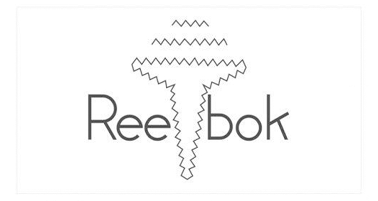
1958-1977
After the Union Jack Rebook logo, the company developed a new logo design. This time, the logo had the company name, but it was divided into two parts by some abstract geometric shape. First, there was a thin zig-zag horizontal contouring.
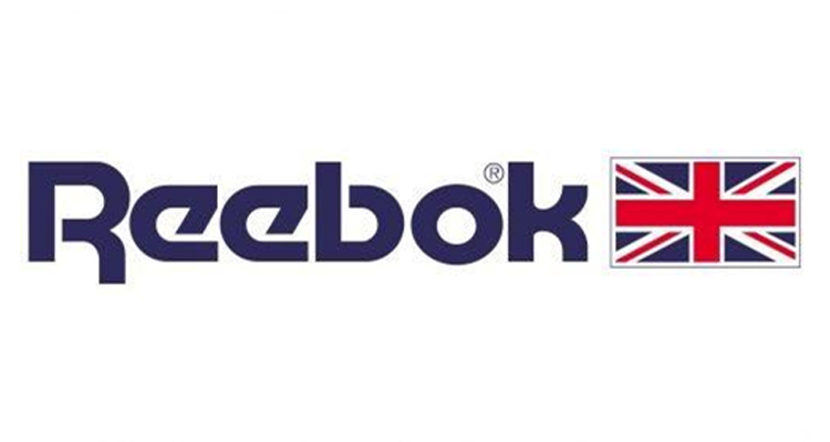
1977-1993
In 1977 the company incorporated the British flag on the right side of the brand name. The designer used sans-serif font with diagonal lines and rounded letter angles.
1993-1997
In 1993, the iconic Reebok emblem we see today took shape. It was created with two thick blue lines that looked like a racing track, merging into one sharp line. There was a red triangle placed over those lines, crossing them.
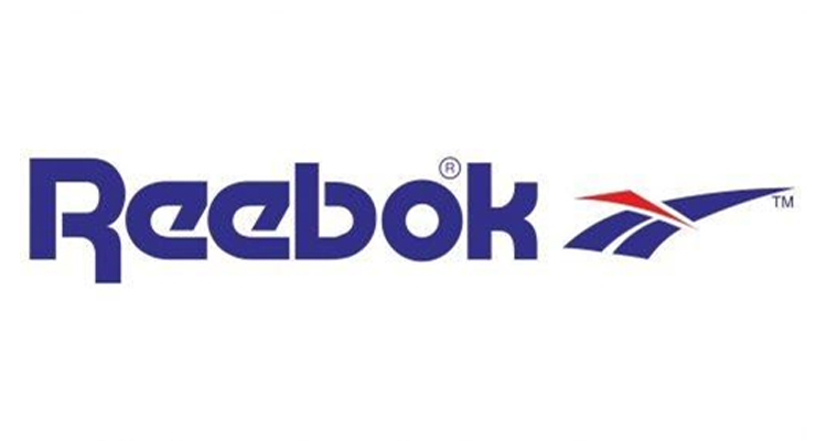
This image was found placed on the right of the brand name. This time, the wordmark was in a lighter shade of blue as compared to the previous logo.
Looking For a Logo Design?
We have helped thousands of business owners from all around the world with their graphic design needs such as a logo design, website design, social media posts, banner design and much more.
Get Your Logo Design Create Your Own Logo Online
1997-2000
In 1997, the company tweaked the logo again and moved the symbol to the top of the wordmark. Another change incorporated was the color, which became light gray from the bright red and blue of the earlier logo.

The redesigned company’s logo looked sophisticated and elegant as it was light on the eyes. In addition, it gave the impression that the brand was professional and produced sophisticated fitness wear.
2000-2005
The company changed its logo design in 2000, leaving the emblem untouched. The emblem was placed on the left of the wordmark on a gray background. The emblem and the brand name were enclosed in a parallelogram drawn in thick blue outlines.
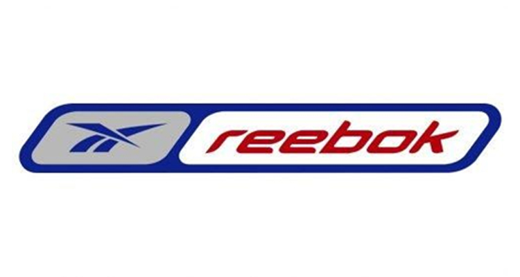
Also, the logo frame appeared in two segments, with the emblem in light gray and the wordmark on white background. The typeface also appeared a little differently. This time, the company changed the typeface into a sharp, square sans-serif.
The font appeared a bit italicized to express motion and speed symbolically. When it comes to color changes, the brand name was red to give the sports logo a distinctive visual identity and evoke viewers’ emotions of passion and energy.
Recommended Reading:
2005-2008
Another time the company made some changes was in 2005, when the brand name was shortened in the logo. The new name ‘RBK’ was in red and in italicized thick letters to depict movement. It was placed on the left of the blue symbol, and the blue emblem was put in a rectangular frame with rounded angles.

2008-2014
In 2008, Reebok redesigned its logo to give it a minimalistic look. Minimalist logos convey a message using bare minimum elements. So, one font or color is usually good enough to send the message to potential customers.
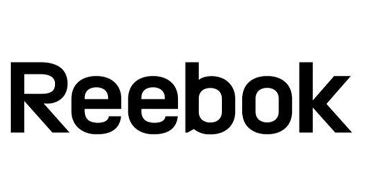
Reebok removed its iconic emblem and kept only the brand name in the logo in sans-serif. The use of light shades of blue in the redesigned logo was in keeping with the minimalistic principles of design. The company kept on using this logo for close to six years.
Recommended Reading:
2014-2019
Reebok returned its colors in 2014 when it redesigned its iconic emblem into a minimalist triangle in red. The geometric CrossFit Delta emblem comprised three equal segments. Also, the brand name appeared in black. Note also that the Delta was the third symbol that the company used after the Union Jack flag, and then the ‘’vectorial’’ symbol.
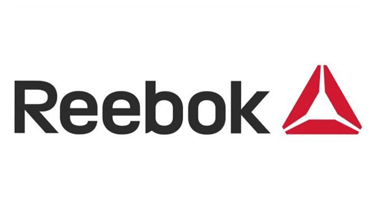
During this period, the company wanted to project its brand as an agent of change and transformation, not just speed and performance. It was evident from the company’s CrossFit Delta emblem incorporated in the logo. Reebok chose this symbol with three sides that stood for the three physical, mental, and social changes due to practicing hard.
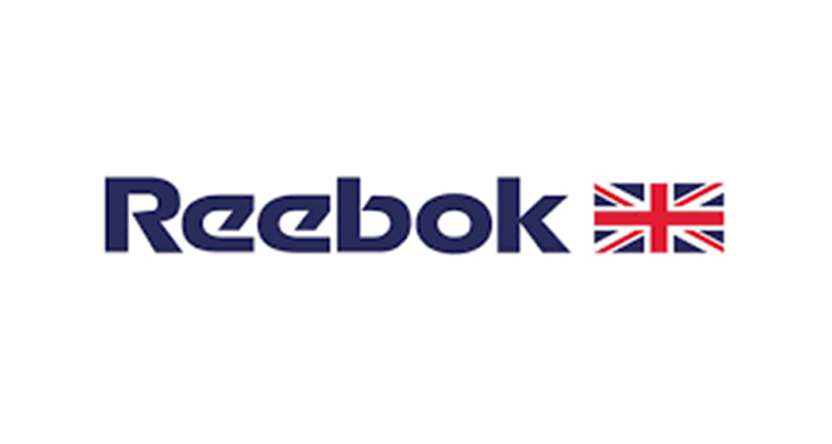
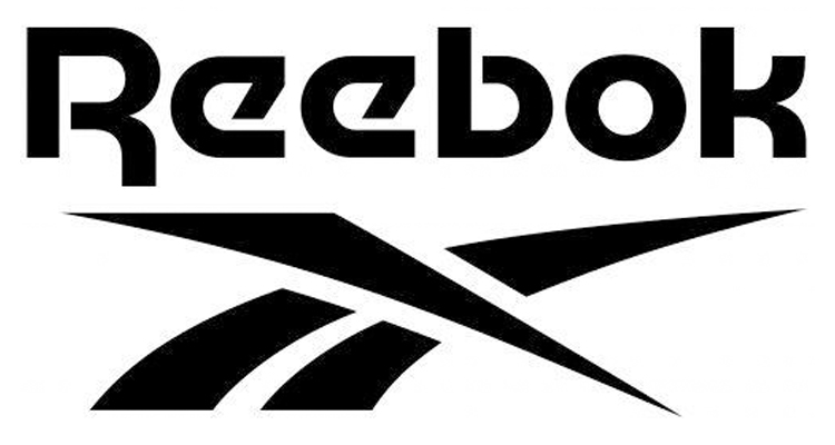
2019-Today
In 2019, the brand returned its iconic emblem logo of the 1979s. But the color palette was different this time. Getting rid of the blue and red color scheme, the company created the logo in a monochrome pallet. Also, the wordmark was moved up to the top, and the emblem underneath.
The company had announced that from 2020, all of its products would come under one brand logo and wordmark, which are the ‘drop-R’ wordmark and the Vector logo. Matt O’Toole, Reebok President, said, “At Reebok, our mission is to be the best fitness brand in the world. We live at the intersection of fitness and fashion, and our product is a reflection of that connection.
“As we continue to differentiate ourselves, we’re blurring the lines between our entire portfolio of performance and lifestyle products even more so to give our brand one unified presence and voice,” he added later.
So, these were the phases the Reebook logo went through in its design history, starting from 1958. You can notice that the company was regularly amending its logo by erasing or bringing back some design elements.
The company did that to suit the requirements of those times. For instance, when the minimalistic design trend picked up, Reebok also switched to this trend by keeping only the brand name.
A lesson from the Reebok logo design is that logos must be simple with a clean brand message. This logo has always been simple, making the design changes possible every time without altering its look.
Are you also looking to redesign your existing logo or need an entirely new logo? You should brainstorm to come up with lots of unique design ideas if you want to design it in-house. Alternatively, you can outsource those ideas and designs from Designhill, the leading creative marketplace.
Launch your logo design contest at this site, and you will shortly get dozens of unique logo ideas from talented designers worldwide. You can pick one winning design that best suits your brand. The marketplace also allows you to work with any designer of your choice on a one-to-one basis.
Wrapping Up
The iconic Reebok logo is a simple but unique design recognized worldwide. But the Reebok logo went through multiple changes in its design over the decades. First, starting as a logo with the Union Jack flag to express patriotism, the logo turned into a wordmark only. Then, it came up with symbols, and finally, now it is a combination logo with the brand name and the symbol.


