
Last updated on May 10th, 2019
Reported by Tech Republic as one of the hottest issues in web design since 2013, the battle between responsive and adaptive web design is still going strong. Figuring out which will work best for you isn’t just a matter of opinion, it requires understanding what makes responsive or adaptive web design styles different, the strengths and weaknesses of both options and why, exactly catering to mobile traffic is so important in the first place.
Differences between responsive or adaptive web design:
Responsive Design
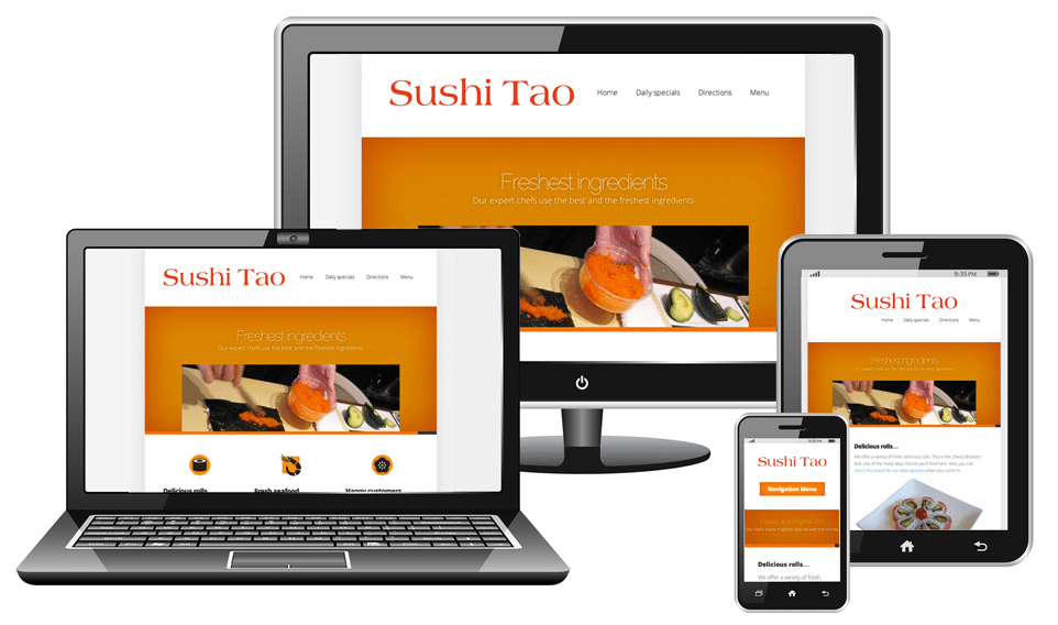
[Source carsonparkdesign.com]
The goal of responsive web design and development is to make your website fully functional at any display size. This involves a fair amount of coding knowhow, understanding of composition at different sizes and a clear image of how the scaling process works; in other words, it should always be done by a professional. Mobile-optimizing plugins can only offer so much help.
Talk of responsive website layouts is common with most web designers, with most insisting that you opt to have your website designed with responsiveness in mind. In layman terms, responsive web design creates fluid layouts that automatically scale to make all elements fit any resolution and still be optimally visible. This causes photos that were originally floating to the left of text to drop the space between two paragraphs, scales up text while scaling down the width of the column in which it’s been placed and so on.
Responsive design is the standard favorite among the majority of designers and the majority of businesses, not just because it often takes less technical work than adaptive layouts, but because it literally makes the website in question fully compatible with any resolution. With the number of smartphones and other mobile devices every year only getting higher, and each of those devices coming with a different—often bizarre—resolution, responsive layouts are a huge boon to businesses everywhere. Responsive design assures that you don’t have update your website every time another iPhone comes out; furthermore, it makes sure that you’re catering to that increasing number of mobile browsers without having to put too much extra work into it. Adaptive layouts, on the other hand, are a different story entirely.
Adaptive Design
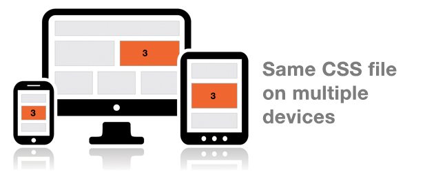
[Source: usdm.net]
Many entrepreneurs, even those with a decent amount of experience with web design, may not be overly familiar with the term or concept of adaptive web design, but it has its fair share of benefits.
Adaptive layouts are designed with specific resolutions and display sizes in mind. Instead of offering a fluid shift depending on the size of the window, an adaptive layout checks what resolution your browsing window is and loads the display code for the webpage in a different way in order to display properly for your resolution. It may sound like a lot of extra work, but adaptive design offers a level of fine-tuning and control that responsive layouts simply can’t. With full control over the design at multiple resolutions, you can be sure that your website is always displaying exactly how you want it too—or even how it needs to.
While Web Designer Depot reports that responsive layouts generally perform better than the adaptive alternative, the experts do admit that in the case of complex web applications and fields that need to be fine-tuned, adaptive is the better choice. By being able to fine-tune and customize your website layout at specific resolutions, you can be completely sure that your embedded app or complicated order form displays perfectly for either desktop and mobile browsers, or at least most of them.
Unfortunately there’s no efficient way to design for every single resolution, particularly with smartphone resolutions being literally all over the place, so adaptive web design has its limits. You can choose to design for the most common dozen or half-dozen resolutions, but need to accept that you’ll lose some traffic in the process. However, if you’re catering to a specific niche clientele—as most businesses that opt for adaptive design are—that shouldn’t be a problem.
Why Does Mobile Matter?
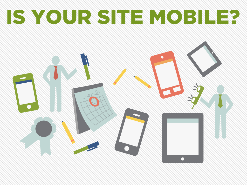
[Source: Vervesearch.com]
When all comes down to it, regardless of which choice you make, your business needs mobile web compatibility if it intends to survive online. In a Tech Crunch report, mobile traffic was revealed to clock in at a stunning 60 percent of all digital media usage—and that includes web browsing. With three of every five possible visitors accessing your site through a mobile device, your business can’t afford to ignore mobile traffic anymore.
Luckily, the professionals at Designhill are more than capable of hooking you up with the design you want and the compatibility you need. Put together your own website design contest today to experience all the benefits of crowdsourcing firsthand; stop worrying about how you’ll cater to the right web traffic and start looking for unique website design ideas to take your company website to the next level.
Have you been planning to go responsive this year? Not a fan of huge fees? Launch a website design contest at Designhill now and get to choose from 100+ responsive website designs in a matter of days!! We offer a full 100% money back guarantee! So rest assured, if you don’t find the web design you love, we’ll refund all your money, no questions asked.
For interesting insights and updates on how you can take your startup or small business to the next level, follow our blog, explore our Twitter updates and dig our Facebook page.


