Last updated on April 28th, 2022
Every logo has a history. And, like any other iconic logo, the TikTok logo has a fascinating history as well. You can see that this popular video-making app has a logo shaped like a musical note and the app name underneath. It is a simple logo that conveys its message instantly and engages viewers. Take a close look at how the designer came up with the logo idea. Knowing its design improvements over the years will be interesting.
TikTok is a social networking platform where users can create 15-second videos. The modern-day Generation Z is both creator and user of art, entertainment, and authenticity. The platform stands out from its competitors by offering services that help users be creators and consumers simultaneously.
The networking app offers a series of creative tools, including filters, masks, stickers, visual effects, and plenty of tracks that users can explore to dub videos.
Users can express themselves musically on this platform by creating duets, funny videos, competitions, challenges, and reactions to popular clips.
The Significance Of The TikTok Logo
TikTok is a highly sought-after app for instantly making concise videos of a few seconds. It is amongst the apps that achieved phenomenal success overnight because it meets users’ video-making requirements for entertainment.
When it comes to the TikTok logo, we can say that its design plays a key role in its success as it is a critical visual identity.
Note that an app must have a unique but eye-catching and recognizable digital logo. Such a logo should fit nicely on a phone’s small home screen. Since the logo is an outstanding design and is visible to the users always, TikTok can incentivize users to open the app and use it more often. The more users open and explore the app, the more revenue the app earns.
No doubt that the logo has contributed a lot in marketing the app. Its logo has featured in almost all app ads over the years. The recognizable symbol turns into a focal point of the ads.
Also, the unique TikTok logo design has been a good reason for the app to create licensed products. The logo appears on many promotional products such as custom t-shirts, shorts, hoodies, coffee mugs, journals, and many more. The company licenses its TikTok logo for such products, which becomes another lucrative revenue stream for the app.
The History Of TikTok Logo – The Making Of TikTok Logo
TikTok busted on the social media scenario in September 2016. It instantly became a hit with users worldwide and competed well with social media giants like Twitter, Facebook, and Snapchat.
Although TikTok arrived late in the world of social media, it showed that it is here to stay, and it ultimately established itself as a significant global player. Today, TikTok has more than 1.5 billion active monthly users, and the app is worth over $100 billion.
TikTok logo design is unchanged from its inception, except minor revisions here and there. It is not clear who designed the logo. But according to the reports, the designer got the inspiration from a concert he attended. He said, “TikTok is a young man who loves attending concerts, especially rock concerts’’. He wanted to create an experience of a concert where people were on the stage against darkness in the background. The stage looks colorful and bright to the viewers.
So, inspired by the concert, the designer incorporated the company’s logo against a black background. The logo was colorful and shaped like an electronic wave, which gave the design a 3D look. To express the ambiance of a concert, the designer used bright neon blue and red colors that looked like neon lights.
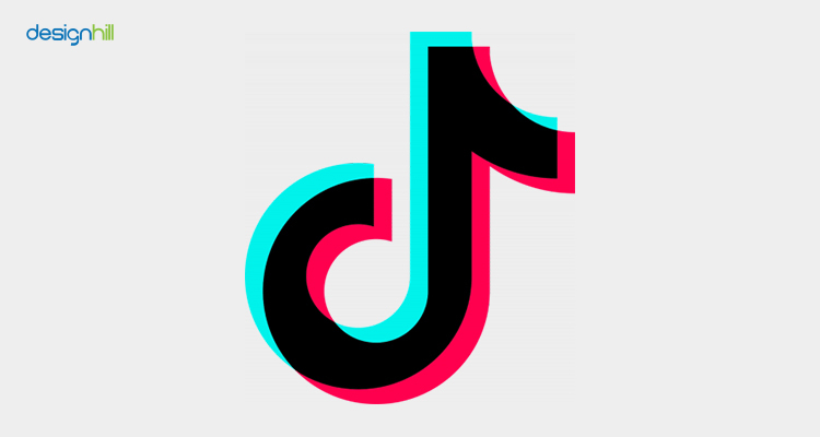
The logo is in the ‘d’ shape and modeled after a musical note. Another version says that the letter ‘d’ represents Douyin, later named TikTok. The company continued to use the logo despite the name change.
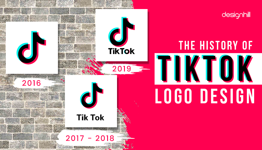
2016
The logo had not changed much since 2016, when it first launched. Its main feature and attraction have always been the ‘d’ symbol, which shapes up a musical note.
Looking For a Logo Design?
We have helped thousands of business owners from all around the world with their graphic design needs such as a logo design, website design, social media posts, banner design and much more.
Get Your Logo DesignCreate Your TikTok Logo Online
2017 — 2018
In 2017, the TikTok logo appeared with a wordmark, but the words ‘‘Tik’’ and ‘’Tok’’ were set apart. There was a wide gap between the two.
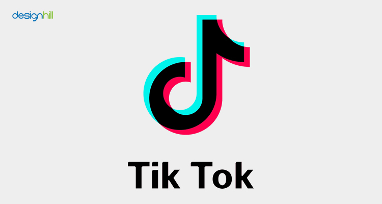
The other difference was that the ends of the bars on the T and k letters were vague. The angles of the letters also were not clear.
2018 — Today
In 2018, some changes in the logo design happened again when the wordmark appeared a little differently. There were many ways to place the emblem and the app’s name. It could sometimes be in the center of the wordmark, with the emblem being comparatively larger. If the emblem was on the left of the wordmark, the symbol appeared more significant than the text.
Also, the text had a hint of colors for the first time. Previously, the app name was in black and white. But now the ‘o’ had the red and blue colors of the emblem. This letter coloring helped merge the emblem and text, and they appeared as a whole.

Another change was that the designer shortened the space between the first ‘’k’’ and the ‘‘T’’. But the designer capitalized the second and saved the app name from looking like one word.
Additionally, the dot on the ‘i’ was circular from the previous original square-like shape. The letter ‘o’ is also designed to look more like a circle than the original elliptical text. The ‘k’s also appear slightly different as they are somewhat raised than before.
Design Elements Of TikTok Logo
The TikTok logo is simple, but its color scheme and font choice. Consider these tips when using a social media graphic maker to design the logo.
Colors
The TikTok logo is colorful and appears in pink, blue, and white against the black background. These colors resulted from the designer getting inspiration from a rock concert where the hall was dark while the stage lit up.
Because the colors overlap, the logo appears like a 3D design. The overlapping of colors signifies music vibrations. All these make it an ideal design for funny t-shirts and for those who love to show off their love for music
A TikTok logo maker tool will help you guide through these different colors when creating the logo all by yourself for your account.
![]()
Fonts
The designer used a simple sans serif font in capital letters for the TikTok logo when it comes to the font choice. The two words Tik and Tok were nearer to each other initially. But later, the space between them got reduced.
Must-Know Tips: How to create your TikTok logo design?
Now that you know the history of how this unique logo design came into existence how about doing a logo for your TikTok account. You can either create the logo for entertainment purposes or your business promotion.
Consider these tips and keep them in mind when exploring an online logo generator to design the logo on your own:
Know Your Brand Purpose
Make sure that your brand’s purpose is clear to you. Whichever business or industry you are in, know what problems your product or services solve for the customers. You should be clear about who your target customers. Are they teenagers, men, women, or kids?
Pick The Right Fonts and Colors
You should choose the fonts that can suit your brand personality and help convey a message. Always keep in mind your target audience when picking the colors and fonts — no matter whether you’re designing a logo, t-shirt design or any other design. Colors evoke our emotions. So, choose those colors to engage your audience and raise their feelings for your industry and business.
Recommended Reading:
Keep The Design Simple
Whichever colors and fonts or type of logo you choose, it should be a simple design so that people can interact with it quickly. Do not involve too many elements to make the design complicated.
Consider The Image Size
Each social media platform has its own limited space to put your logo. For TikTok, the dimensions for your logo is 200 x 200 px, though the profile picture is in 1:1 aspect ratio – 100 x 100px.
It is advisable to check the design size guide and adjust your TikTok logo design accordingly to look good in the smaller space. But you should leave some space as a margin to avoid cropping.
When designing logos or any other designs, graphic design tools will help you do the job smoothly without wasting your precious time.
For instance, a thumbnail maker comes in handy when designing a mini version of your design to fit in a tiny space such as a mobile phone screen. You can access the entire range of designing-making tools, including business flyer maker, water bottle label maker, and campaign poster maker.
So, we can say that the tiktok logo design is unique and straightforward, but it has not changed much over the years. However, it is just over five years old, and the company may tweak the design in the coming years as per the day’s requirements.
Are you also thinking of making TikTok videos to promote your business? If that be so, then use TikTok Logo Maker by Designhill. This AI-driven DIY tool will help you choose the right fonts, colors, and other elements to help you create a customized logo all by yourself.
Wrapping Up
The TikTok logo design is a musical note shape since the app allows users to create short, entertaining videos. After its inception in 2016, the logo went through only a few minor design tweaks here and there. While the emblem remains the same, some changes were made in the text.