
Last updated on April 20th, 2023
The Academy Awards, better known as the Oscars, are the most prestigious worldwide awards for artistic and technical merit in the global film industry. Oscars are enthralling ceremonies with glitz, glamor, and emotional moments that hook audiences worldwide. But have you ever been curious about the genesis of the iconic Oscar logo? In this blog post, we’ll delve into the secrets that make the Oscar logo a perfect blend of consistency and innovation.
Lights, camera, logo!
Have you ever wondered how the Oscar logo remains significant and timeless while moving with the times? In fact, it is a delicate balance to strike, but the secret of the design lies in identifying the right balance between consistency and innovation.
The Oscar logo conveys a clear message and is a fantastic illustration of the impact of intelligent design and consistency. This is a lesson that brands may use to improve their logos’ recall and message clarity.
The Oscar logo’s continued success proves that the most straightforward approaches to logo design are frequently the most successful. Though the logo has undergone many overhauls over the years, it has always maintained its peculiarity and relevance.
Oscar Logo History
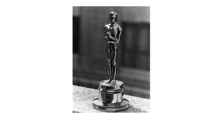
The original Oscar statuette was made in 1927 and 1928 when the Oscar Awards first appeared. Oscar statuettes have been awarded since the initial design, which featured a knight clutching a sword and standing on the reel, was unveiled.
The word ‘OSCAR’ in the logo contains a hidden ‘A’ that has become a crucial component of its identity. Initially, only 36 individuals in the industry participated in the decision-making process for the awards, but this number has now risen to almost 6000.
![]()
![]()
The Oscar, formerly known as the ‘Academy Award of Merit,’ has become one of the most coveted and sought-after prizes in the movie business.
What does the Oscar logo mean?
The Oscar logo is a stylized depiction of a knight holding a crusader’s sword and standing on a five-spoked film reel. The five spokes reflect the ‘Academy of Motion Picture Arts and Sciences‘ founding branches — Actors, Directors, Producers, Technicians, and Writers.
The knight holding the sword is said to represent Emilio “El Indio” Fernández Romo — a prominent Mexican film director. The figure is supposed to depict a knight, representing the pinnacle of excellence in the film business.
Generally, the Oscar logo symbolizes quality and prominence in the film industry. It is a permanent emblem of the Academy Awards — one of the film industry’s most distinguished honors.
The design of the logo has stayed similar for over 90 years, resulting in an iconic and timeless brand identity that evokes a sense of excellence, glamor, and achievement.
Oscar means ‘spear of the gods’ in Greek. The name was derived from Irish Gaelic as ‘Oscur,’ which eventually gained the extra meaning ‘deer buddy.’ The name is pronounced ‘Oss ka.’
Looking For a Logo Design?
We have helped thousands of business owners from all around the world with their graphic design needs such as a logo design, website design, social media posts, banner design and much more.
Get Your Logo Design Create Your Own Logo Online
Oscar Logo Redesigned
The Oscars redesigned its logo in 2013 to reflect its new branding strategy. This is one of the main reasons behind introducing a new design that has already received plenty of acclaims.
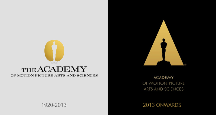
By introducing this new design, the Academy focuses on shifting the attention towards the various works done by the organization, like in the creative arts & sciences, instead of the annual awards ceremony.
The New Logo Elements
The old logo used by the Academy featured the Oscar statuette’s outline on black background with “The Oscars” spelled out in gold lettering. The Oscar statuette is spotlighted above in the new logo, surrounded by the letter ‘A,’ which stands for ‘The Academy’. The use of the stylish and contemporary font was primarily aimed at advertising the Academy Awards Ceremony in February every year.
![]()
![]()
The new logo design uses a white and golden color scheme. The designers at 180LA have created a truly stunning and minimalist design through the same color palette, and the theme is shared by the old and the new logo. The old logo for the Academy, used since the 1920s, was replaced by the newly introduced logo at the 86th Academy Awards held in 2014.
The New Design Reflects The Academy’s Ethos
A glance at the new design indicates a bit of trimming, unlike the previous one. The best part is that the refreshed design takes a confident approach without using words, emphasizing that most people will instantly recognize what the new design symbolizes.

A clever touch comes in the ‘A’ shape where the Oscar statuette is spotlighted from above. The white and gold coloring indicates prestige and glamor, which is always an integral part of the Academy.
The simple and minimalist design exceeds the previous logo, which looked quite busy. The new look of the Academy’s logo is expected to go a long way toward helping the organization with its future endeavors and efforts.
![]()
![]()
The Oscar Logo’s Secret To Success
The Oscar logo is undoubtedly one of the most recognizable symbols. But why has it been a popular and respected design for many decades?
Here Are The Three Primary Reasons For The Logo’s Success:
- Consistency
- Innovation
- Balancing the two design principles
Consistency: The Design Has Been Unchanged For 90 Years
Branding relies heavily on consistency. A consistent brand identity fosters audience awareness and familiarity, which may lead to increased loyalty and trust. This is especially significant for the Oscar logo because it signifies one of the film industry’s most renowned accolades.
Therefore, people should easily recognize the Oscar logo when they see it, which is why the fundamental design of the emblem has stayed the same since its inception in 1928.
The Oscar logo depicts a stylized person brandishing a sword, standing on a film reel with five spokes signifying the Academy’s original branches — Actors, Directors, Producers, Technicians, and Writers.
The fundamental design of the logo has remained intact for almost 90 years, resulting in an instantly recognizable strong brand identity. The Oscar logo has remained virtually unchanged, with the last significant revision in 2014. Its reliability is evidence of the logo’s durability and potency as a message transmitter.
In addition, the logo’s strength and ease of identification are partly due to how easily it can be recognized, making it a source of honor and respect.
Innovation: Subtle Logo Design Updates
While consistency is vital, keeping abreast and reflecting on industry developments is also critical. The film business constantly changes, and the Oscar logo must keep up. Here is when creativity comes into play. The Academy may stay contemporary and appeal to a younger audience by making small changes to the design while keeping the emblem’s legendary position.
The Oscar logo has been updated multiple times, including color, shading, and typeface modifications. For example, the logo was modified in 2013 with a more modern, streamlined style with a brighter, metallic gold hue and more straightforward typography. This redesign aimed to appeal to a younger audience while keeping the logo’s iconic position.
In addition, the Oscar logo has been changed to reflect developments in the film business. The Academy launched a new branch, the Animated Feature Film category, in 2001, represented in the emblem by adding an animated character brandishing a sword. This revision was a modest means of reflecting industry developments while keeping the logo consistent.
Balancing Consistency and Innovation
Finding the right mix between consistency and creativity is the secret of the Oscar logo’s success. The core design of the logo has stayed unchanged for more than 90 years, generating identification and familiarity. However, modest tweaks have been made to keep it new and contemporary.
The Academy has made only a few minor changes to the logo. Further alterations may diminish the brand’s identity. So instead, they have concentrated on minor tweaks reflecting industry developments while preserving the logo’s iconic significance. This strategy has proven effective, as the Oscar logo has remained one of the most recognizable in the world.
So, the Oscar logo design makes its presence felt in the logo design industry. It is a symbol of excellence in the film industry across the globe. This logo inspires designers when it comes to creating unique logos for businesses.
Taking inspiration from the Oscar logo, as a logo designer, you can find design jobs at Designhill and create unique logos. Or, you can use a logo maker to design a logo all by yourself at this creative marketplace.
Wrapping Up
The Oscar logo has achieved enduring success as one of the most distinctive insignia, representing excellence and authority in the global film industry. Its longevity lies in its proper balance between constancy and innovation. While the fundamental design of this iconic logo has been mainly kept unchanged for over 90 years, the Academy has incorporated some new design elements to make it up-to-date and relevant without losing its iconic status.
Since the Oscars continue to evolve with the times, its logo will unquestionably remain an identifiable hallmark and achievement for years to come.


