Last updated on February 3rd, 2023
Social media is the new center of our social and professional lives. It can help us to stay connected with our potential clients and achieve many things at just fingertips. These platforms are mainly visual-based, therefore, the design is an important element to make the most of it. As experts say, our social media posts need to be bright and appealing to get the message across. In this article, we look at the ways where you can improve your social media design. Have a look!
There is no doubt that social media has become one of the most important methods of communication. It is also the only one way that enables us to reach a potentially unlimited audience.
Social media is used all over the world and it is accessible for anyone with an internet connection. This makes it a powerful tool with which we can influence others and increase the exposure of our brands.
It involves the use of a variety of media types, but it is predominantly visual. Photos and videos are the most convenient modes of communication.
This means one of the best methods for promoting a brand is by creating designs with the help of social media templates that will be noticeable and deliver an immediate impact.
So, how can you improve your social media designs? What are the various things that you need to keep in mind when designing your social media visual? The answer to these questions is follows:
Here Are The Tips To Improve Your Social Media Designs
01. Define Your Objectives
All of your work in creating social media content will come with goals that need to be made clear before you get started. We can take as our starting point the purpose and objective of any social media content.
This may be to generate traffic, drive sales or increase engagement in a web project.
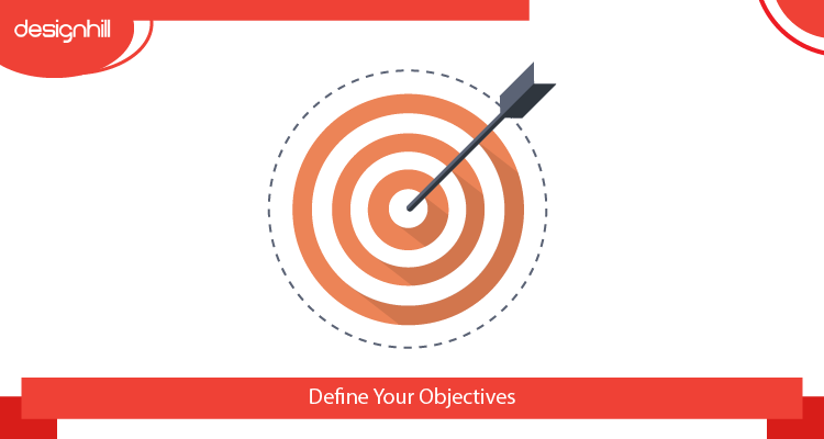
It is important to take our target audience into account, as well as our competitors, and closely align them with our marketing strategies.
Your creative approach can derive from all of this, reflecting all of your marketing goals and remaining sensitive to your audience. Your creativity should not be constrained by these parameters and your designs can still be appealing and fun.
02. Select Your Typography
This is an area of graphic design that has the potential to be very beautiful, stylish or eye-catching. It is not always easy to find the right font for an image, but when carefully chosen font can have a real impact.
Different fonts can be understood in different ways, so you need to find one that is emblematic of your brand and true to your message.
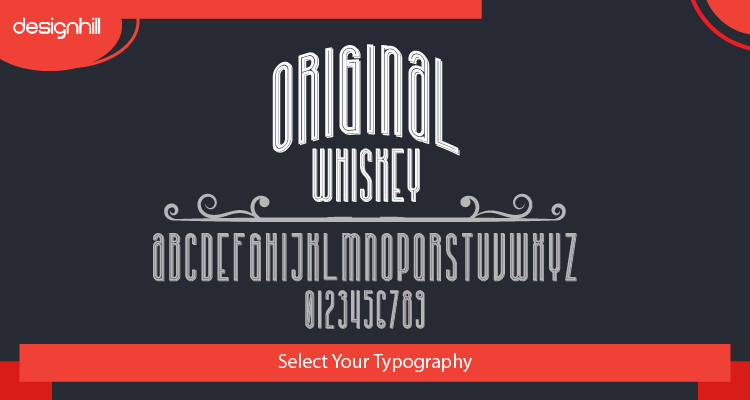
All fonts have a certain tone, so they need to be selected carefully. It is best to choose no more than three separate fonts as too many fonts are confusing for the viewer.
As a general rule, sans-serif fonts are preferred for web presentations while serif fonts are better for print, but if a particular font seems right then go with your instinct.
Recommended Reading:
03. Know Your Colors
Color is an immediate aspect of design and makes a considerable impact. Every color evokes a different emotion in the viewer, which is a powerful tool for creating a mood or atmosphere. Different colors are even shown to recall memories in individuals.
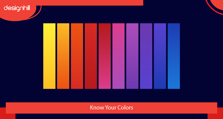
In color theory, each color means certain things to viewers, such as blue which is trust and security, and orange which is aggression. For this reason, designers must choose their colors carefully, as the emotions evoked by each color will be associated with the brand or campaign.
Choosing color combinations can be difficult as colors need to balance well. They should contrast enough to avoid color bleeding, yet not so much contrast that they cause a visual vibration.
04. Use Text Sparingly
Text is not the same as typography, as the text is the mass of letters and words and not the letters and words as they appear visually.
Businesses often want to include lots of information in their designs so they can introduce the brand identity, convey their message, and produce a response in the viewer.
The problem with this is that it can result in overcrowding of the image or design which will overwhelm the viewer and they will lose interest. Graphics on social media should be simple and easy to read, with no more than two lines of text.
Don’t forget that many viewers will be using a mobile device, so the text should be sufficiently clear, large and contrasting. If you need any help with technical issues, it is a good idea to have trusted IT support on hand at all times.
Looking For a Social Media Page Design?
We have helped thousands of business owners from all around the world with their graphic design needs such as a logo design, website design, social media posts, banner design and much more.
Get Your Social Media Page DesignGet a Free Quote
05. Use Lines Carefully
Lines can make a big difference to visual designs that are used for marketing purposes, as they can guide the viewer to different places. Lines can also create a different mood, which can create an appropriate backdrop to the overall message.
Curved or wavy lines can convey a mood of excitement or pleasure while straight lines can mean organization and tidiness. Lines can also be used to create a visual narrative, or for dividing a presentation into sections are stages.
They can also lead the eye around an image and draw it towards the center where the product or brand can be placed. Lines can be a useful tool in creating interest and leading the customer in the right direction.
06. Know The Power Of Contrast
The advantage of using contrasting colors, such as black and white, is that it can help images to be noticed. Contrast can be used in various ways with color, shapes, font and size, and it immediately draws the eye.

Contrasting white-and-black fonts can be used with logos to make them more noticeable and readable. As a general rule, light fonts work well on dark backgrounds and vice versa.
Contrast can separate different parts of a design and create a visual impact, while it can also emphasize particular features and words. A lack of contrast can make designs appear too dull, but on the other hand, the effect of too much contrast can be uncomfortable and crowded.
07. Make It Consistent
Content on social media pages and other channels needs to keep a certain level of consistency for a brand and message to be easily noticed.
This means establishing a consistent look, style and themes, so your audience will connect that particular visual approach with your brand. There needs to be enough variation in your content to make it interesting and different from previous posts.
Posts also need to be similar enough to make the connection possible and the brand recognizable. It can be useful to use templates that enforce a certain level of consistency, as well as being a quicker way of producing content.
This can then be maintained on different social media platforms to reach a wider audience.
08. Use Your Space
Using space to give artistic effect is an important aspect of design, as what is not in an image can be equally important as what is there. White space, or negative space, is the term used to describe the area that surrounds a subject in a composition.
We need a certain amount of simplicity and space to draw attention to what really matters, and this can also help to make the design more aesthetically pleasing.
White space around items in images can help to place a strong emphasis and make the viewer pick up on the smaller details. Simplicity and extra space also serve to deliver a message, brand or slogan to a more resounding degree.
09. Check The Platform
There are various social media platforms to launch campaigns and showcase your attractive designs, but each of these should be treated as separate entities.
This means reaching different audiences and adjusting to different image formats and sizes. While:
- Pinterest is a platform for sharing creative ideas visually.
- LinkedIn is more directed towards business and professional networking
- Instagram has a younger audience and is used more for images and videos on mobile devices
- Facebook is for an older audience and can handle various forms of media.
Posts on Facebook can be up to 1200 x 630 pixels in size while pins on Pinterest can be 600 x 1260 pixels in size. Images on each platform should be slightly different to meet the particular dimensions and audiences of the forum.
10. Be Creative
We are all creative people capable of producing interesting and imaginative work. It is this creativity that we need to explore in order to make appealing designs. We need to use our imagination to create imagery that will resonate with others and reveal our brands as something unique.
Make sure that your images are unique and that they convey some message to your target audience on social media. If you are struggling to get new image ideas, use AI image generator that will display dozens of new images as per your brief.
We also need to be able to create posts that are attractive and interesting to increase engagement and make the audience more likely to share them with their friends.
The design is the first aspect they will see, so things like color, fonts and composition could cause the viewer to stop scrolling.
It is always good to find inspiration in other designs but remember that you need to make your images different from the rest, so your audience will pay more attention.
Conclusion
There is a range of aspects of design to consider while creating images and posts for social media that will be the most effective. Some of these are technical and meet the requirements of the particular platform or device, others are dependent on styles that are in vogue, while other aspects relate more to the compositional elements. In addition to all of this advice, it is important to follow your intuition and what you feel will look great and make a successful project.