Last updated on September 9th, 2022
Most restaurant businesses from across the globe believe a good restaurant logo to be one of the most vital marketing tools. Restaurant logos are intricately designed to communicate the business idea, connect with the audience, advertise the specialities and of course please the eyes.
No wonder, logos remains the trickiest part of your restaurant business. In the last few years, several poorly crafted restaurant logos have created huge public outcry making several restaurant businesses to think about redesigning their restaurant logos.
Here Is The List Of 5 Restaurant Logos That Fail To Leave A Good Impression
01. Dairy Queen
Dairy Queen Ice cream is perhaps one name that most people and kids can reckon with. Their original logo was certainly a masterpiece with great typography, unique shape and vibrant colors. However, Dairy Queen changed their restaurant logo design by using the initials for their brand DQ and adding “Grill & Chill” to tap in the huge demand of snack offerings.
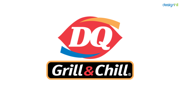
As a result, their new logo proved to be a mingle-mangle design with poor typography, unimpressive colors and asymmetrical shape. DQ Grill & Chill logo is perhaps the greatest example of a poorly crafted restaurant logo that fails to capture onlooker’s fancy.
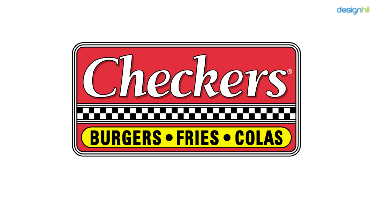
02. Checkers
Checkers is undoubtedly one of the most impressive eateries, but their logo ranks alongside some of the world’s most unimpressive designs. The Checkers logo uses color scheme that doesn’t impress and inspire. There are several issues that blend with the a host of many other elements to make the look not-so-interesting.
03. Jason’s Deli’s
Most foodies will agree that Jason’s Deli’s food is quite awesome and never fails to tickle one’s taste buds. But their restaurant logo doesn’t represent this offering.
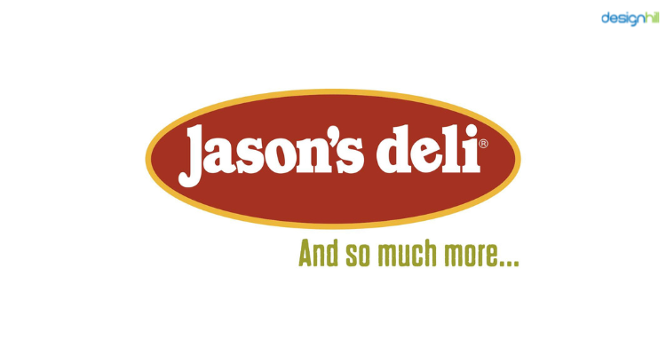
The asymmetrical spacing between ‘J’, ‘a’ and‘s’ is one of the most off-putting elements of this logo design. In addition, this logo doesn’t make an impact and hence, fails to stand out from the crowd.

04. Papa Johns
Papa Johns is one brand that most pizza lovers swear by. However, its unimposing logo doesn’t share the same popularity like the brand. There are several issues with the logo.
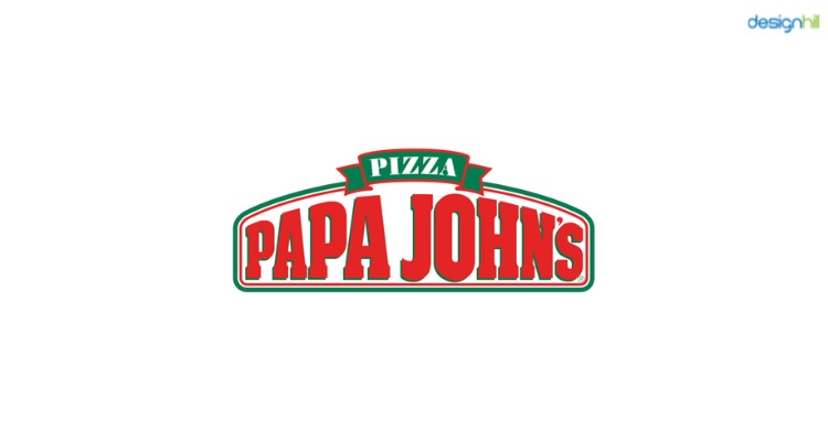
Its unimpressive color palate fails to make this pizza giant stand out from other competitors restaurant logos. Finally, its complex graphic treatment, its unsymmetrical shape and shadow effects makes this simple restaurant logo design not-so-impressive.
05. American Deli’s
American Deli’s logo uses system standard fonts that give it a very uncanny look. The use of usual fonts doesn’t make this logo any different from other restaurant logos. Even the well-aligned typeface and carefully hand-picked color scheme of the logo doesn’t help it stand out from the crowd.
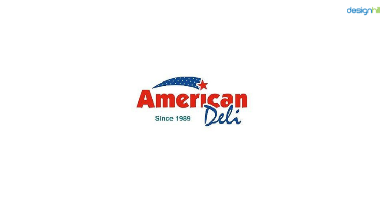
The overused concept of using a shooting star graphic fails to garner some eyeballs for American Deli’s restaurant logo. All in all, this poorly crafted restaurant logo fails to summarize the popularity and specialties of the popular restaurant, American Deli’s.
Take a cue from these not-so-appealing restaurant logos and make sure that you craft an impressive logo that is simplistic, gorgeous and very succinct yet bears that tantalizing feel to stand out of the crowd and catch the fancy of foodies and epicureans.