Last updated on November 15th, 2021
The main objective of any email campaign is to make the subscribers read your message and take the next action. For your subscribers to scroll through the entire email, you must organize the email layout such that it grabs the subscriber’s attention. The visual hierarchy comes into play here.
Visual hierarchy refers to the placement of various graphic elements and text in perfect alignment with each other. It will, in turn, influence the user experience and how the audience will perceive your message. Proper prioritization of the content and images will connect with the subscribers and guide their eye scan pattern.
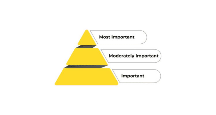
To put it simply, take a look at the image below. See how different elements are arranged in the increasing order of their importance.
 Checking For Visual Hierarchy
Squint test is the most extensively used method to check your emails for visual hierarchy.
Through this technique, you must keep your device at an appropriate distance that would allow you to view the imagery clearly.
After adjusting the vision, squint at the design. This will make the entire email hazy and you will be able to visualize the elements that stand out.
If this is how you want your subscribers to see the email, it is good to go. If not, you will have to customize the email design and change the placement of the important elements.
Continue the squint test by testing the alignment and modifying the color, contrast, and texture of the visuals.
Here’s A Welcome Email Template by Trello
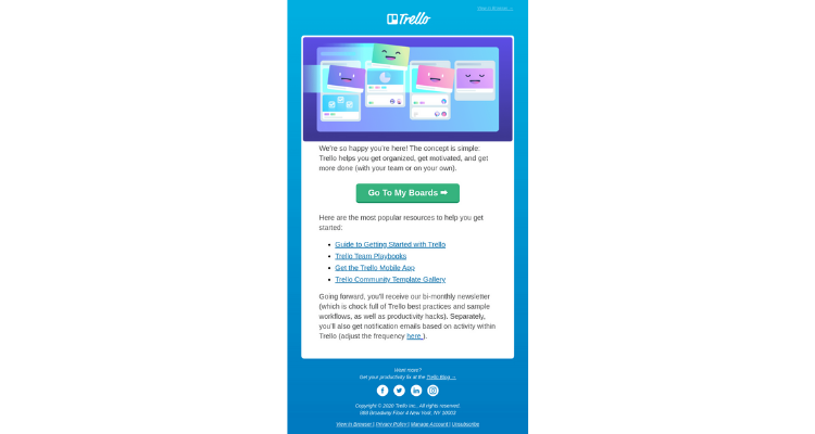
[Source: Really Good Emails]
Carry out the squint test on the visual. The user will instantly see the CTA followed by the explanatory copy along with it.
Factors Influencing Visual Hierarchy
There are several parameters that influence visual hierarchy:
01. Size Of The Font
While bigger font size helps to capture the user’s attention, smaller font size conveys the information in further detail. You can also use formatting elements like bold, italics, and underline.
The same principle applies to HTML tags like <p>, <H1>, <H2>, and <H3>. They help to organize the email better.
Take a look at this email.
They have chosen the font size to perfectly abide by the rules of visual hierarchy.
[Source: Really Good Emails]
02. Hero Image
The featured image placed at the top of the email, that reflects the purpose and theme of the email is known as hero image.
Sandland does a great job at selecting a hero image that grabs the subscriber’s attention right away.
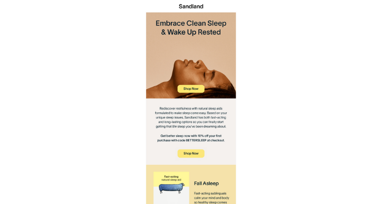
[Source: Really Good Emails]
03. Color Palette
Choose the color palette in such a way that it matches the purpose of the email and conforms to your branding guidelines.
Saturation, hue, and lightness or darkness are three distinct components of colors.
Let’s Understand How You Can Create Hierarchy By Using Them.
a. Saturation
Suppose you have a black and white image. In such images, a colored element will capture the reader’s attention. Alternatively, you can use neutral colors and make one element more saturated than the rest.
b. Hue
Bright colors like red are most likely to get noticed. Therefore, many marketers use such vibrant colors to promote a discount offer or sale.
c. Lightness or Darkness
If a design uses a darker color palette, bright colors will catch more attention. On the other hand, darker colors will be more prominent in a light design.
Take a look at this email by Apple and see how they have used different colors to make the email more impactful for the readers.
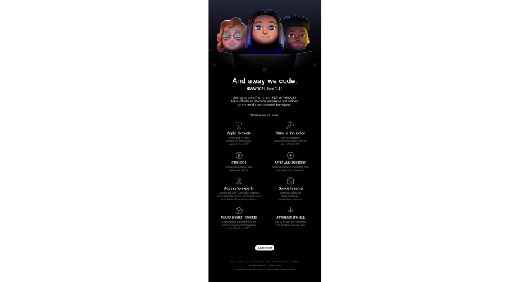
[Source: Really Good Emails]
Looking For an E-mail Design?
We have helped thousands of business owners from all around the world with their graphic design needs such as a logo design, website design, social media posts, banner design and much more.
Get Your E-mail DesignGet a free quote
04. Color Contrast
Color contrast helps to differentiate between the various elements you have used in your email. Pick the font colors and CTA buttons in accordance with the same.
Here’s an email example to explain the importance of contrasting colors in visual hierarchy.
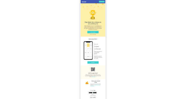
[Source: Really Good Emails]
05. Content Block Layout
Place the elements in the decreasing order of their priority, from top to bottom. This is also important from the point of view of accessibility as it will help screen readers understand your message better.
06. Repetition
You must use repeating color schemes and content placing patterns to maintain a consistent flow in the emails.
07. Proximity Of Content Elements
Arrange the closely related elements in proximity to each other. For instance: Your heading and subheadings should be placed so that they guide the user’s reading flow.
08. White Space
Most of the subscribers are scanning your emails rather than reading them. White space or negative space gives your readers breathing space to consume your email and understand what it is all about even while scanning.
Different Types Of Visual Hierarchy Patterns For Emails
01. Inverted Pyramid Pattern
In the inverted pyramid pattern, the entire email is designed in the form of an imaginary inverted triangle. The structure of email leads the reader toward a call to action.
This method is great for welcome emails, lifecycle emails, marketing emails, and behavioral emails.
The inverted pyramid model not only works well for emails with a single message and CTA but also for newsletters that have multiple messages and calls-to-action.
You can use it in combination with the 1-2-3 method as it will help you to create a more profound impact on your readers.
See how Medium has done it in their welcome email.
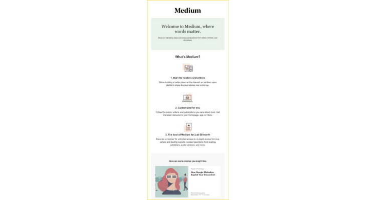
Your readers are busy people. They want to get to the gist of the email instantly without having to search for it. An email structured in the inverted pyramid pattern gets straight to the point and lets the reader know about the next action.
Here Are A Few Tips That Will Allow You To Ace The Inverted Pyramid Model For Your Emails
01. You must have an irresistible value proposition.
Inform the subscribers about the benefits of your products or services. Let them know why they should care about it and what sets you apart from the competitors.
02. Include relevant visuals.
Visuals are of utmost importance when it comes to inverted pyramid model. The images you choose must support the purpose of your email and its content. It is advisable to use real life photographs rather than stock images. Doing so will reflect professionalism in your email templates and enhance the subscriber engagement.
03. Avoid writing lengthy copy.
A wall of text is the most unattractive thing in an email. Try to write a short yet engaging copy that keeps the reader hooked to your email and scroll further. You can use the Problem-Agitation-Solution formula to make your email copy interesting for the reader and get results. Alternatively, you can tell a compelling story that would connect with the readers on a deeper level.
04. Bring focus to your call-to-action.
Last but not the least, you must add a prominent call-to-action button for the subscribers to take the next step. Instead of a text link, you must include a large button of 44×44 px to increase the likelihood of click-through and conversion.
Teaonic has sent out a nice email to prompt the users to ‘order a refill’.
Whether it is the header, the hero image, the copy, or the CTA, everything is perfectly in sync with the inverted pyramid pattern. They have presented their USP in the first fold followed by the most popular products.
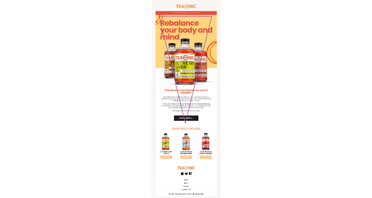
[Source: Really Good Emails]
02. Z-Pattern
The Z-pattern guides the route of the human eye to facilitate reading or scanning the email.
Here’s How It Works:
Your subscribers start off by reading from the top left and proceed toward the top right. It makes a virtual horizontal line.
Then, they move downward to the left side of the email (or web page) and it creates an imaginary diagonal line.
In the end, they form another horizontal line by moving toward the bottom right.
All these eye movements, combined, will give us a hypothetical “Z” pattern. (as shown in the image below).
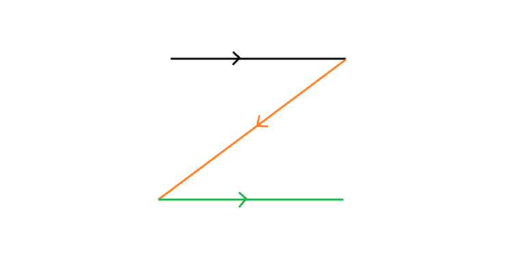
Remember that these Z-patterns do not have to follow the theoretical Z-shape. There can be ‘n’ number of Z-angles in the pattern.
If your email has multiple messages to convey in small bits, a Z-shaped pattern will work the best for you. It is a great option when you want to control the eye movement of the readers.
However, you must keep in mind that every user will not read or scan through your emails in the same way. The aim should be to direct the viewers on their reading path and then tempt them to click on the CTA.
How to design for the Z-layout?
Include the main components in the top horizontal line. This section will bring the maximum reader attention.
The diagonal line should lead the users to the CTA button with an informative copy.
The bottom horizontal line will feature the CTA and drive the subscribers to take action.
Alternatively, you can also add the CTA at the turns of the Z-pattern. That’s where the eye movement of your reader takes a pause. Many marketers choose to add a CTA in a repetitive pattern at several turns. As a result, the subscribers will be convinced to click-through and take action.
Another important factor that you must consider is the font size. The headline must have the largest font followed by the email copy. Decide the font size of your CTA in such a way that it encourages the user to click-through.
Lavva sends out a nice email that perfectly follows the Z-shaped visual hierarchy.
See how they have placed the CTA buttons at different turns to encourage the user to take action.
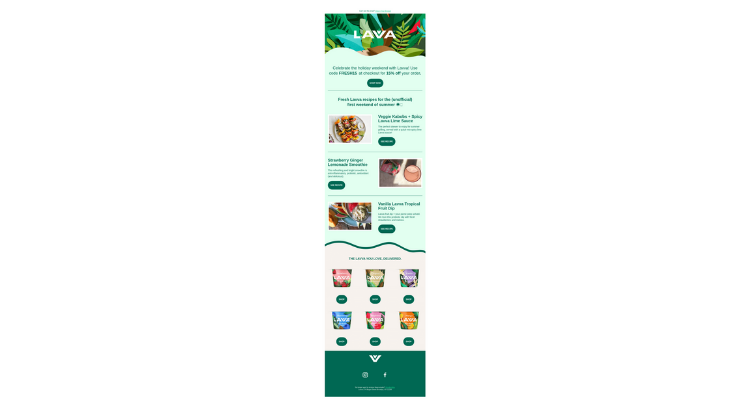
[Source: Really Good Emails]
03. F-Pattern
The F-layout is suitable to design emails where you have a lot to convey to the readers. While the Z-pattern is used for simple emails with primary focus on the CTA, F-pattern comes into the picture for content-centric emails and newsletters.
Back in 2006, the Nielsen Norman Group (NNG) pointed out the F-shaped reading pattern while carrying out an eye-tracking study. They assessed the behavior of 200+ users reading thousands of web pages.
Based on this research, they deduced that:
- Generally, the user starts reading in a horizontal pattern from the top of the content area. It makes an imaginary top part of the letter F.
- Subsequently, they move downward and read in another horizontal movement, which is shorter as compared to the first one.
- To end with, the reader’s eyes move in a vertical manner to create the remaining part of the letter F.
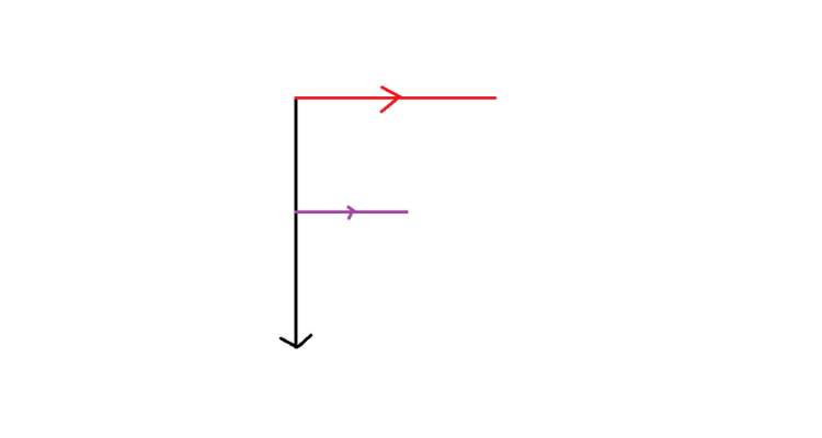
Just like the Z-shaped pattern, remember that it will not form a perfect ‘F’ shape as we studied at school. It will look like a rough outline resembling the letter F.
How to make an F-shaped layout work for your emails?
- Prioritize the most important and least important part of your emails and arrange them accordingly.
- Place the most important information in the ‘hot-spots’ of the layout to encourage better subscriber engagement and interaction.
- Set the right expectation by including the most necessary information in the first horizontal section.
- Use power words while starting new paragraphs.
- Take the help of bold formatting to highlight essential information and CTA buttons.
- Make the content easily consumable by using bullet points and separators.
- Do not overwhelm the readers by including too many ideas in a single content block.
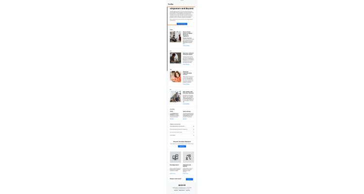
DocuSign has sent out a detailed email that adheres to the ‘F-shaped’ layout without any information overload for the readers.
Wrapping Up
Visual hierarchy is not just about making your emails more readable for your subscribers. It is about creating an aesthetic appeal and extending your brand personality. I would like to sign off by saying that test the principles discussed here and figure out what works the best for your subscribers. No matter which principles or layout you choose, visual hierarchy lies at the core of high-converting email designs.