Last updated on October 5th, 2021
Call-to-action buttons are of crucial importance to any website. These are the buttons responsible for helping the customers to do some buying action. Once visitors have read the content and required information about products and services, it is time for them to buy things from the site. But it is not just purchasing of products or services but subscribing to newsletters etc. also tasks too are performed through these buttons.
But success of call-to-action buttons for a website business depends on their positioning and colors. Remove the clutter from web pages and position the buttons at right areas. On higher side of the page, the call-to-action button should be placed on the right hand side and they should be on the left hand side at the lower level pages. This is because top half of a web page is usually scanned from left to right while the ending pages generally focus at the left side for more important information.
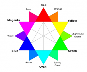
Colors are crucial to lay emphasis on importance of information including call-to-action buttons. Make sure that these buttons should shine to catch attention of the visitors. You should not settle for a particular color and instead choose the colors that identify the industry. Such as green is the color for food industry and blue for social networking site. You can choose such industry specific colors for your call-to-action buttons so that customers have more confidence in your business.

