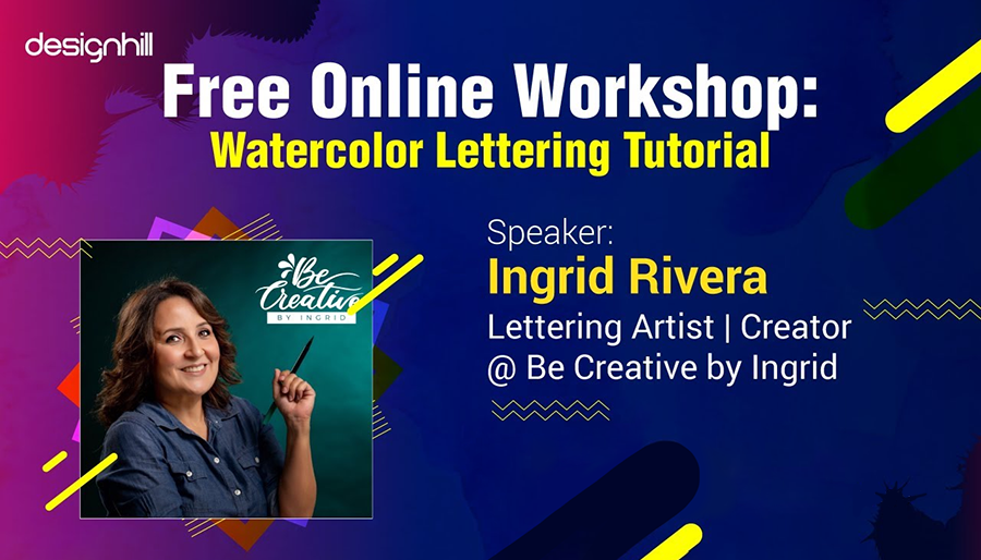
A key characteristic of watercolors is that they look natural. Since everyone wishes to be one with nature, the use of watercolors is widespread amongst artists. Watercolor lettering is one such art that catches our attention quickly for its eye-pleasing use of colors. Designhill conducted an online lettering workshop with lettering artist Ingrid Rivera who showed the right way to create lettering with watercolors.
Watercolors are generally associated with beautiful paintings. But these are also mesmerizing colors when it comes to doing lettering. Watercolor lettering is now widely used for its display on social media and other platforms to convey a message.
Designhill, the leading creative marketplace, thought of organizing a workshop for its community of lettering artists to give them some useful tips. So, on 23rd April 2021, the marketplace had a workshop with lettering expert Ingrid Rivera Diaz on how to do watercolor lettering professionally.
About Ingrid Rivera
Ingrid Rivera has always been fascinated by letter styles, what they look like and what they represent. She has her own company called Be Creative by Ingrid, through which she is dedicated to offering workshops on watercolor and lettering. In 2020, she made a collaboration with zebra pen USA, winter zebra mild liner highlighters campaign through their social media.
In this post, we’ve shared the workshop video and transcript in the form of Q/A where you can learn more about watercolor lettering.

Transcript (Q/A): Here Is How You Should Proceed To Do Watercolor Lettering
Designhill: What do you need to have for watercolor lettering?
Brush Pens
Ingrid Rivera: For today’s worship tutorial, we will use brush pens. These are basic brush pens. Right now I have 30 markers. These are the ones I’m going to use because they are one of my favorites. After all, the ink is liquid, and it is easier for me to do the blending or the gradient in the watercolor paper. If you don’t have any markers, you can use an older brush pen. Tombow is one of the main brands of brush pens. If you don’t have that kind of brush pen, any other market water-based will work.
Markers
You can use Crayola markers, stapler samples, Sharpie, and that kind of marker. It doesn’t need to be a brush pen to do the job. But if the marker as a brush pen works, it would work fine. Any fine teeth marker brush water base will do. Also, you are going to need water. This is a water brush fan or Aqua brush. I prefer to use these when I do blending in my letters. That is because this is very fine. I always use them when the bristles are wet. You don’t need to refill the brush in a jar.
A Fine Brush
But again, if you don’t have this amazing tool, you can use any regular brush that you have. You will need a fine brush, probably size one to size four, maybe size six, not bigger than that.
Paper
You will need paper and some napkins because you need to clean the tape of your brush.
A Pencil and Eraser
When you switch colors, you are going to need your eraser and pencil. You can use any pencil. But I just recommend that when you do the lines or you do the layers please do it very lightly. Because after we finish we are going to erase them.
So try not to apply too much pressure. If you have a personalized ceramic plate, you can use that if you don’t, it is. Like most, I use this to mix colors if I need to. I always have one close to me that is a nice tool. If you don’t have a plate, a plastic plate, we’re not falling trees or any plastic paper.
What else do we have, of course, a fine liner? If you don’t have a fine liner like this, you can use regular thin blue because please we are going to add details at the end to decorate our composition. So, we are going to do some gradient reading. Radiant yes is a technique. A method is like an ombre effect when you have some color from dark to light. ,
Doing the gradient
Ingrid Rivera: So, I’m going to do some samples here before we start. Because I want you to know a little bit more about how to do a gradient and how you can combine colors. The paper we are going to use is watercolor paper. If you don’t have watercolor paper. You can use mixed media paperwork, watercolor paper and 140 pounds or 300 grams will work better. That is because it holds more work.
Pick the right paper
Ingrid Rivera: I have two different kinds of paper here. This one is a Canson watercolor paper, one of my favorites. The texture of this paper is very beautiful. These arches of paper are one of the favorite papers for white-color artists in the world.
I love the texture of the paper. But today, I’m not going to use this texture. This is because this paper is too absorbent for the work we are going to use today. Why don’t we need an absorbent paper for today’s workshop? That is because we need to work very fast or at least try to work fast. So, it is very absorbent and is going to dry faster. It does not take much time to mix the colors or the gradient or the blending.
Direct blending
Ingrid Rivera: So, here I am going to do a direct blending. Direct blending is when we deposit paint directly in the paper. And then we do a gradient. It looks very nice and beautiful because this ink is liquid.
The good thing about these water brush bands is that it is always great if you need to press a little bit here in the belly. So, please don’t do it on top of the paper. So, can you part because you can damage your work with this single water drop.
The paper from arches is very absorbing, and we need to use more water. This is why I’m not going to use this paper but it is very nice. There is a difference in the use of a wet brush pen and a dry brush pen. It is much easier for me to do the blender and the grading. Gradient means using two or three colors the same with the same view. Then, you are using the color and spreading it around to clean your brush fan. You keep using clean water and then you can see the ombre effect.
I just want you to see the difference between the two papers. So, this is a sample of how the training looks in two different kinds of papers. That is even if they are the same specifications while they are very different brands. Paper is one of the main goals though for our compositions. Everything matters, and not just the ink or the tool, for the final composition. Not every paper works the same, even if they have the same specifications.
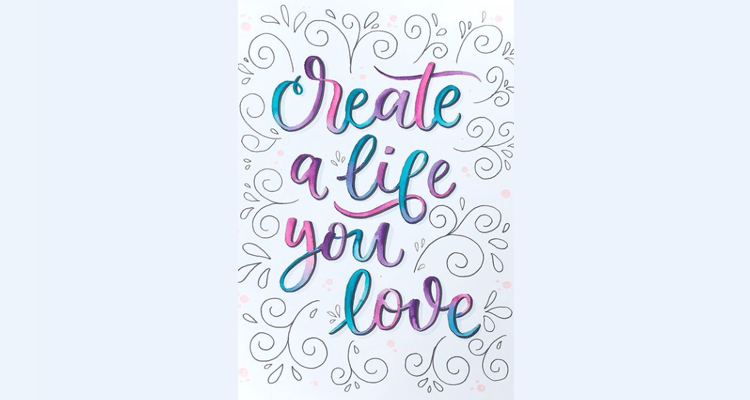
So, we are so ready to start. We will create a phrase that says – Create a life you love. This is going to be our quote for today.
Draw outlines
Ingrid Rivera: First, use a ruler to trace some margins. When we do some compositions, we barely do them by hand or hand-eye, sometimes we don’t use rulers. We are going to make some guides for you. I’m going to press a little bit hard to see if like an inch from each side of the paper. I have this 9 by 11-inch paper. It helps to balance the letters. We don’t want one word at the top, it is like when you have a frame and see that it is not balanced. This happens when we create phrases or words. So, even if you don’t have any specific rule in lettering, you overcome the leveling issues.
Use a pencil to trace letters
When I want to do my lettering I always trace with my pencil first. This is because I don’t want to miss anything while lettering. Also, I do not want to waste too much paper. So, here I am writing the letters of the phrase – Create a life you love.
Trace letters with a light brush pen
Ingrid Rivera: Now, I am going to use this very light grey brush pen. If you don’t have grey you can use any other ink. Now, we are going to use a technique. When you do brush lettering, the downstrokes are bold and upstrokes are thin.
Select colors
I’m going to use three colors – pink, galactic purple, and turquoise. Now, I will erase the pencil marks to clean the letters so that only brush pen marks remain.
Now, we are going to color letter by letter and not paint the entire phrase because the ink is going to dry. So, it will be a little bit more difficult for us to do the mixing of the colors and blending of the grey.
Track The Line
Ingrid Rivera: Now, we start with our water brush pen. Try not to get out of the line of the letters. This is why we trace the phrase with grey color so that you can add more color. A good thing about these markers is that you can add color when the surface of the paper is still wet. The colors appear very rich and bright.
Add water when required
Ingrid Rivera: I’m going to add a little bit more water here as I deposit color on the wet surface. Here I am applying this beautiful color purple to the letter. The paper doesn’t need to be wet for you to possibly color. You can add color to the dry surface.
So, here I am using my favorite color blue. If you don’t know how to combine your color, you can always use the color wheel. If you don’t have the color wheel, we have today a lot of applications today. You can find a very nice tool to help combine and choose the right colors.
Let the colors dry
Ingrid Rivera: Once you are done with coloring the letters, make sure that you let them dry letter by letter. I need to let them dry before I continue. All the three colors I used today are going to look like we have a team. Please try not to mix two colors.
Again, I’m using Canson paper, one of my favorites. It is more inexpensive, very accessible from shops and online. Now, I have finished coloring the letters, and only the remaining space at the border of the paper is to be filled.
So, now we are going to add very quickly some doodles that I used to decorate around the letters. These are in the form of some hearts, dots, and lines. Here we have a rectangle area to decorate. Sometimes this area is a circle or square.
Decorating empty spaces
So, we are going to make these doodles inside and we are going to draw in these empty spaces. We call them the negative areas where we are going to decorate. You can trace by pencil first if you want. Draw some thin lines.
We have a nice space at the corner of the paper that needs to be decorated. So, I draw this space with a line with a pencil inside out. We have this folder space where we draw the lines again inside out. I am going to add more little details in these other areas of the paper. Then, after I am finished with drawing the pencil lines, I trace these lines with a pen or Tombow.
You can use a heart shape or lines because I want to cover the empty space at the border not too much. So, I am not doing too many doodles. Now you need to wait for the colors to dry before erasing the pencil lines.
Designhill: How to identify where to make a stronger color over the lighter one?
Use color wheel
Ingrid Rivera: I recommend you use the color wheel to identify what kind of colors you need. The wheel helps you to identify the kind of darker colors you need to use over the lighter colors. So, you can find different hues of a darker or lighter color. The easiest way to lighten a color is to add clean water to it.
I don’t recommend mixing complementary colors as they are the ones on the opposite sides of the wheel. So, if you mix those colors you’re going to get darker colors. If you want to mix colors, use the colors that are by the side of the wheel and not on the opposite side.
Designhill: Do we always have to use watercolor paper or can we switch it to anything?
Ingrid Rivera: I recommend you can use watercolor paper. As I mentioned at the beginning, I prefer 140 pounds or 300 grams. When we use water in papers, we need special paper. If we use water in any other regular paper, we’re going to break the paper. So you will need to be very careful when you buy the paper.
Make sure that the paper you are using is watercolor paper or you can use the other one as a mix. Mix media is good for watercolor, but the paper is very thin. So you probably can use it. You can do this kind of lettering work on this paper, but it will hold less water because the paper is thin.
Designhill: What practices or exercises can you recommend for us to have a light hand and steady brushstrokes?
Practice daily with loose brush pens
Ingrid Rivera: I used to practice every day with loose brush pens. The light strokes are when you don’t put pressure. But, your hand is very shaky sometimes. Therefore, practice, exercises, and draw your lines in pencil and try to follow the lines. Daily practice will help you get the knowledge of tools that will tell you to use the API using water brush fans or any regular brush.
As I say you can draw lines and then paint down little lines, one by one, stroke by stroke. But practice every day. That is the key for you to succeed in every piece of things you’re doing, especially here in the art.
Designhill: Can we use watercolors instead of brush pens?
Ingrid Rivera: Yes, of course, you can use it. You can use your watercolor pens, tools, or pens or pencils, and watercolor pencils to prepare them beforehand. So, you need to get all your callers ready before you start to pay your lawyers. Because you need to work fast. You need to get ready for the tools or the course you want to use and prepare the needs.
So, these are the tips you should be considering while practicing watercolor lettering. Make sure that you have patience when learning the tricks. You will take time to finally master the lettering art using watercolor.
If you are a lettering artist, you can hope to make it big in the field. You can sell your lettering art at your price to earn an attractive profit. To do that, think of opening your online store at PrintShop by Designhill.
At this Print On Demand platform, you can not only display your lettering artwork regularly but sell them as well. So, get started with it to sell your artworks with a big profit.
Wrapping Up
Watercolor lettering is an attractive art that most lettering artists are following. The new entrants in this field should, however, learn the basics of using watercolor for lettering. They should be careful while mixing colors and using water and pick their tools such as brush pens.