Last updated on November 23rd, 2022
Graphic designers love to play with fonts as these elements are crucial to give personality to a design. A strategic choice of typography helps convey a brand message to the target audience and build a memorable visual identity. To achieve that aim, designers work with different font combinations to create visually aesthetic designs and make an impact on the audience.
Typography is vast. You can locate hundreds of typefaces on the web, and a majority of them are accessible free. Graphic designers use most free fonts that were once created as exclusive fonts but later became commonplace due to overuse.
Now, plenty of designs have the use of freely available fonts since creating a new and unique font is usually not budget-friendly for small businesses. Then, paid fonts also are available to the designers or business owners who have a good marketing budget.
However, fonts make the desired impact only when they are incorporated strategically in graphic design. If they appear randomly in a design, they fail to serve a purpose and add no value to a brand.
Therefore, experienced designers pick fonts based on several factors such as the target audience, brand message, aesthetics, company’s future plans, and so on.
But freelance graphic designers mostly like to use fonts in combinations. They rarely use the same font across the entire text body as it makes the blog or any other text-based design monotonous and dull. Instead, a better way to create attractive designs is to use at least two fonts that look different in terms of style, weight, and other overall appearance.
Before you also set out to create a font based design, have some insight into its different aspects.
What Is Typography?
Typography is all about how a letter or word will appear in print. The emphasis here is about the impression it will make on viewers when printed. So, we can say that typography makes a letter look visually pleasing with a sense of aesthetics also take care of. But is it a skill? During the pre-digital age, typography was certainly a craft as a lot of processing went into putting those letters in place and turning them into blocks for printing a book or magazine, etc.
In the modern digital era, however, the craft side is now missing as fonts are readily available to the users on the web. Even kinetic typography for motion designers is available in plenty.
So, now typography is today more a matter of choice for the designers. Most of them do not create fonts as they have plenty to choose from. But, to some extent typography art is alive in the sense that the designer has to create a visually impactful and appealing piece.
Why Is Typography So Crucial?
Any design that uses text even in a smaller proportion, it involves typography. Big text-based designs such as blogs and websites use many aspects of typefaces carefully for the desired impact and result.
No designer can ignore typography as it is an essential part of creating something unique and attractive based on the use of letters. Even when a typography generator can churn out fonts in plenty, the designers have to pick a few of them carefully as per specific design requirements.
Here Are Some Major Advantages Of Typography For Businesses
01. Grab Your Audience’s Attention
When people’s attention span is fast eroding, typography can catch their eyes for a while at least. If the content has some value for them, they can then spend more time with it to read and get the message. So, a typography logo that uses a delicate pairing of fonts is likely to catch the eye quickly.

A combination of bold and smaller typefaces, for instance, produces the contrast to catch our eyes immediately. Similarly, an elegant handwritten typeface holds out attention and fills us with joy. Brands, therefore, can use this power of typography to drive potential customers’ attention.
02. Create An Information Hierarchy
A big chunk of text is not easy to read if there are no variations in the use of fonts. The reader will miss important information. But when tactically used, typography can draw attention to an important piece of content instantly.

For instance, the title is usually in a bold typeface as it tells about the subject of discussion in a blog. Then, subheadings and the text body are designed in a different font. In this way, viewers can even know which is the most and least important detail by glancing at the page or site.
03. Build Recognition For Your Brand
Typography gives personality to a design. Viewers can know about the type of business a design represents at a glance. So, careful use of typefaces can make viewers aware of the brand.

When the font use is unique and creative, the typography design becomes visually appealing. In this way, typography is crucial to helping the audience recognize a brand instantly by merely looking at its visuals.
Take, for example, the logos of Disneyland and CocaCola. The handwritten typeface used in these logos has become identities of these global brands. Other examples include FedEx, Samsung, and Nike.
04. Convey A Mood
A skillful graphic designer knows how typography can help create a mood for the viewers. For instance, the use of serif fonts is generally preferred to convey the professionalism and seriousness of businesses that run in a formal environment. But sans serif fonts typically help create a friendly mood. That is the reason that social media logo designs are mostly in sans serif fonts.
What Is The Font Combination?
Font combination is also known as font pairing. Generally, designers consider font combination to create a contrast for viewers. But when two or three fonts appear in a design, they complement each other. So, the combination not only produces a contrasting effect, but all the fonts used in the design should visually supportive as well.
We can say that font combination is about setting fonts against each other. So, the designers will choose fonts that have opposite styles but can work together well.
What Are The Best-Known Font Combinations?
Creative graphic designers experiment a lot with different font combinations. They do so to find out the right combination to produce the desired contrast and impact.
The most designer will avoid the most used font pairing and rather prefer pitting two or more fonts against each other in a unique but creative way to stand out.
However, some font combinations help create visual pleasure. You can use the contrast of their different personalities to get easily noticed and also to convey your brand message. These combinations include:
i. Montserrat & Courier New
ii. Rockwell Bold & Bembo
iii. Helvetica Neue & Garamond
iv. Playfair Display & Source Sans Pro
v. Raleway & Lusitan
vi. Super Grotesk & Minion Pro
vii. Amatic SC & Josefin Sans
viii. Century Gothic & PT Serif
ix. Source Sans Pro & Times New Roman
As a general practice, graphic designers like to incorporate body text in certain fonts. These fonts include Vision, PT SANS, Bifocals Grotesk, Alte Haas Grotesk, and Roman Serif. For display text, they typically use Eva, Geizer, Konstant Grotesk, and Ridgeline 201. All of these fonts are available free to the designers.
These and many other fonts and their combinations create personalities for designs so that the target audience can get the brand message immediately. Remember that the designers choose fonts from major categories and combine them to target audiences with a message.
As far as different categories of fonts and their usage are concerned, the designers have some specific choices. Typically, the designers use serif fonts as part of their typography design ideas to convey traditions, the formal environments of govt offices, security, safety, reliability, and history.
Sans serif category of fonts finds use mostly to create a less formal and friendly personality of brands. These types of fonts are clean and modern in their design. But to convey elegance, romance, grace, and a sense of feminism, the designers generally use script fonts.
Considering these values of fonts, designers usually pick them for certain businesses and industries. For instance, fashion bloggers typically use Helvetica Neue thin, Gotham Black or Montserrat Bold while IT companies have Simplifica, Pier, Big John, Slim Joe, Moon in their visuals identities.
The financial sector uses Gotham Narrow, Clarendon, Bembo, FF Kievit, and Andrew Samuels. Similarly, wedding photography businesses depend more on elegant fonts such as Roses, Anisha Script, Beautify, and Hunter River.
When it comes to combining these fonts, an experienced designer will evaluate the mixed impact they will create on viewers.
Now that you have some insight into the major aspects of fonts, it is time now to learn about how to combine them for the desired impact.
How To Choose The Perfect Font Combination To Create A Design?
Picking the right combination of fonts is surely a challenging job for any graphic designer. Since hundreds of free fonts are accessible, it only creates a problem of plenty.
Therefore, the designers have to consider a lot of aspects of pairing the choice of fonts. It is after taking all of these aspects into account that a designer finally chooses the right combination to reflect a brand’s personality and identity.
So, Follow These Basics To Ascertain The Right Font Pairing
01. Avoid Using Typefaces From The Same Categories
The first basic to consider for a wiser font combination is to avoid using typefaces from the same categories. If you do, then your design will lack in contrasting effect.
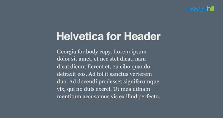
For instance, when using Helvetica font for header, which is a sans serif font, then use Georgia in the body text, which is a serif font. This gives a design a pleasing contrast to viewers.
Similarly, for instance, use slab fonts with script fonts to create appealing designs. This is because slabs are the types of serif fonts that have block-like projections at the end of the letters. Whereas, script fonts link each letter to the next one and are usually preferred for display or headings.
02. Contrast Font Sizes And Weight
When using a font, pay attention to its size and weight in contrast to the other fonts used in a design. This measure helps in making the contrast even more effective. There should be enough difference in sizes between two fonts.
So, a difference of merely, say, 8 pts is not good enough. But near around half the difference between the font sizes used in the title and body text is most useful to create the desired contrast.
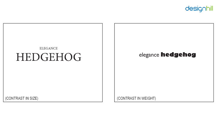
The big enough difference of font sizes will help readers grasp the information easily. It makes reading a blog or website content a stressless exercise. Different font sizes also create a visual hierarchy for viewers so that they can pick the most important information first.
Font weight also is a tactic for designers to achieve contrast as well as a hierarchy to make a typography idea visually appealing. Use bold, heavy, and black fonts for title and contrast it against a light font for the body text. In this way, viewers can quickly catch the headline first and then settle to read the rest of the content.
03. Use The Same Fonts For Consistency
Another tip to consider to use typography to achieve perfect font combination is to ensure consistency. Make sure that you use the same font for that particular purpose throughout the design.
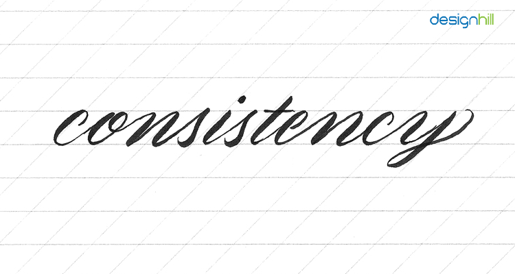
For instance, use the same font for headings and another same font for intro everywhere in your blog site or website. Similarly, you can use another font consistently for body copy. This is also a way to win a reader or customer’s trust in your business.
04. Pair A Personality Font With The Neutral One
Do not make the usual mistake of pairing a personality font with another one that also has a strong personality. That way, both fonts will lose their domination over each other. Consequently, the reader gets nothing in terms of viewing pleasure and readability.
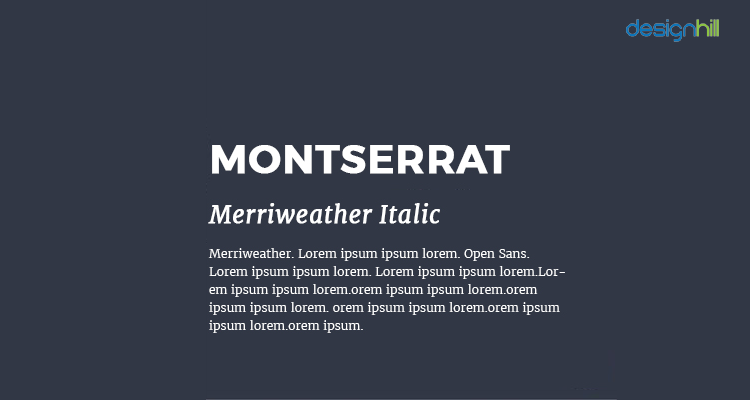
For instance, if you combine a script font like Blackjack for a headline with another script font Milkshake, it will create a jarring design. But if you pair Blackjack with a neutral font such as Montserrat Light, it helps create a viewing pleasure due to the contrast. In doing so, you help the personality of the headline font come up distinctly. So, avoid two personality fonts.
05. Use Fonts From The Same Family
Think of using different fonts from the same typeface family. It is your effective way to produce the contrast that you were looking for in a quick time. You do not have to waste a lot of your valuable time in comparing many font combinations.
Just pick the right typeface that conveys the personality and message of a brand. Then use it in the headline in a bold and black while create the body text in the same light version of the typeface.
For instance, a Helvetica Black for a header combined with a Helvetica normal for body text or a Raleway Black Head and Releway Thin is a perfect combination. However, you should avoid pairing fonts that look too similar as they have very little contrast. Such font pairing becomes problematic for establishing a hierarchy.
06. Create Design With A Limited Number Of Fonts
Another thing you should pay heed to is to limit your number of fonts. Do not use more than two to three fonts for one project. Follow this rule of thumb to design content for magazine spreads and other editorial designs.

However, you can even break this rule for some design projects that demand multiple fonts. If you intend to create a fancy design, it will surely use a variety of fonts. If you have to use more fonts, then make sure to assign a motive to each font. If you can’t do that, then it is better to restrict the use of fonts.
07. Keep Away From Conflict
While achieving a good contrast may be your goal when using typography, ascertain that there is no conflict between the fonts. The use of different fonts does not necessarily mean that they will go along well together.
For instance, you used a combination of sans-serif and serif fonts to present the contrast. But if they appear totally different from each other, it will ruin the design.
For instance, if a typeface is very rounded and its letters are well-spaced, while the other typeface has taller letters with little space, then there is a clash between the two. You should avoid using fonts in this manner.
These are the important tips to follow when you intend to pick the right combination of fonts for the desired results.
In case you are not a designer yourself and need a great blog design or website design etc. text-based designs, you can outsource the work to Designhill. This is a leading creative marketplace that is home to thousands of graphic designers.
Just launch your design contest with your brief, and you can then get a winning design with the font combination that suits your brand personality.
Wrapping Up
Font combination used in graphic design with a purpose is a way to reflect a brand personality. It also helps in delivering the intended message of a brand to the target audience. To achieve the right font pairing, use fonts of different personalities and styles to build contrast in a design. Avoid using too similar fonts but think of pairing those fonts which come from the same typeface family in bold and thin style. But keep away from the fonts that conflict with each other and use a limited number of fonts.