
Last updated on January 2nd, 2018
Typeface is one of the key design elements. It plays even more important role in logo designing as it lends a personality to the logo. But a wrong choice of typeface yields the potential to damage a client’s business interest due to wrong message conveyed to the customers. The importance of fonts can be gauged from the fact that a majority of the logo designs are actually based on fonts. For example, the logos of global giants like Samsung, Coca-cola, Dell, Mail Chimp, Visa, Cad bury and Federal Express are text logos solely based on a specific font choice.
In this article, You will know How to Make Creative Use of Typeface in Logo Designs
1. Make A Careful Font Choice
For the creative logo designs, functionality and clarity of the font is a major consideration. Clarity here implies that the visibility of the font is ensured even when viewers see a logo from a greater distance. After all, a logo is a means to advertise your business and so its quick visibility matters a lot. But, avoid the fonts that are too thin due to their lack of clarity for the viewers. They are mostly for the sake of aesthetics in some logos. Functionality involves the purpose of the font. The client’s business message from the typeface is the main purpose behind its selection.
Here are two font choices for the same creative logo designs. The logo is of a financial advisory firm. Note that the company wants to convey a message of trust to its clients. The first logo has fonts that seem to be informal in style and convey non-seriousness of the business. The font also lacks in clarity as the letters are too close to each others. But the bottom font is a clever choice as the letters give the impression of a business being professionally conducted. The font is simple, elegant and clean.
2. No Harm In Use Of Existing Typeface
If you are on a tight budget, you can make minor changes in an existing typeface to give it a new look. Many existing fonts are great and look good enough to carry your business message effectively. They are accessible free of charge as well. Just as you tweak them here and there, the fonts take a new shape. You can safely use them without fear of creating a cliched logo designs.
However, if you can afford, hire a typeface designer to create a unique font. Such unused fonts will certainly give your logo a unique personality and will help in building a brand image also.
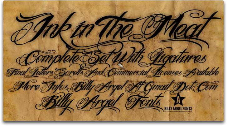
3. Avoid Too Fancy Fonts
Professional logo designers know how risky fancy fonts are for business. They understand that people take a client’s business as the one offering low quality products or services, if it is represented by a logo created with fonts that look too fancy. Such fancy look of the fonts gives the impression of a non-serious business, unless it is related to some fancy items or children’s toys etc.
Instead, pick up the fonts that are classy and simple. Only such typefaces are capable of attracting the serious customers to your business as they will recognize your business for quality offerings.
The below mentioned typeface is surely a bad choice unless you really need it. The letters are too fancy for the modern viewers and many of them will not be able to read the letters from any distance.
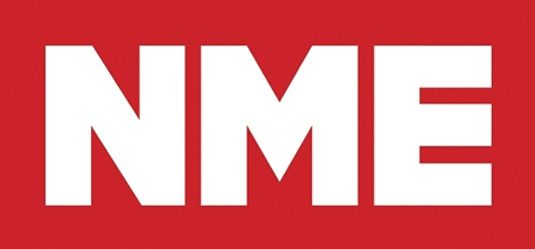
4. Match The Typeface With The Brand
The typeface choice should be based on its purpose for the brand. You need to build your brand identity through your logo designs. For example, if your brand’s message is about strength, you can choose slab type fonts that are big and powerful. If the message is to convey class and style, then elegant scripts and serifs are the ideal font choice. Similarly, if you need to convey forward thinking and movement to create brand identity, then slanted fonts are generally ideal choice for logos.
Here is an example of how fonts match with the brand. The logo mentioned below is of British indie magazine NME [New Musical Express] which is a music industry institution. The company wished to convey the message of authority through its logo. So, the designer used a sans-serif font called Sharp-Sans, created by Lucas Sharp, and the simplicity of the font is capable of putting across the authority of the institution.
Looking for a fresh and unique web banner ads design idea? Launch a banner ads design contest today!
Choose from 100+ designs. Take your pick!
We offer a full 100% money back guarantee! Finally, a risk-free way of getting a customized design.