Last updated on October 25th, 2021
A few more days and 53rd NFL Super Bowl will be here! Since the beginning of this championship game, a lot of things have changed. In the last 53 years, the game, design and even taste have come a long, long way.
The day is nothing less than a national holiday where people load themselves with nachos and stick to the TV screen with family and friends. Everything about the championship game makes a headline, even its logo design! Like earlier, this year too, the NFL committee has unveiled a new logo.
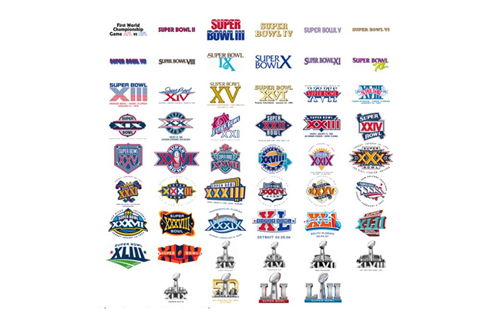
If you go back in its 53-year history, you will find that its official logo went through various changes. It, in fact, evolved from random lettering and Roman numerals to colorful yet symbolic zing portraying the cities hosting this game. It is the uniqueness of the Super Bowl logos that helped businesses to establish their own brand identity.
But before we dig deeper into its logo design, here is how Super Bowl event came into existence.
Let’s Have A Look At The Super Bowl Event first
The Rise Of The Super Bowl
The AFL and NFL — the two football leagues — faced each other in 1967. The event was known as the “1st World Championship Game AFL vs. NFL.” Both the leagues were a rival of each other. While the NFL had its football legacy running for forty years, the AFL debuted in 1960. In the months these two rivals faced each other, gave rise to a better yet more laconic name — The Super Bowl.
Later in 1970, the two leagues merged. However, the name “Super Bowl” grew into a cultural spectacle for people. You can get a hint of this cultural spectacle in its logo itself.
Super Bowl 2019 Logo
Well, after seeing the Super Bowl 2019 logo, we will find that nothing has changed. Yes, nothing has changed but the roman numbers.
The logo design follows the same illustration and format as of 2017. It has “L” positioned to the left that symbolizes 50 in roman numerals. While “I”‘s are positioned to the right symbolizing 3 (LIII= 53), Vince Lombardi trophy placed in the middle.
The heavily templated logo showcases a silver gradient with a tinge of a little darker shade of blue as compared to its predecessor.

The NFL had a history of introducing a dramatically different logo for the much-awaited Super Bowl event every year. The logo was based on the location where the game was organized. They even used Roman numerals to add a punch. But for the past couple of years, the logo design remains the same.
Landor is the designing company that has taken the responsibility to create the logo ever since after the Super Bowl 45 held in Arlington. Although the logo is a strikingly rendered illustration and designed by a professional graphic designer, it lacks colors.
Evolution Of The Super Bowl Logo Design
The first ten years or so of this sporting event, the design of the logo had two focal points— Super Bowl. The words were printed like a headline, a banner with Roman numerals side-by-side. The designs weren’t static but varied widely. But after a few years, it introduced consistency in design on a regular basis.

Conclusion
All in all, the Super Bowl logo that used to be a source of inspiration and creativity, each year is static now. It has just a silver gradient effect with blue (a little darker shade) punch, Vince Lombardi trophy and Roman numerals, noting refreshing but a predictable design. We suggest you add a punch of creativity when you create your own logo. It helps your brand attract eyeballs and engage the audience.
