Last updated on December 14th, 2022
Typography is almost an art and if its full potential is explored, the richness it can deliver to a website is beyond the ken of words. Sometimes, in an attempt to lend a flavour of uniqueness to their websites, web designer commit serious typographical blunders.
Here Are Top 5 Typography Errors Every Web Designer Should Avoid
1. Lack of proper leading
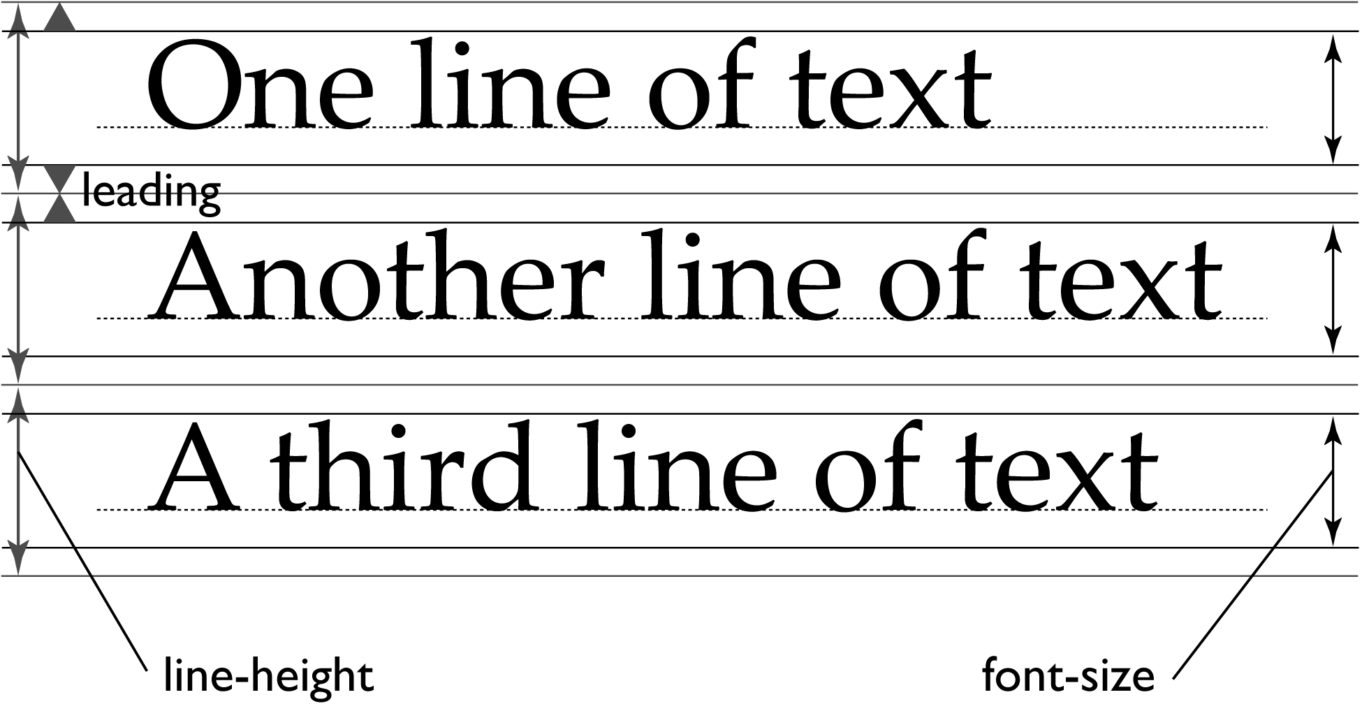
– Leading refers to the space created between two lines to make the textual matter more readable and clear. The space should complement the text font as well as the text matter, so that neither the text gets cluttered nor it looks too fallen apart. Here, the rules are governed by general practices that stem from user’s convenience and ease allowing them to read the text without much hassle. So, to ensure better user experience, it makes sense to judge the legibility of the text. Though it may require little brainstorming from the web designer, it is certainly worth a shot to incorporate prefect leading.
2. Inadequate tracking-
Space between individual letters of a word or a phrase is referred to as tracking. Some web designer try to add too much of tracking to the letters to make the text clear, while others just don’t care about it. Though the common practice followed by web designers tell that they use tracking as an adjustment tool to let the type fit within a line length. However, small adjustments are always permissible, major changes in tracking only for the sake of fitting the text aren’t advisable. Remember too much of tracking can seriously diminish the readability of text.
![]()
3. Text centering-
Many pro and novice web designers have already faced flake from design community for centering the text. It’s not that one must never center the text, but there must be a valid reason for doing so. Be it enhancing the look of the website or doing justice with the placement of your web design elements, centering the text is no mean feat. However, never try centering the text only to create a balance on your website.
4.Double spacing after full stops-
This mistake finds its roots in the good old days of typewriters, where the extra blank space was substituted to avoid placement of next character in close approximation to the full stop. Yet, as a web designer, it is your job to look after such things so that they do not reflect in the form of typographical error on your website.
5.Bad contrasting-
When visitors come across such typographical copy, they simply ignore and move to other sites, no matter how interesting it appears! This means a bad contrasting background with its inefficiency to deliver the text in full clarity impacts your website in a negative way. Bad contrast might appear when either the text is quite similar to the background color or appears on some tinted backgrounds.