Last updated on June 1st, 2022
What’s in a logo redesign? If you think like that, hang on. There have been many big brands that went under the logo design change. And Zara is one of them.
A few weeks ago ‘Slack’ came up with a logo redesign, then Kate Spade, now Zara. Yes, the Spanish fast-fashion brand has updated its logo keeping this ongoing trend alive. While other brands have been doing this by opting for a minimal logo design, this fashion retailer has decided to go just to the opposite direction.
The typical spaced-out look is no longer its essence. Instead, it has chosen overlapping letters as its brand’s face. Whether you know it or not, but it’s the second time, the retailer has introduced a new logo since its inception in 1975.
The first logo design was uncovered in 2010, nine years ago. At that time, it was a discrete update. However, at present, the brand took the help of social media channels— Twitter and Facebook to inform its audience for a drastic design change in its logo.
Who Undertook Zara’s Logo Redesign Task?
We all want to know the creative people behind the curtains, aren’t we? Well, “Baron & Baron” is the advertising agency that undertook the task. The company established by Fabien Baron— French editor as well as an artistic director who gained popularity for his work in Harper’s Bazaar, Interview Magazine, Dior, Coach, Bottega Veneta, and many more.
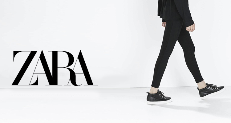
What’s New In Zara Logo?
The new typography introduced in the logo can be found on Baron & Baron’s website. Yes, that’s what makes its signature typography written all over its website (seems like a favorite, that’s why the same typeface has been chosen for its clients.) WINK, SHHHH
Let’s come to the point. The new design connects each letter of the brand. The letters “Z” and “R” have accentuated curves now. Each letter looks overlapping each other that look the same as Harper’s Bazaar in the 1990s. Compared to its earlier version, this one has a more complex and curvaceous style all with a brutal (yes brutal you read it right) kerning.
The new look also invokes its heritage and significance with all-caps, large lettermark logo. And perhaps, it indicates the brand’s goals to carve out a niche among luxury fashion brands.
All in all, the new design preserves its visual connections to its original typeface but has gone a bit further with serifs and overlapping letters. But Zara is not the only fashion brand that changed its logo. In fact, many fashion brands have made changes in their clothing logos to convey a new brand message by tweaking some design elements here and there.
How Did The Old Logo Look?

The previous logo of Zara featured a simple and elegant watermark with the custom typeface. The font has a Roman style with thin serifs. In other words, the previous logo was overly simple, predictable and generic. The spacing between the letters was more that offered it a compelling visual appeal.

Looking For A Logo Design?
We have helped thousands of business owners from all around the world with their graphic design needs such as a logo design, website design, social media posts, banner and much more.
Get Your Logo DesignHire A Freelance Graphic Designer
Netizens’ Reactions— What They Have To Say?

The moment Zara publicized its new logo, netizens started sharing their thoughts. While some hailed the transformation, some said that’s not a logo design they would expect from brands like Zara. And, in all this, there are some who started the meme gigs. Take a look at the given picture, and you will know how.
Conclusion
Love it or hate it, Zara’s new logo design gives a glimpse of its future marketing ambitions. The elegant space-full logo is no more its signature style. The fast-fashion brand has come up with a new logo with brutal kerning, bold serifs, no space and curvaceous “Z” and “R” letters.
What do you think of its latest logo design? Do share your views on the same in the comment section below.