
Last updated on November 15th, 2021
No matter what kind of business you run, chances are you’ve looked into running an email campaign now and then; if you haven’t, you should. Some marketers believe that monthly newsletters are a thing of the past, but really they’ve just changed from paper and ink to pixels and information technologies.
Today most newsletters are sent via email, leveling the playing field between large and small businesses. The independent retailer no longer has to worry about the high cost of color printing or the logistics of mailing out 100 or more newsletters at a single time when they’re the captain cook and bottle-washer of their online retail vessel.
However, getting into the field of email marketing requires an understanding of the design skill required to pull it off, and that’s where this handy email design guide comes in.
This is just a starter—your Designhill team or personal design assistant can help make sure that your final product hits all the right points in the right ways for your industry, but that doesn’t mean you shouldn’t learn the basics.
1. Design for a 600 Pixel Width
As addressed by SitePoint in their list of best practices for email design, emails are viewed on a multitude of devices, using a plethora of different clients and apps.
You need to be sure that your blast will look good on as many devices as possible, so designing to a width of 600 pixels assures it will be large enough to be readable on standard and large screens, and small enough to display correctly even on screens small enough to be handheld.
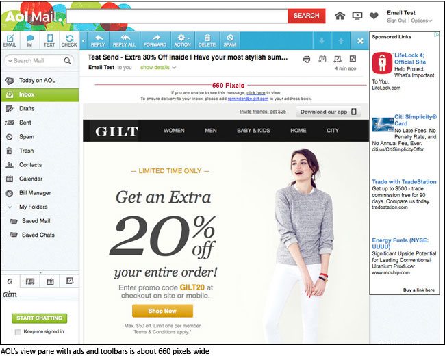
While many mobile devices now boast impressive screen resolutions, staying around this width is the safest way to be sure your carefully crafted design isn’t going to be cut off by limited screen space.
2. Use a Standard Typeface
You may use a custom typeface on your website, but there’s no telling whether or not every client’s computer will be able to display the chosen font correctly.
Sticking with a basic system font is the best way to avoid this issue entirely, and be sure that your design will display exactly as you want it to. You can work around this by using titles for graphics, but this makes the email’s “file size” larger and will make it take longer to load.
Overall it’s better to work within the display limitations and focus on the content of the email itself to speak more loudly than the typeface you’ve chosen to write the message.
3. Design for Reading
According to the Mequoda Group, data from-eye-tracking marketers points to the left side of the screen as being the main focus for the majority of email readers—at least in countries where words are read from the left to right.
If you’re designing for an international audience, it may be worth flipping your composition to accommodate the difference in reading habits.
Either way, you want to weight your design at least a bit on the side where your clients are going to start reading, using this side for your images, promos, et cetera. If you prefer two-column layouts, however, this can be mirrored or weighted to the opposite side instead.
4. Put Your Best Design “Above the Fold”
Consider the upper 600 pixels of your email to be the “fold” of the page; this is the point where most displays cut off the image, and users have to scroll to see below this point.
This means that you need to utilize it to the best of your ability, utilizing your logo, headline and other key information in this area. Don’t try to cram everything into a 600 by 600 pixel square, of course, but use the space “above the fold” to catch your readers’ interest.
5. People Sell to People
Digital Telepathy reports that readers respond better to pictures of other people in email newsletters than anything else, so try to focus your design around people.
Studies report that friendly faces are viewed as more trustworthy than anything else, no matter how great the product; there are even split test reports showing that the right utilization of human photography in your design could result in a conversion increase of over 30 percent.
You need to understand your demographics, of course, but overall people respond best to other people.
6. Keep the Cardinal Rules in Mind
Remember that email design is like all other forms of graphic design, and requires you keep the cardinal rules in mind as much as possible. Stick to your brand color scheme, don’t change up your logo, and keep your company image in mind.
Your designer or design team can only go so far without your help, so be ready to provide guidance on maintaining the right image without compromising the quality of your newsletter. Don’t forget to add email signature as well. The response your first email newsletter gets may just surprise you.