Last updated on June 6th, 2018
Sometimes, a simple technique can work wonders when you want to give a unique look to your graphic design such as poster design. Ink splattering is an easy but impressive technique that many designers use to give a casual look and feel to their designs. Ink splattering technique is relatively simple to follow yet gives you amazing results and proves to be a very useful way, especially when you wish to impress the viewers.
In Part-1 of this tutorial, you learnt how to set the document to create image of the Knight and technique to give it the faded look. In the Part -2 of this tutorial, you learnt how to create a faded and vintage look of the knight and the design. You also learnt how to create the impression of splattered ink in the design.
Now in this concluding part, we will complete the design by following easy steps to set the image by creating some blurring effect and then bringing back the image to life by splattering of colors.
Step -1
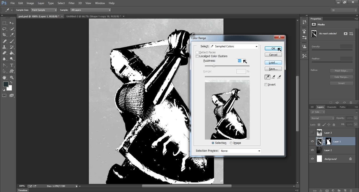
Let’s now turn the otherwise bright image of the Knight into a fading one. To do this, select the number that shows how much Fuzziness you want in the picture. Here we have selected 40 as the level of fuzziness.
Step -2
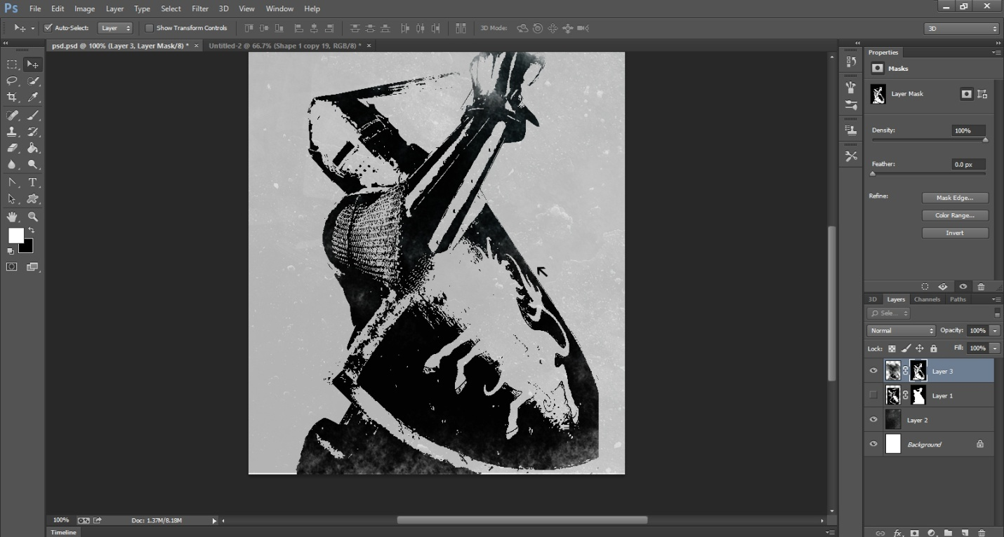
As a result of the fuzziness, we now have an image with a fading look. You can see the lion on the shield of the Knight is very blurry and the entire picture bears a worn-out look.
Step -3
Go to the Images and select Adjustment and then select Invert. This measure will allow for removal of the image and a white space will appear in its place.

Step-4
We now have a ghost image of the Knight with only the outlines of the image visible. This is because we have hidden the Knight layer.

Step -5
When we bring back the knight image, we can see that it is a little more faded for the effect.
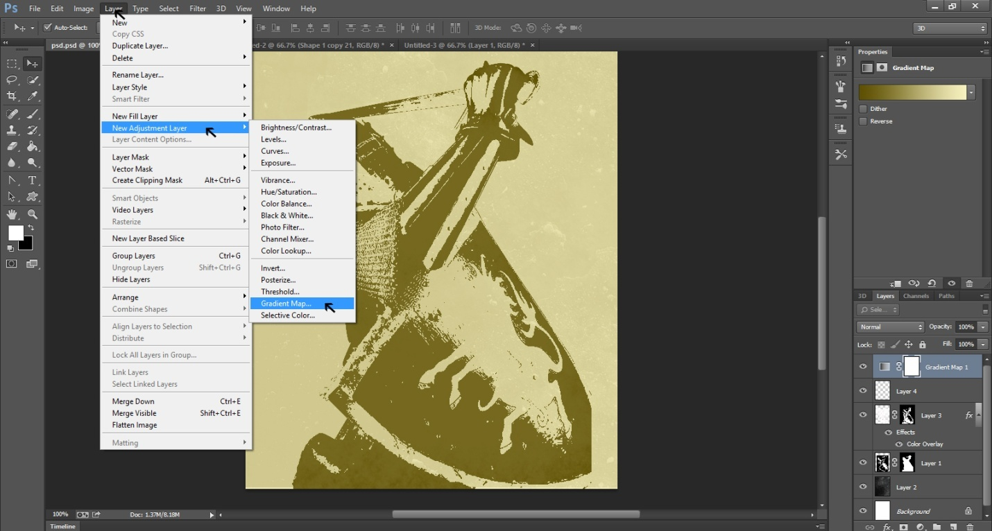
Step -6
Let’s now give the image some colors. Go to Layer and select New Adjustment Layer and then Gradient Map. This step will create a new layer for coloring the image.
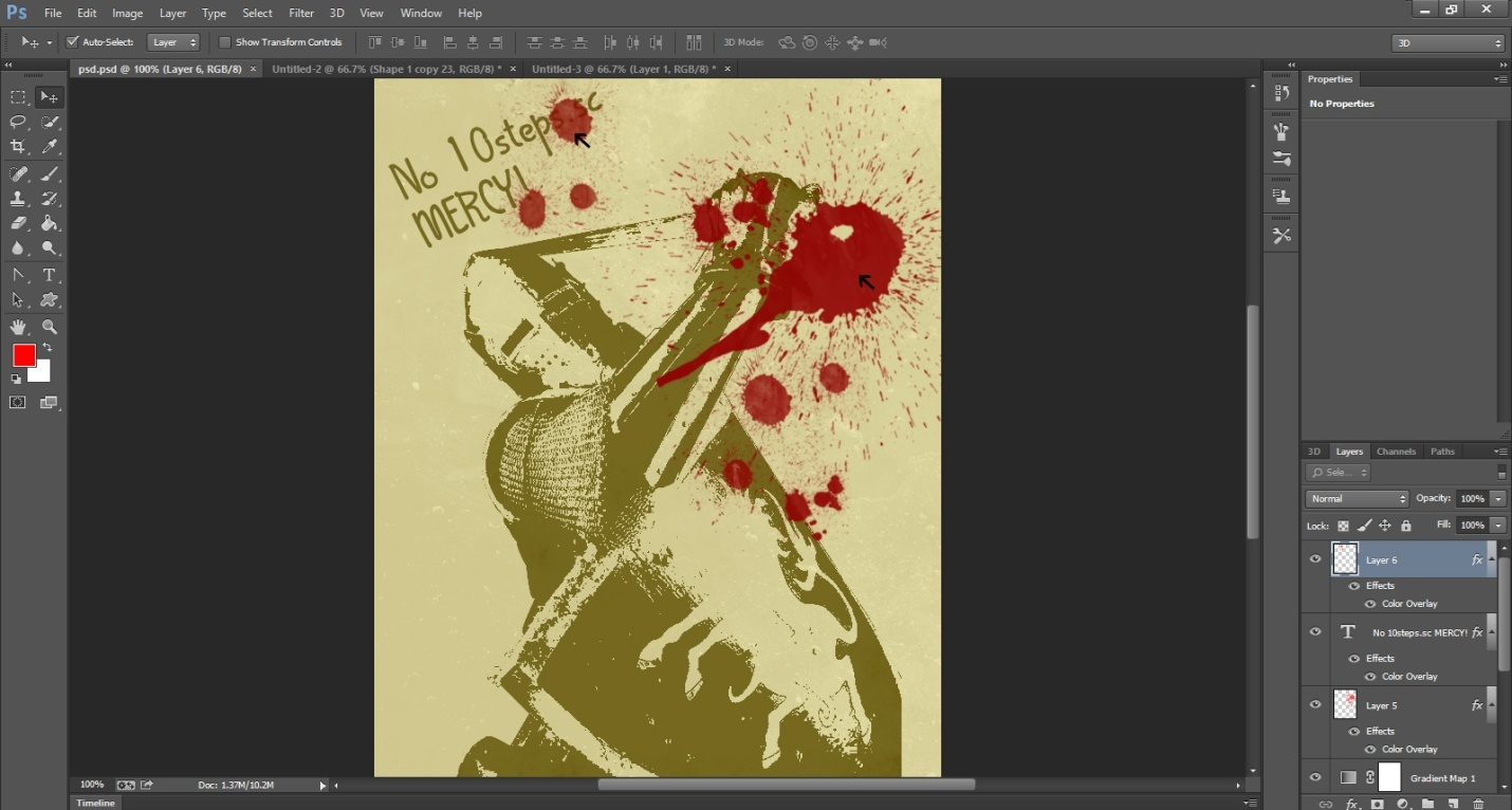
Step-7
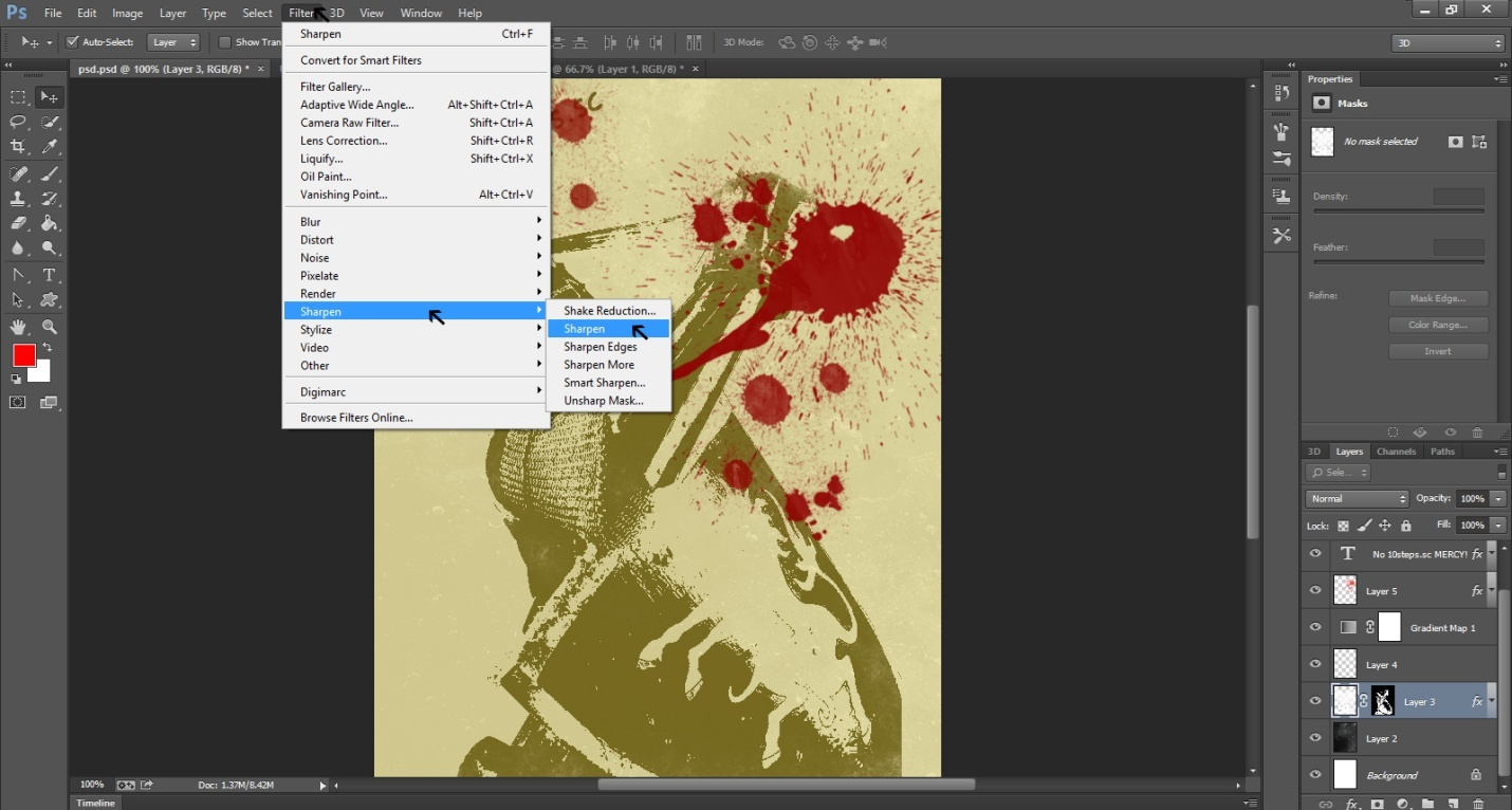
Here, we have splattered red colors on the Knight image to give it a violent look. To do so, we selected red for the new layer 6. Also, you may choose to write some text on the picture if you like.
Step-8
We are almost done with the design. All you need to do at this last step is to sharpen the image for a final impact. Go to Filter at the top bar and select Sharpen. You have options such as Sharpen Edges, Sharpen More and simply Sharpen. Choose the one that best fits your requirement.
Our image of a violent Knight is finally ready to be displayed.