

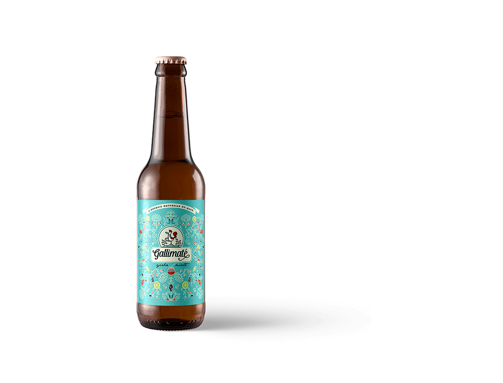
Create Limited Edition Energy Drink Design for 4th of July - American Independence Day
Christopher Wagner paid $1249 for a new Packaging Design and received 183 designs from 29 Designers.

Christopher Wagner United States
“ Needed several extensions to get adequate submissions but design turned out great. ”
$1249
Create Limited Edition Energy Drink Design for 4th of July - American Independence Day
- Packaging DesignFood & Drink
- Guaranteed
- Watch (35)
Contest Closed
This contest is now closed. Start a new design contest like this today!
Note : Design brief last updated on
Contest title
Select your industry
What is the name of your product?
What is the name of your company?
Describe what you want designed
Link to your website
Describe activities of your organization or product and targeted audience.
Describe who would typically use your product
Any helpful content you want to provide to designers for your packaging design.
Visual Brief - Color
Other colors: Red, White, and Blue - American Patriotism
A design you’ll love or your money back. It’s that simple!
World's No.1 Graphic Design Platform
- Quick turnaround time
- 3M+ Satisfied Customers
- 150K++ Professional Designers
- Receive dozens of designs to choose from
- Receive print and web-friendly art files and full copyright
- Complete Copyright & Ownership
- 24x7 Free Customer Support
- 100% Money Back Guarantee! No questions asked!

Have some questions? or did not find what you were looking for? Don't worry! We can call and help you right away!
Call us at +1 415-853-3655
or


Need A Design?
Over 100,000+ business have used Designhill to source high quality graphic designs. There are two ways by which you can get a professional graphic design at Designhill:

Hire Multiple Designers
Best for when you want to crowdsource ideas. Multiple designers submit entries for you to rate and review before you award a winner.
- Fixed price packages
- Hand crafted designs from World-class designers
- Dozens of concepts to pick from
- 100% money back guarantee

Hire A Single Designer
Best for when you want to work with a single designer only. Explore the range of creative services offered by our highly talented designers.
- Work with a single designer
- Hand crafted designs from World-class designers
- Options within all price ranges
- Flexible turnaround time
Announcements & Public Discussion Board ×