
Last updated on January 24th, 2022
Web design consists, for the most part, of interface design. There are many techniques involved in crafting beautiful and functional interfaces. Here’s my collection of 10 that I think you’ll find useful in your work.
They’re not related to any particular theme, but are rather a collection of techniques I use in my own projects. Without further ado, let’s get started.
- Auto-focus on Input
Many Web applications and websites feature forms. These may be search forms or input forms inviting you to submit something. If this form is the core feature of your application or website, you may want to consider automatically focusing the user’s cursor on the input field when the website loads.
This will speed things up because users can start typing right away without having to click on it. A good example of this is Google and Wikipedia’s websites.
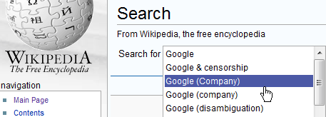
Upon arriving at Wikipedia.org, the search box is already highlighted, ready to accept text.
To automatically focus on input fields, you’ll need a little bit of JavaScript. There are various solutions, and the one you should use depends on the functionality you want to achieve. The simplest way to do it would be to add the following to your body tag:
To automatically focus on input fields, you’ll need a little bit of JavaScript. There are various solutions, and the one you should use depends on the functionality you want to achieve. The simplest way to do it would be to add the following to your body tag:
<body onLoad=”document.forms.form_name.form_field.focus()”>
Your form code should look something like:
<form method=”get” name=”form_name” action=”#”>
<input type=”text” name=”form_field” size=”20″ />
<input type=”submit” value=”Go” />
</form>
Now, every time the page loads, the text field called “form_field” will be automatically selected, ready for input.
- Using Color to Manage Attention
Color can also be used to effectively focus your visitors’ attention on important or actionable elements. For example, during the US presidential election, pretty much all of the candidates’ websites had the donation button colored red.
Red is a very bright and powerful color so it attracts attention, and it stands out even more when the rest of the professional website design is in blue or another colder color.
Warmer tones like red, yellow and orange are naturally bright and so tend to attract the eye. They also “expand” when set against colder colors like blue and green.
This means that an orange button on a blue background looks like its flowing outwards and taking the front seat. Conversely, a blue button on an orange background contracts inward, wishing to stay in the background. Here’s a picture to illustrate:
- Padded Block Links
Links (or anchors) are inline elements by default, which means that their clickable area spans only the height and width of the text. This clickable area, or the space where you can click to go to that link’s destination, can be increased for greater usability.
We can do this by adding padding and, in some cases, also converting the link into a block element. Obviously, the larger the clickable area is, the easier it is to click on the link because there is less of a chance of missing it.
Converting links into block elements makes the text area span the whole width of the container, unless the width is specified otherwise. This makes it ideal for links located in sidebars. We can do it with the following code:
a { display: block; padding: 6px; }
Make sure to also add a healthy dose of padding to the links, because converting a link into a block only affects its behavior and width; adding padding ensures that the link is high enough and has some room to breathe.
- Using Contrast to Manage Focus
Similarly, you can also manage the focus of your visitors’ attention with contrast between elements.
This technique comes in very handy for information-heavy websites, such as blogs, forums and social networks, in which you want to make a lot of information easily scannable while still showing a lot of additional things, like dates.
Fading the extras allows visitors to easily focus their attention on the most important pieces of text.
[Source: azamudd.in]
- Letter Spacing
Web design is pretty limiting for typographers. But while there are only a few safe Web fonts and not a great many things you can do to style them, it’s worth remembering that we do still have some level of control.
“Tracking” is a term used in the field of typography to describe the adjustment of spacing between letters in words. We’ve got the ability to do this with CSS using the “letter-spacing” property.
If used with restraint and taste, this property can be effective in improving the look of your headlines. I wouldn’t recommend using letter spacing on the body text because the default spacing generally provides the best readability for smaller font sizes.
Here’s an example of letter spacing in use:
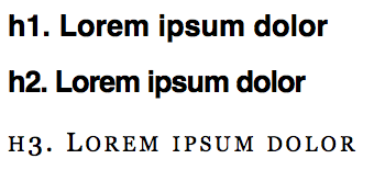
And here’s the CSS code used for the above examples:
h1 { font-family: Helvetica; font-size: 27px; }
h2 { font-family: Helvetica; font-size: 27px; letter-spacing: -1px; }
h3 { font-family: Georgia; font-size: 24px; letter-spacing: 3px; font-variant: small-caps; font-weight: normal; }
The effect can be useful when you want to craft a more aesthetically pleasing or more original heading.


