
Did you know Disney Plus changed its logo color to mark a new era in its branding?
Businesses often recreate their logo designs to reflect the changes happening in the markets. Most logos also represent new developments taking place in the company.
Disney+ is a leading American video-on-demand, over-the-top streaming service. This subscription-based service is popular among fans who look forward to watching movies from Disney Entertainment, Walt Disney’s significant segment.
The Disney+ logo has undergone some changes to accommodate new developments happening within the company.
How does the Disney+ logo look different now?
The Disney+ logo has undergone specific changes that are instantly noticeable. Here are the changes:
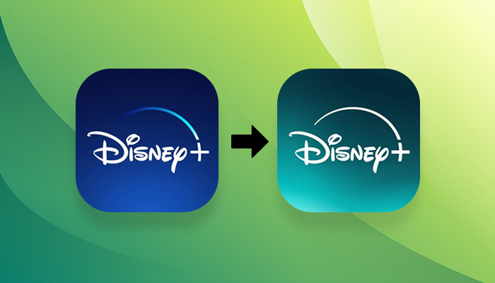
Change in background color from blue to teal
The most significant change occurred in the background color. Now, it appears to be teal/sea foam in color. This color resembles a mix of the previous blue background and Hulu’s green.
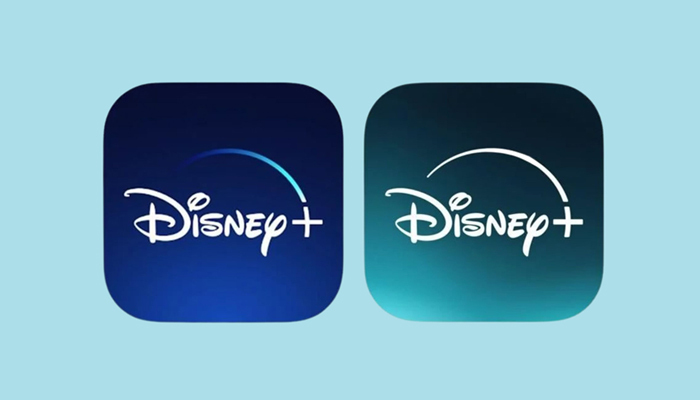
The company has shed its iconic dark blue and white logo this time. Instead, the new logo is entirely white with the blue color removed. The company has created a new version of its logo; which looks familiar. There is one slight but apparent change that people can immediately notice. The overall logo design remains the same, but the color has changed.
Including teal may surprise Disney fans as they have seen the logo in royal blue so far. However, the company considers it part of the evolution of Disney+. According to Andy Baker, the creative Voice President of the company, “We think we’ve found a balance of new and nostalgic that helps strike a chord that Disney+ has all the things you love about Disney but is also evolving and adding new things to love, too.”
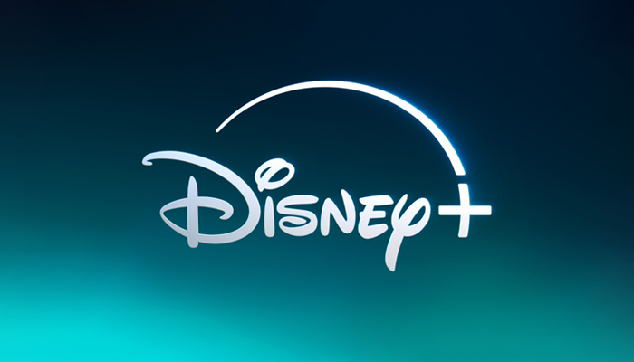
Logo featuring the northern lights
The static version of the Disney logo features northern light visible in subtle gradient form. The light appears bright team at the bottom left corner and goes darker at the top. When you see the animated version of Disney Plus logo, you find the change more evident in the app.
Earlier, the workmark of the Disney appeared first and then the star swooping over it and tearing into a plus symbol. Now, the swoop appears first and then the wordmark.
No sweeping gradient
A big noticeable change is that there is no sweeping gradient now. There is just a white logo against a teal background. So, the dramatic effect is no longer present in the logo. It is now a plain white logo, reflecting the dark night sky, where white is the only color visible.
Previously, the dark blue and white logo had a sweeping gradient going towards the ‘+’ in the logo.
Changes in the animated version
The latest animated version of Disney Plus logo shows the swoop first, followed by the Disney wordmark. The swoop is solid white, and the plus sign is thicker white to stand out cleanly on smaller screens. Since most movies are regularly seen on small TV screens nowadays, the white logo makes sense.
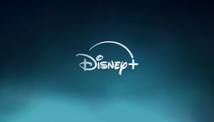
So, the background is in dark when the star is swooping down. After that, the plus sign brightens up, and so does the background, which is a beam of light that goes through clouds that are colored teal. Then, the lower part of the screen fills up with dancing teal streaks to give an impression of an Aurora Borealis.
Why did Disney change its logo?
Disney Plus is a leading subscription-based live-streaming company in the entertainment world. The changes it made in its logo design must have some reasons. The company has not specified those changes outrightly. But we can understand those reasons.
Partnership with Hulu
The Disney Company gave no specific reasons regarding the change in its logo design. However, some speculate that it could be because Disney Plus had merged with Hulu, whose logo is green.
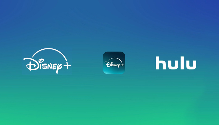
The prominent use of teal for the new logo is due to the company’s partnership with Hulu. There are two main shows on Hulu: The Commanders’ Wives and Dopesick. Both these shows have teal as their primary color.
According to a Disney + spokesperson, the inspiration for teal was mainly from the sky or, to be precise, from the Aurora Borealis. So, the northern lights phenomenon represents the night sky, a prominent feature of Disney shows.
Look different from competitors
Another reason could be that the company wanted to stand out. Disney’s competitors include Paramount, Prime Video, and Max. All of these companies have blue and white logos. So, to stand out, Disney has changed its logo to white only.
Disney made these changes in its logo as part of its strategy to beat Netflix, its biggest rival. The new changes will make the company stand out regarding its visual brand identity, which will convey the message that the company differs from its many rivals in the subscription streaming media.
These are the changes that Disney+ made to its logo recently. Business owners should learn from these tweaks in the design and consider recreating their traditional logos whenever necessary.
If you are also looking forward to redesigning your existing logo or need a fresh new logo, Designhill can help. This leading creative marketplace is home to thousands of creative logo designers. They have the right skills and experience to work on your design brief to give you a suitable logo as your brand identity.
You can either launch a logo design contest with Designhill or work with a designer of your choice on a one-to-one basis.
Wrapping Up
The Disney+ logo appeared recently different from how it looked earlier. The company changed the logo after partnering with another company, Hulu. So, to mark the new development, the Disney+ logo’s background color changed from royal blue to teal. That gives the logo a new look and impression.


