Last updated on March 21st, 2024
Nobody ever thought that a logistics brand logo would be so popular. The FedEx logo is an exemplary example of a logo that’s trendy, meaningful, cool, and relevant. Thanks to its clever use of white space, it became one of the most famous logos in the world.
So, what makes the FedEx sign so iconic and professional? In this blog, we will explore its history, meaning, and evolution throughout.
Exploring the history and evolution of the FedEx logo
When it comes to visual branding, the FedEx symbol takes the lead. Its logo has some interesting facts that you may have missed. The company started its journey as a package delivery business in 1971. However, it was not until 1973 that the brand got its first logo created. Let’s explore its logo design history.
Federal Express (1973 to 1991)
Earlier, FedEx was used to be known as Federal Express. It showcases the connection between the US government and civilians. The company’s founder, Fred Smith, used the word “Federal” to attract the Federal Reserve Bank as its customer.
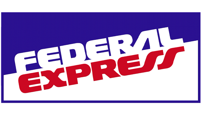
The first Fed Ex logo was heavily reliant on a wordmark — showcasing the business name in a bold and chunky avatar. The company’s core brand message was “speed of delivery.” In order to convey the core messaging, the logo showcased an upward inclination for speed. The text colors showcased contrasting color scheme, blue, red, and white. The letter “A” and “S” resembled highway signifying its package delivery services.
The first Fed Ex logo was heavily reliant on a wordmark — showcasing the business name in a bold and chunky avatar. The company’s core brand message was “speed of delivery.” In order to convey the core messaging, the logo showcased an upward inclination for speed. The text colors showcased contrasting color scheme, purple, orange-toned red, and white. The color palette took inspiration from the flag of the United States of America. The letter “A” and “S” resembled highway signifying its package delivery services.
FedEx (1991-1994)
After a few years, the company bought the Flying Tigers network. With its cargo airline expansion, the company felt the need for a logo overhaul. That’s when it introduced the abbreviated business name. It also showcased a minimalist logo design by redesigning its logo. The FedEx logo appeared to have a new look. The shortening of the brand name transformed its look and feel.
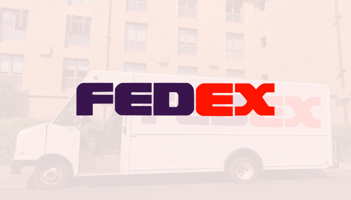
The logo font appeared in all caps. The rectangle was removed. The rounded and bold typeface with the purple and orange color scheme gave it a new brand identity. The legendary arrow wasn’t a part of this redesign.
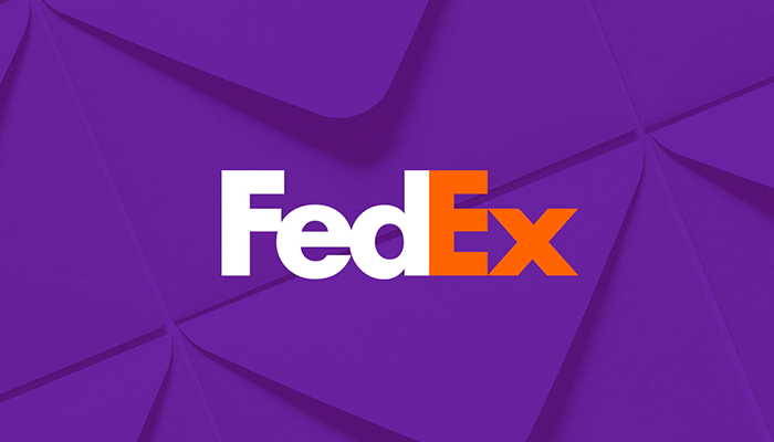
FedEx (1994 to Present)
It was 1994 when the legendary FedEx arrow was introduced. The logo is still in use even after four decades. It was designed by Lindon Leader — a senior design director of the Landor Associates brand consultancy.
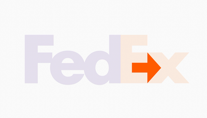
Leader preferred clean and clear design, taking inspiration from the 1980s Smith & Hawken catalogs. It was the most iconic garden lifestyle brand at that time. Leader has always had one recommendation from his clients that they wanted the white space to work. While seeking a possible solution to this problem, Leader encountered the Northwest Orient Airlines logo. He observed the letters “N” and “W” joined together in a single glyph utilizing the negative space. It was an inspirational moment for him, leading to the creation of the famous FedEx logo.
It is said that three design teams worked on the logo, and there were over two hundred versions. But none of the logos had a working white space except the one created by Leader. When he showed the design, most of the senior executives failed to notice the hidden arrow. But the company’s CEO, Fred Smith, noticed the hidden arrow, and that’s how it became the legendary symbol of the FedEx logo.
The logo was introduced with two fonts — Universe 67 and Futura Bold to make the arrow more visible. Due to its iconic symbol, the logo has won more than 40 awards globally.
FedEx logo elements
Fonts used in FedEx logo
The typeface used in the FedEx logo is a combination of two fonts — Universe 67 and Futura Bold. Leader customized these fonts in such a way that the space between them created the iconic arrow symbol.
Colors used in FedEx logo
The FedEx logo has different color variations, signifying different sections of its business. For example, the letters “Ex” in orange denotes FedEx Express services, the green “Ex” signifies FedEx Ground, and the red “Ex” points toward FedEx Freight. Besides, it also has a blue “Ex” that stands for its Office and a yellow “Ex” that denotes its Trade networks.
- Orange “Ex” means FedEx Express
- Green “Ex” means FedEx Ground
- Red “Ex” means FedEx Freight
- Blue “Ex” means Office
- Yellow “Ex” means Trade Networks
So, the FedEx logo tells a tale of wonder in the field of logistics. With over 700 aircrafts and 5, 47,000 employees, the company has created a remarkable name in its niche.
Conclusion
FedEx is famous not just for its logistics business and services but also for its iconic logo with a hidden meaning. The company branded itself as a reliable, trustworthy, and speedy service provider. The logo isn’t just a symbol for its business but signifies its personality. It cleverly shows how the brand is modern, excellent, and dedicated.
Frequently Asked Questions


