
When it comes to luxury car brands, Porsche stands tall among others. The Porsche logo is recognized all over the world for its phenomenal quality. It’s one of the most distinguishable brands. But did you know that the Porsche symbol you see today wasn’t the same a few decades back? In this blog, we’re going to reveal the Porsche logo’s meaning and history.
Porsche is a leading global sports car manufacturer from Germany. While the brand is known for its stylish luxury cars, its logo also boasts an iconic design. The Porsche logo is regarded as a symbol of luxury.
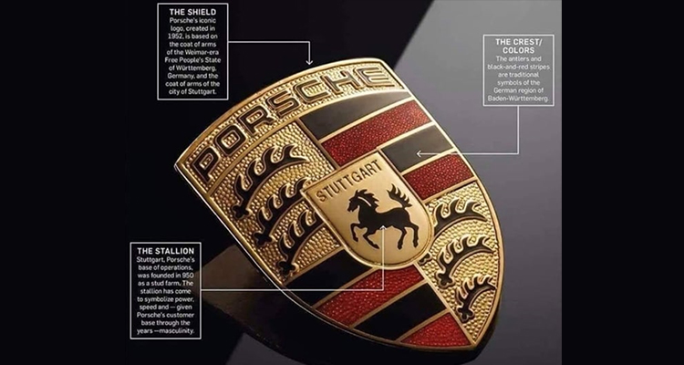
The Porsche symbol is a golden crest with four segments. There is a similar smaller crest in the middle of the logo. The four crests have four contrasting images. There are three black antlers with a golden background at the top right and on the left.
There are stripes and antlers side by side as the main features of the logo. You also see the Stuttgart coat of arms in the center of the bigger Wurttemberg shield design.
The Porsche logo Meaning
Like all the strategically designed logos, the Porsche logo also has a meaning. Its various elements convey a certain set of emotions that viewers turn into something meaningful for themselves.
The logo evokes grace, brightness, speed, and uniqueness due to the font, colors, and other elements used in the design. So, there is a specific Porsche logo meaning that the customers get: each of its car is a high-quality, elegant luxury product.
Source: https://www.reddit.com/
Porsche is a German word that means origins. So, the name is there because of the car-making company’s origin in Stuttgart, located in southwest Germany. A horse is a major element in the logo. This is because Stuttgart city was known for horse breeding and had horses in the city’s seal. The logo also has branched deer horns that remind of the two deer the initial Porsche logo design had back then.
Now that you know what the Porsche logo stands for, it would be interesting to review its design history.
Porsche logo History, Meaning, and Symbolism
Every iconic logo you see today has a design history. The Porsche logo is no exception. The logo was first designed in 1922, and with the growth of the company, its logo also evolved to convey the new aspirations.
Here are the major turning points in the Porsche logo design history:
1922 – 1938 – Retro-styled cluttered logo
Porsche created its first emblem in 1922, depicting two deer standing on their hind legs. They were shown standing on the left and right sides of a shield. The deer looked in opposite directions while leaning on the shield. Their antlers convey the car’s strength and power.

Deer is known for its speed and swiftness, which Porsche wanted to convey to the customers about its cars. So, they adopted deer as a symbol for their car brand. The shield is also in contrasting black and red colors, which evoke power and passion for the company’s cars. The logo lasted for 16 long years before the company simplified it.
1938 – 1948 – Simplified horse logo
In 1938, the company brought in the horse element, replacing the deer. A horse is a traditional symbol of strength and is seen around by people frequently. So, it chose a restive horse flaunting and rearing up as the Porsche logo animal. It was painted in black with a yellow background. All the elements from the previous logo were removed to simplify the design.

The shield element remained since it symbolizes victory over Porsche’s competitor car makers. It continued to be the company’s core identity for a decade.
1948 – 1952 – Shield logo.
In 1948, Porsche once again redesigned the logo. The horse was removed completely this time, returning its original shield element. It made the heraldic shield the sole design element of the logo.

The company retained its original yellow, black, and red color schemes to evoke the brand’s passion and aggression in making the cars. Thick black and red stripes also remained in the shield design.
Many antlers are used in the shield logo to convey the power and strength of the brand’s cars. It also drives the attention toward the company’s natural resources.
1952 – 1963- Emblem within Emblem Design
Porsche came up with yet another change in the logo. It had a logo inside a logo, which was an unusual design. The company considered returning the memory of its horse shield and placing it inside the bigger new shield custom logo design.

The brand name PORSCHE appeared at the top of the bigger shield logo. But there was STUTGART written at the top of the smaller shield inside. Stuttgart is the city where the company made its cars. This emblem within the Porsche emblem design continues in today’s logo design.
1963 – 1994 – Refined shield logo
Porsche kept the shield log design the same, evoking the strength and power of the company’s cars. But the shield shape was given a more refined and elegant look. It also looked smaller and compact in terms of design. The color also turned from dark to lighter.

The logo had a lighter touch. Its background had some embellishments to give it a sophisticated golden look. The horse design in the middle became more dominant and visible.
1994 – 2014 – Darkened shield design
The company again came up with a darker version of the previous shield logo design. The thick stripes inside of the logo now appeared dark black and red. Also, the yellow background color became dominant.

The brand name also appeared prominently at the top in black. It makes the Porsche car logo more visible and noticeable.
2014 – 2023 – Lighter design
The company again reverted to its lighter version. Some invisible changes were made to the logo on Porsche’s 75th anniversary, which helped give the emblem a new look. The boundary lines of the shield were removed completely to give it a plain look at the edge.

Also, the black boundary lines inside were missing this time, giving it an elegant appearance. The background was a little textured as well.
2023 – Present – Some minor changes made
After keeping the previous logo for nearly 9 years, Porsche designed its logo in 2023, opting for a lighter color palette. This time, the intention seems to give the logo a down-to-earth look. The company removed the shine and sophistication of the previous design.

The brand name at the top appears subdued in thin black letters. The overall appearance of the logo became dull. The textured element in the background looks more prominent than before.
Overall, the logo expresses the personality and character of Porsche. “With its cleaner and more state-of-the-art execution, the refined crest communicates the character of Porsche,” says Michael Mauer, Vice President Style Porsche, on the company website porsche.com. “We have reinterpreted historical characteristics and combined them with innovative design elements such as a honeycomb structure and brushed metal. The result is an aesthetically ambitious arc that bridges the history and the future of the brand.”
Porsche logo elements
The Porsche logo looks unique and leaves a lasting impression on viewers. This is because it uses a custom font and a distinctive color scheme. The company kept the logo fonts and colors intact for consistency and solid identity.
Font
Porsche uses a simple but modern custom font created especially for its logo. Named Porsche sans, the font is a modern sans serif type in all capitals. Besides the logo, the company uses the same font for car titles and captions. Currently, the font looks a bit raised because of texturing.
Colors
Porsche logo has red and black colors, which are the colors of Württemberg-Hohenzollern, the West German state where the car brand started its journey.
Red and black convey passion, strength, and power. Gold is another Porsche logo color. It conveys luxury, wealth, and innovation.
The horse
The Porsche logo has a horse as a chief element that conveys the power and speed of its car. The horse evokes Porsche cars’ agility, speed, elegance, and power.
The main reason for incorporating the horse is that the logo designer Franz was inspired by Stuttgart’s city seal, which had a rearing horse. Stuart is an ancient city known for horse breeding and stud farms.
So, these are the evolutionary phases the Porsche logo underwent over the decades. Note that the company gave the same logo a new, refreshing look after a few years. This was done by considering the branding strategies of those times. Some tweaks here and there also save the logo from being the same boring design. This gives the customers a fresh feel about the brand.
If you are also thinking of redesigning your logo or need a new logo, Designhiill can be your platform to get help. This leading marketplace has a global community of designers who can create a professional logo design per your design brief. You can launch your design contest or hire a logo designer to get your logo done professionally.
Wrapping Up
Porsche is a global car manufacturer brand. Its unique logo design is a shield shape with a rearing horse as its main feature. The logo was initially cluttered in 1922 and gradually became the elegant logo it is today. The horse element was first added in 1938 and is part of the design. The logo has remained almost the same over the decades, except for some tweaking.


