
Have you paid any attention to the H&M logo? A glance at the logo transfer you to the world of fashionable clothing. People identify this red logo as a symbol of trendy fashion apparel and accessories. The unique logo evokes passion for wearing high-quality clothes that define fashion in the modern world.
The H&M brand belongs to a multinational Swedish H&M Group. It makes fast-fashion clothing and has more than 4,801 H&M clothing stores worldwide.
What does H&M stand for?
The H and M letters of the company name stand for Hennes and Moritz. Hennes in Swedish means ‘’She,’’ which meant the brand was a women’s clothing store. Moritz was the surname of a clothing store owner that Hennes later acquired. So, the company’s name changed from Hennes to Hennes & Mauritz.
There is no specific or symbolic H&M logo meaning. Instead, it is simply the abbreviation of the two clothing retail stores’ names from the past.
Here is how the present-day H&M logo evolved:
H&M is a leading clothing line brand with a distinctive logo that fashion-loving people, especially youth, know as a symbol of quality clothes. However, the company logo design was not always the same. It started its design journey on a humble note and later became the bright red design we see today. Here is how it evolved.
1947 – 1968 A wordmark with 3D effect
In 1947, when the company was founded, its logo was simple. But it had its impact at that time due to its 3D effect. The fashion company’s logo looked unique since the company name appeared well-lit against a dark background.
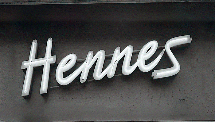
The company name ‘’Hennes’’ was in italics and positioned upward as a symbol of growth. The H and S letters were in uppercase, while the rest were in lowercase to make the brandmark unique and eye-catching. The entire name looked upward as a symbol of the company progressing and growing unabatedly. There are two parallel lines underneath the letters.
The dark color in the background is uneven. The area at the top of the letters is darker than the lower half. This gives the company logo a bit of contrast for visibility and to break the monotony of the design.
1968 – 1999 Combining the two emblems
The company created an entirely new logo in 1968 for a reason. It was a combination of the two emblems. The company had acquired Mauritz, the clothes shop named after the store owner. This is the first time the initial letters we see today combined and appeared as the H&M logo.
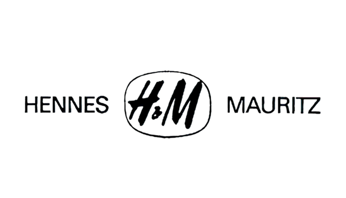
Interestingly, the company let the abbreviated and the full name versions of the logo be together. The H&M logo design was in the middle, with the Hennes and Mauritz placed to the left and right side of the trademark. The names of the two fashion brands appeared in thin uppercase.
The ‘’H&M’’ logo appears in this emblem design for the first time. The abbreviated design in the middle was in an uneven circle.
Later, the company came up with a second logo in this duration. This time, the ‘’H&M’’ logo appeared independently and looked short and bright. It was in a rich red, with the old black and white version discarded.
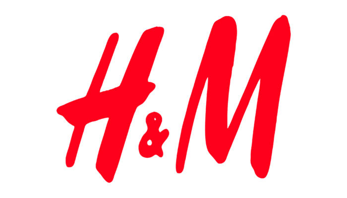
The ‘’H and M’’ letters were handwritten and appeared with careless brush strokes like in the black and white version. This gave the logo a distinctive look and helped it stand out from many clothing brand logos.
1999 – Today – Elongated letters

The company continues to keep the ‘’H&M’’ monogram logo as its core brand identity. But in 1999, the company tweaked the logo a bit. This time, the letters H and M were slightly elongated from the rounded shapes earlier. The title of the letters to the right was increased.
Also, the letters appeared in saturated colors. They had dark red instead of the earlier scarlet.
H&M logo font and colors
The H&M logo is a simple, minimalistic design that instantly catches the eye. But which font does it use? The first logo was initially handwritten with the complete brand name. The company kept the handwritten letters but abbreviated them.
The letters H and M appeared in sans-serif, a preferred font choice back then. Today, the logo has only the letters and an ampersand. That is why the style of the letters became important in the design. Such casually drawn letters give it a simple look.
Note that the logo has letters drawn and not printed, giving the design a distinctive look and impact. The letter strokes are uneven and resemble brush strokes.
Regarding the brand colors, the logo has two colors: red and white. Red is the color dominating the design, as the letters and the ampersand are bright red. The background is white to make the red letters even more visible.
So, this is a brief history of the H&M logo showing how it evolved from a wordmark and ended up with the brand’s initial in bright red.
If you are also looking for a logo as an impressive core identity of your emerging brand, let Designhill handle the job. It’s a popular creative platform for business owners and designers alike. You can involve many talented designers in creating your company’s logo by launching a contest. You can also work with them on a 1-to-1 basis.
Wrapping Up
The H&M logo is amongst the most identifiable clothing line logos globally. Today, it is a minimalistic design with only two letters, H and M, with an ampersand in between. The red color and white background give the logo a clear visibility. It was a simple wordmark initially when the company started its clothing store. Later, after the acquisition of another brand, Mortiz was added. Then, only the H and M in handwritten letters remained as the identifiers of the logo.


