Last updated on January 3rd, 2024
Burger King is amongst the world’s leading fast food brands. Its logo is an impressive and unique design that targets primarily young audiences and conveys their happiness. But the logo has its evolutionary history. Starting with a simple wordmark, it is now a colorful iconic logo.
The iconic Burger King logo saw several modifications during its long history that dates back to 1953. Along with redesigning and tweaking its logos, the company also gave a new look to its staff uniform and product packaging as part of its branding strategies. An intention to redesign the logo was to refresh the brand visuals for the new generation of consumers.
It’s nearly difficult not to have heard of Burger King (BK), the second-largest burger chain with a global network of more than 17,800 locations in more than 100 countries (till 2020), whether you enjoy burgers or not.
What Does The Burger King Logo Represent?
The Burger King logo symbolically expresses a hidden meaning, which the viewers can instantly get. The logo is the company’s badge, representing a burger that the company sells. Burger usually has a meat layer, which the company name represents. The symbol of a burger between the buns represents the company’s essence.
So, the logo conveys the happiness of satisfied consumers who regularly buy Burger King’s fast food. The emblem expresses their joy and becomes a cultural symbol of fast food consumption.
The Burger King Logo History
Based in Miami-Dade County, Florida, this burger chain was first introduced as Insta-Burger King in 1953. Insta Burger King was taken over by its two Miami-based franchisees, David Edgerton and James McLamore, who renamed it “Burger King” in 1954 as it struggled financially.
In the ensuing fifty years, the ownership of the brand changed hands four times, with the third group of owners, a joint venture between Bain Capital, TPG Capital, and Goldman Sachs Capital Partners, going public with their business in 2002.
In the latter half of 2010, 3G Capital (Brazil) acquired a considerable stake in the business through a US$3.26 billion contract. The corporation started a reorganization effort to improve growth and marketing. Burger King and Tim Hortons, a Canadian doughnut company, were combined by 3G and Berkshire Hathaway under a single-parent name.
The corporation started a reorganization effort to improve growth and marketing. Burger King and Tim Hortons, a Canadian doughnut company, were combined by 3G in partnership with Berkshire Hathaway under the new parent company Restaurant Brands International. As exciting as Burger King’s ownership history is, so is the logo’s journey.
Create Your Logo With World’s #1 Logo Maker
Decoding The Burger King Logo Design & Its History
Here is how one of the most prominent fast-food restaurants in the world modified its visual identity to keep up with the changes.
![]()
![]()
1953 – 1954: The Rising Sun Logo
When the company started in 1953, it was known as Insta Burger King. It got its logo in the same year. Then, the logo was a rising sun with the sunrays stylized as triangles around the half disk. The brand name Burger King was in all caps and bold letters. It was a black-and-white logo back then. Despite being a friendly emblem, the company lasted only for a year. So, the first step toward the later Burger King logo evolution was creating a simple black-and-white combination logo.

1954 – 1957: Just The Wordmark
The company acquired the restaurants from David Edgerton and James McLamore in 1954. To show its authority, the logo also had a new design. This time it had no rising sun; instead, the brand name made the logo.

The old Burger King logo was a minimalist bold wordmark in a sans-serif typeface with uneven letter edges. It was a simple logo with no other details. The company kept this logo for three years as its brand identity
Looking For a Logo Design?
We have helped thousands of business owners from all around the world with their graphic design needs such as a logo design, website design, social media posts, banner design and much more.
Get Your Logo DesignGet a Free Quote
1957 – 1969: Colorful, Engaging Logo
The company introduced a multicolor yellow, red, blue, and brown logo in 1957. At that time, it was an exciting and engaging logo due to the use of colors. A bolder and neater font further made the logo look impressive. It also had a tagline, ‘’Home of the Whopper.’’

This time, the designer made radical changes in the logo by incorporating a happy clown sitting on the burger with a huge soft drink glass. A good range of colors and the clown gave the logo a distinctive look.
1969 – 1994: The First Bun Logo
The iconic Bun logo we are familiar with today was designed in 1969. Its bold red lettering was the chief attraction and a key feature. The bold red sans-serif lettering with smooth lines caught the eye instantly.
While the color palette for this design came from the previous versions of the logo, the composition, shape, and style were still new. The wordmark sandwiched between the two layers of buns made the logo unique. This design also visually conveyed that the company sells fast food.
1994 – 1999: The Tweaked Bun Logo
In 1994, the company tweaked the logo slightly to give it a traditional and solid look and feel. The buns’ color was a little brighter this time to convey the happiness of a satisfied customer. Also, the wordmark was in all capitals with the letters in rounded sans-serif. Many restaurants use this logo even today.

This logo is an example of how simply changing the letter style can dramatically alter the look of the emblem. The change of letters from a little stylish in the previous version to the straight letters in this one gave it a new look and feel.
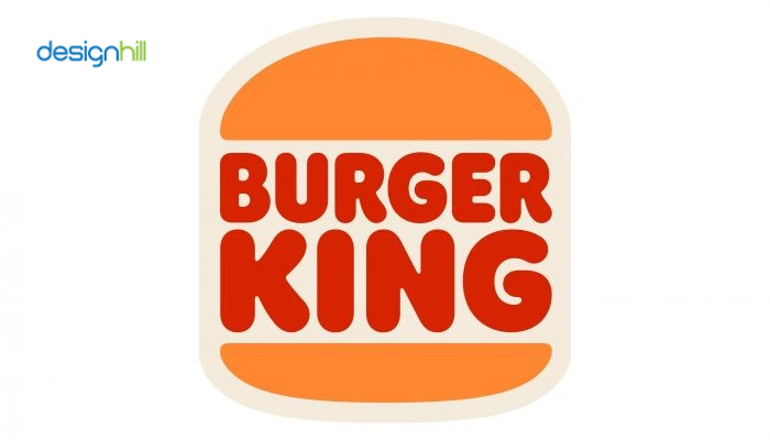
1999 – Today: Round-Shaped Version Introduced
The company redesigned the logo again in 1999 to give it a round shape and a distinctive look. This time, the enlarged wordmark was placed diagonally between the bun halves. The bright yellow buns had some white strokes to give it a refreshing look.

Also, a blue C-shaped arc around the wordmark became the attraction of the design. It further gave the logo a distinctive look. This design is today’s core identity of the brand.
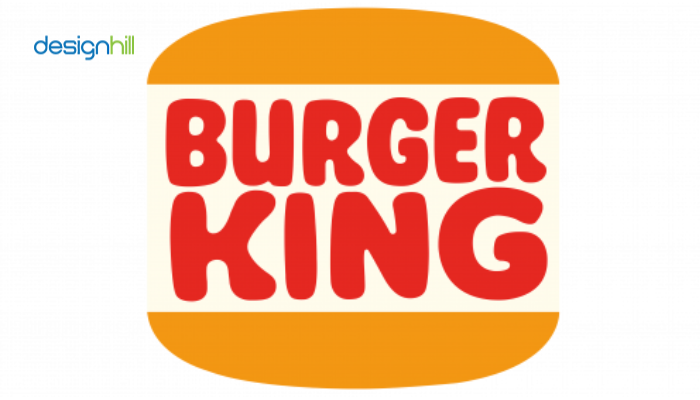
2021 – Today: The Vertical Logo
In 2021, the company again redesigned the logo in bold red lettering, placed between the two buns. The color of the buns also was changed to orange. Additionally, the background was in light cream, which makes the emblem’s framing. The color scheme gives the logo a warmer and friendlier look.
This design looked compact to make a different impression on the viewers. The upper bun was larger this time than the lower one. This gave the impression that the buns were larger and had more stuff inside.
Recommended Reading:
Burger King Logo Elements
The Burger King logo has its fonts and colors, giving it an identity amongst target consumers and markets. Most of the Burger King logos letters are in uppercase to express its authority in the market. The heavy sans-serif typeface helps the design stand out.
The logo’s color scheme is also crucial to make it a distinctive visual identity. It has red and orange as the primary colors. While the background is in a light cream-beige shade, the prominent colors are bright and eye-catching. These colors evoke energy and happiness.
Overall, these are the evolutionary phases of the iconic Burger King logo. The logo versions met those times’ requirements to convey a brand message.
If you also need a unique and impressive logo design for your new business, Designhill, the leading creative marketplace, can help. You can launch a logo design contest and get dozens of logo ideas from contestants worldwide. Or, use a logo maker that can generate multiple logos based on your brief.
Wrapping Up
Burger King is the world’s leading fast-food brand. Its iconic logo is a well-known emblem that people can recognize instantly. But the logo design has gone through its evolutionary phase. It was a black and white simple work mark initially. Then, it became a colored logo with buns and a wordmark in between. The company made the necessary changes regularly to make it look refreshing to the new consumers.


