
Last updated on December 9th, 2023
Social media site Reddit has created a new logo design for a fresh brand identity and look. The company had previously redesigned its logo and identity in 2017 when it launched its first mobile app. The Reddit logo is a mascot, Snoo, which the company has given a 3D look now in its rebranding efforts. The mascot now appears more likable and approachable.
Reddit is a popular social news website that works as a user forum. The site is known for socially curated content, which members promote based on user votes.
There are hundreds of sub-communities on Reddit. These are known as subreddits, each with a specific topic, such as politics, music, or technology. The most popular posts from the users appear on the site’s home page.
Reddit is also known for its unique logo, a popular visual amongst users. The logo is a mascot that people can easily identify and relate to.
What does the Reddit mascot mean?
The Reddit logo looks like a mascot, which the company calls Snoo. But the mascot is designed to be gender-neutral, so that it is neither a male nor a female. A reason for making the gender-neutral mascot logo is that gender will not matter much in the future when assessing a person’s abilities.

The Snoo mascot has an antenna, which makes it look like an alien that can travel in time and space. The antenna here aims to convey that future generations will also find the Reddit platform relevant.
While there are many alien logos, the Reddit logo stands out due to the red eyes of the symbol, Snoo. The company redesigned its logo on previous occasions but kept the red color of the eyes unchanged. That is what most brands do. While redesigning their logos, they keep one or two design elements identical for familiarity and consistency.
Why was the logo redesigned?
The company has new ambitions of enhancing its global presence. It wants to reach out to the new markets. There is a challenge for the company to drive a new set of users to the platform. That prompted the company to give itself a new brand identity, including a redesigned logo.
 Explaining the logo redesign, Reddit’s chief marketing and consumer experience officer on the company website said, “As we expand our global presence into new markets and engage with more audiences from advertisers and developers to redditors and moderators, we need to strengthen our brand foundation to allow for more creative and consistent expression.’’
With many changes in the world, the company needed to evolve its brand. The need of the time was to create visuals, including its logo, that make the brand look more intuitive, integrated, and global.
How different does the new logo look now?
The previous Reddit logo redesign was in 2017. So, how different did the logo look after its redesign in 2023?
Here is how the logo looked previously.
2017 – 2023
 Now, the company has given it a new look by reshaping some of its elements. The new changes are visible instantly to the users. They get the new brand message when they see the business logo.
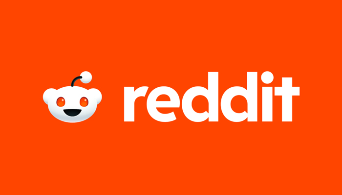
Here is how the refreshed logo looks today.
2023 to Today

As you can notice, the logo gives us a bright, shining, and very happy look due to the redesign. Here is what has changed in this popular logo.
The speech bubble
The conventional round shape bubble is no more. It’s now reshaped into a speech bubble, which stands for the company’s business of being a communication platform where people interact.
 But the speech bubble was designed not just as a twisted element. More than that, the conversational bubble was there with a purpose. The company wanted it to be the brand’s new visual identity cornerstone.
The mascot with a 3D look
Another crucial design change is about the mascot. Now, it appears in a 3D look with a depth that makes it more engaging and less robotic. It is also shown in speaking mode with the mouth open, as opposed to a simple smile in the previous logo design.

Also, the mascot’s antenna now looks more personalized, whereas the mascot of the 2017 logo had a robotic antenna.
An orange-red logo
The redesigned Reddit logo is now mostly in a mix of orange and red, except for the mascot in white. The logo appeared in an orange-red mix color scheme than the white and black last time. The brand name was in black with a red dot on the ‘i’ letter, while the white mascot’s background in the circle was orange.
Now, the entire logo, except the white mascot, is in orangey red. Still, the black color of the previous logo has been retained in the newer one, which appears in the mascot’s single antenna and mouth.
Reddit has kept its iconic orangey-red color in the redesigned logo because it’s the brand’s signature. But the traditional color this time comes paired with white and a hint of black to give the logo a fresher and distinctive look.
Pentagram, the design agency that refreshed the Reddit logo, used a refined secondary palette besides Reddit’s signature hue of Orange-Red for the logo. This time, the agency refined the secondary color palette from a library of more than 100 colors. It simplified them to 15 colors of five primary hues, each with three shades.
About the color palette, the Pentagram on its website said that their approach shows the balance between expression and brand significance. Moderators can use the latest secondary palette for easy customization.
New typefaces introduced
To give its identity a distinctive look, Reddit introduced new typefaces. The company developed the typefaces known as Reddit Sans and Reddit Display. These typefaces are designed to make the brand more intuitive and integrated worldwide.
The logo has the company name in the Reddit Display typeface alongside the mascot, Snoo. The typeface helps give the emblem a refreshed appearance. This Reddit sans provides the logo with a friendly and clean look.
Moreover, the Reddit sans typeface is versatile to use on any digital platform. The letters are large in height, making them easily readable and visible from a distance. So, such a typeface and big letters ensure a better user experience.
Quoting the use of Reddit Sans, the company said that it was built for the Web, with legible and clear letterforms maintaining the warmth and diverse nature of digital conversations. The font can go up to x-height for readability and is highly versatile. The disambiguated letterforms offer quick identification with a more incredible user experience.
So, these are the changes Reddit introduced to refresh its identity. The new logo addresses and targets the brand’s new set of users. Besides, being one of the most-visited websites, Reddit’s latest logo redesign journey talks volumes about it expansion strategies.
If your small business needs a logo redesign like this, you can count on Designhill. The leading creative marketplace lets you leverage its logo design services and tools to get a relevant company logo.
Wrapping Up
Reddit recently redesigned its iconic mascot logo to give it a distinctive look. This now appears in one orangey red color. But the white mascot has been enclosed into a speech bubble to recreate the brand identity with the logo. The speech bubble logo with the wordmark stands for the company’s business of being a communication platform.


