
Last updated on November 29th, 2021
Modern day consumers find mobile phones handy for not only researching some information, products or services but also for easy and convenient shopping.
So, in the present scenario, without a mobile website, it will be difficult for any company to survive when a large number of orders are placed by customers on mobile websites.
In a latest report, it has been pointed out that despite phenomenal rise in the number of smartphones users; the shift from desktop based website to mobile website has not been in an equal measure.
The study reveals that 45% of businesses surveyed did not have a responsive or a mobile website. Such businesses are finding it increasingly difficult to remain in competition when the consumers are making purchases by searching on mobile phones.
In this article, we give you vital tips to help you design mobile websites for your customers.
The Design Must Be Responsive
A basic but major consideration while creating mobile website is that it must be responsive to the smaller screens of mobile devices like smartphones and tablets.
A responsive web design is the one that is suitable to both the desktop computer and mobile phones. Due to which the design responding well to the smaller screens, there is no need to have two versions of the same website.

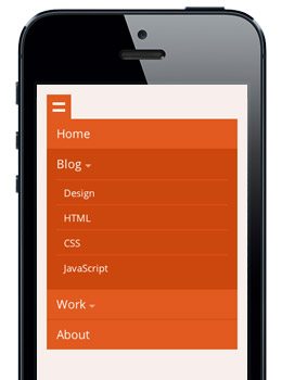
Know The Limitations of Mobile Devices
The mobile devices users do not use full keywords or a mouse, which means that they depend on fingers to touch a very small keypad on the mobile screen and the design must take that into account.
For easier searching the links, features, text etc. should be in larger images. The designers should create a drop-down menu for easier navigation across pages.
Place Important Information At The Top
Mobile users cannot access a major part of a website right away on the screen. They see only a tiny part of the site and hence make sure that your crucial information is immediately seen to the consumers.
For instance, if you run a restaurant business, the users would like to see your menu right away. Therefore, your menu for lunch, dinner, dessert and drinks must be visible instantly before you provide other information.
So, find out which details are the most crucial and place them at the top.
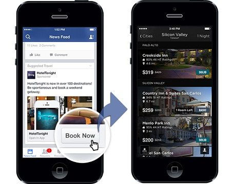
Use of Icons and Call to Action Buttons
Since a mobile site has a smaller surface area for display, it is imperative to use icons to prevent the site from looking cluttered. Use of Call to Action (CTA) buttons is also highly recommended to allow guide users to the most important features of your website.
Using such icons or CTA buttons helps users relate to mobile apps and allows them to easily use your website.
Using Optimized Images
The mobile internet speeds are generally lower as compared to broadband powered laptops or desktops, therefore, it is important for mobile websites to be highly optimized.
One of the first things that a designer should look at while optimizing the speed of a mobile website are the images.
Since the mobile device resolutions and aspect ratio are considerably lower ranging from 240X320 to 2560 X 1440, images should be resized, cropped or brought down to the aforesaid resolutions and aspect ratios.
Further, JavaScript libraries and heavy jquery files must also be replaced with standalone JavaScript.


